Introduction:
In this blog, we will see how to perform classification prediction scenario in SAP Analytics Cloud. The example taken for this scenario is Student Pass Prediction.
This model will be useful for schools or colleges in which the students’ pass or fail status in particular exam is predicted based on several attributes and necessary changes can be made in order to achieve high pass percentage and improve the students’ performance.
This is basically a binary classification scenario wherein 1 represents that the student might pass and 0 represents that the student might fail. Let’s deep dive into the content.
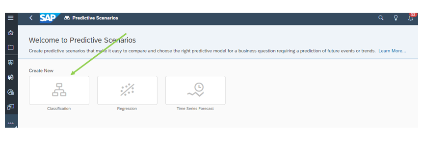
Generally SAC Prediction Scenario is classified into three types, namely
- Classification
- Regression
- Time Series Forecast
Classification is about predicting a boolean value which means either this or that. (example. today will it rain or not). Regression is about predicting a measure value (example. what will be the sales price or net revenue). Time Series Forecast is about making prediction based on historical time stamped data.
Student Pass Prediction based on SAC Classification:
The version of SAC used by me is 2021.20. SAC is integrated with ML Algorithms so that we can facilitate that and perform Smart Predictions.As before mentioned, the data used for this content is student data set which is split into training and test dataset.
The information used to train an algorithm is called training dataset and the testing dataset is used to test or validate a model.
The total number of rows available in the data set is 395. Out of those, I consider 300 as training data set and left 95 as testing data set. (Usually consider 75% occupies training data set).
Now, let’s look into the step by step procedure of creating prediction model.
1. Importing the train dataset
Go to the datasets tab and import the training data set by clicking create new from CSV or Excel file. The name of the training dataset in our case is Training Dataset.
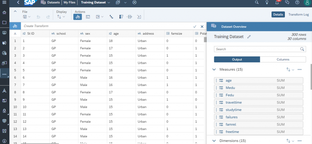
For precise understanding, create a new folder inside the files and maintain all the necessary datasets inside the folder itself. In my case, the name of the folder is Student Pass Prediction.
2. Data Discovery
Once the data is successfully imported, you can see the raw data in the center and dataset overview in the right pane. The right pane displays the number of rows, columns, output and column views. In our case, we have 300 rows and 30 columns. We have 15 measures and 15 dimensions.
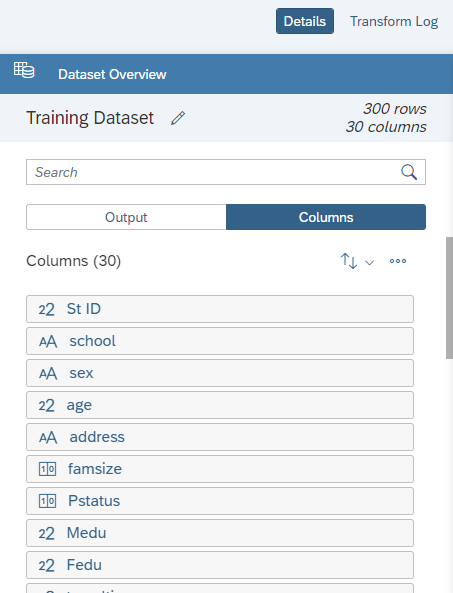
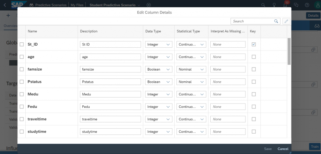
Let us switch to column view to get more details about a column. The column view consists of dimension properties and column details including data type, statistical type, data distribution and validation.
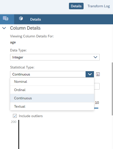
By default, SAC itself has the ability to auto predict the data types and statistical types. In case of any changes needed, you can manually change by yourself.
Statistical types add semantic context to column data.
Nominal : Unordered, discrete values (ex. Categories)
Ordinal : Sortable, discrete values (ex. rankings)
Continuous : Numerical, sortable, continuous values (ex. salaries, dates)
Textual : Nominal values containing text (ex. sentences)
In our dataset, student ID field (St ID ) acts as a key field which uniquely identify a student and pass field is a target variable (1 represents pass and 0 represents fail) used for training.
The other variables include
school – student’s school
gender – student’s gender (Male or Female)
age – student’s age (numeric: from 15 to 22)
address – student’s home address type (Urban or Rural)
famsize – family size (bool: 1 if it is LE3 else 0)
Pstatus – parent’s cohabitation status (bool: 1 if it is living together else 0)
Medu – mother’s education (0-none, 1-primary, 2- 5th to 9th grade, 3- secondary education, 4- higher education)
Fedu – father’s education (0-none, 1-primary, 2- 5th to 9th grade, 3- secondary education, 4- higher education)
traveltime – home to school travel time (numeric in hours)
study time – weekly study time (numeric in hours)
failures – number of past class failures (numeric: n if 1<=n<3, else 4)
schoolsup – extra educational support (bool 1 if it is yes else 0)
famsup – family educational support (bool 1 if it is yes else 0)
paid – extra paid classes (bool 1 if it is yes else 0)
activities – extra-curricular activities (bool 1 if it is yes else 0)
nursery – attended nursery school (bool 1 if it is yes else 0)
higher – wants to take higher education (bool 1 if it is yes else 0)
internet – internet access at home (bool 1 if it is yes else 0)
romantic – with a romantic relationship (bool 1 if it is yes else 0)
famrel – quality of family relationships (numeric: from 1 – very bad to 5 – excellent)
freetime – free time after school (numeric: from 1 – very low to 5 – very high)
goout – going out with friends (numeric: from 1 – very low to 5 – very high)
Dalc – workday alcohol consumption (numeric: from 1 – very low to 5 – very high)
Walc – weekend alcohol consumption (numeric: from 1 – very low to 5 – very high)
health – current health status (numeric: from 1 – very bad to 5 – very good)
absences – number of school absences (numeric: from 0 to 93)
G1 – first period grade
G2 – second period grade
G3 – final grade
Once after checked the data consistency, saving this dataset into the Student Pass Prediction folder.
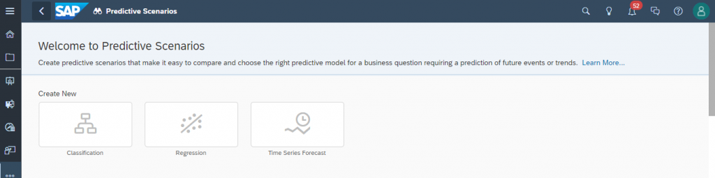
3. Creating a Predictive Scenario
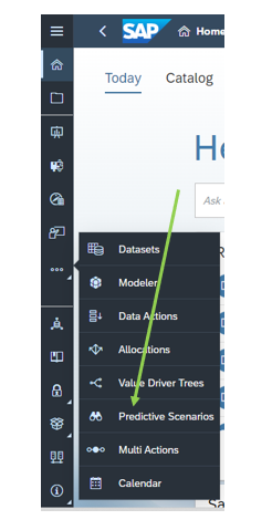
A Predictive scenario is used to compare and choose the right predictive model for a business question requiring a prediction of future events or trends. Let us create a new predictive scenario by clicking the create new classification model.
Give a name for the predictive scenario and save it in the same folder. In my case, the name of the predictive scenario is Student Predictive Scenario.
Select our training data set as train datasource. By clicking on the edit column details,you can verify the statistical types and select the key variable.
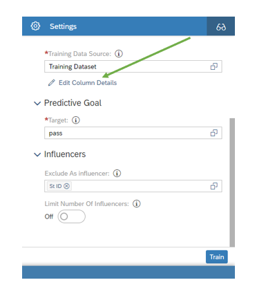
In the predictive goal tab, select the target variable. In our case, pass fields is target variable. Some cases, there exists some variable which does not cause any effect in the output like student id , student name etc.. These variable can be loaded in exclude as influencers tab.
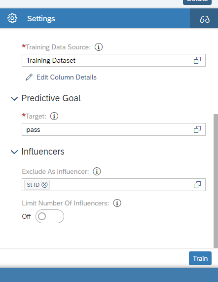
Now we gonna click the train button.Training is a process that takes these values and uses SAP machine learning algorithms to explore relationships in our data source to come up with the best combinations for the predictive model.
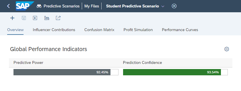
Once the train button is clicked, we can see a new model has been created with the parameters like model name, status, creation date, predictive power, predictive confidence,influencer count, record count, classification rate.We can also delete or duplicate this model.
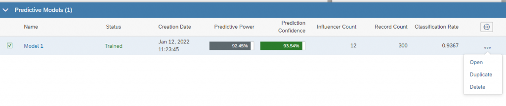
Predictive Power indicates how confidently we can apply this predictive model to make predictions. It is used to measure the quality of a model. The predictive power of our model is 92.45% (which is above 80) and good for predictions.
Predictive confidence indicates degree of confidence when we use different dataset with the same model to get same level of prediction. It is used to measure the robustness of a model.The predictive confidence of our model is 93.54% (above 80) and good to use it for different dataset.
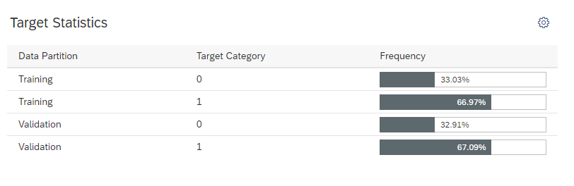
Target statistics demonstrates the frequency of predicted category in both training and validation data partition
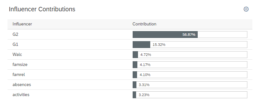
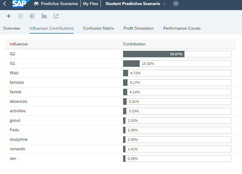
Influencers are the variable which actively participate in predicting the final target variable.
The influencer contribution pane defines what are all the influencers and their contribution. In our case, the top 6 influencers are
G2 – 56.87%
G1 – 15.32%
Walc – 4.72%
famsize – 4.17%
famrel – 4.10%
absences – 3.31%
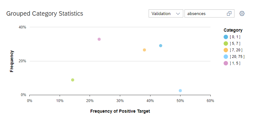
The grouped category influence demonstrate a single value or a range of value of a particular influencer and its contribution for predicting the final target output.
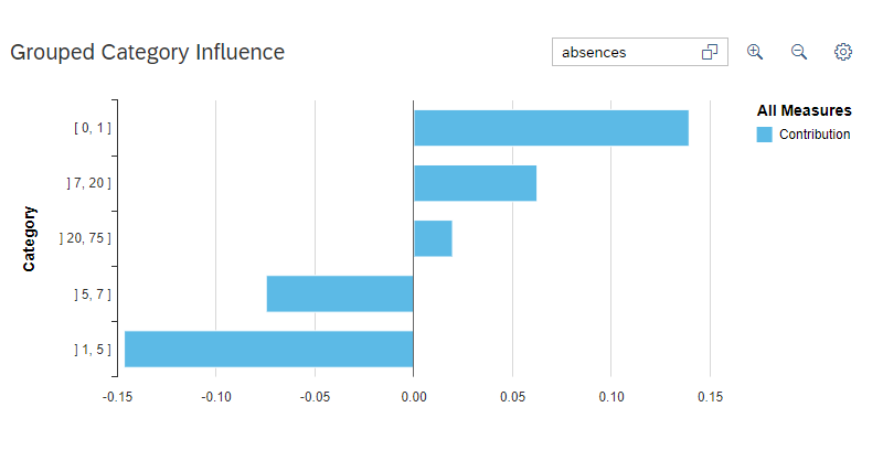
The grouped category statistics defines the frequency of positive target against the influencer values.
SAC gives us the confusion matrix which defines the four major values namely
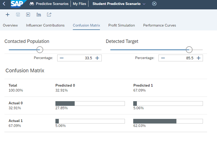
True Positive – Actual is 1 and Predicted also 1 (62.03% in our case)
True Negative – Actual is 1 but Predicted is 0 (5.06% in our case)
False Positive – Actual is 0 but predicted is 1 (5.06% in our case)
False Negative – Actual is 0 and Predicted also 0 (27.85% in our case)
A good predictive model is a one which contains maximum percentage of True Positive and False Negative cases.
% Detected Target chart consists of 4 parameters namely perfect model, validation, random and training.
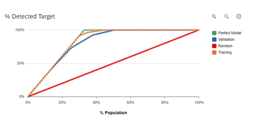
Predictive power shows how close the validation curve is to perfect model.
Predictive confidence shows how close the validation curve is to training curve.
4. Importing Test Dataset
Once a predictive model is created, we need to apply this model to a set of population (testing dataset) to predict the student’s pass or fail status. For this purpose, we are importing a test dataset consists all the columns in the training dataset except the target variable column. The number of rows in the test dataset is 95.
Save the dataset and open our predictive scenario application.
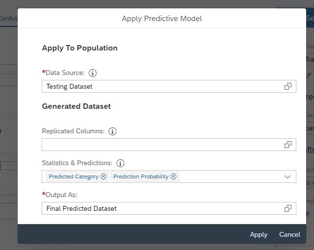
Click on the apply predictive model icon.
After clicking, you are required to select the test dataset. In the Statistics & Predictions tab, select Predicted Category and Probability (if needed). In the Output as tab, select the final output dataset. (Final Predicted Dataset in our case) No need to select any values in replicated colums, since student id field (our key variable) will automatically replicated. Now click on Apply button.
Expand the status panel, and you’ll see the status changing from “Trained” to “Applying Pending” to “Applying” and, finally, to “Applied”.
Now go to the Files app where you should find Final Predicted Dataset generated dataset.
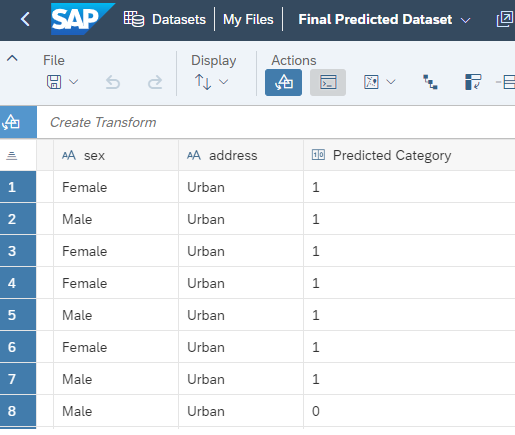
You should see two new columns predicted category and prediction probability value. Out of the 95 rows, our model predicts that 70 students will pass (pass variable is 1) and 25 students will fail (pass variable is 0).
5. Increasing the prediction percentage
Now let us create a new model (named model 2) by removing the influencers which is contributing less than 3 percentage and check for prediction power and confidence.
Let us remove the influencers goout, Fedu, study time, romantic and gender and train the model 2.

We can see that the predictive power and predictive confidence is increased in the second model.
Now let us create a new model by considering only the top 2 contributing influencers. Here G1 and G2 are the top 2 influencers. We can name this model as model 3.
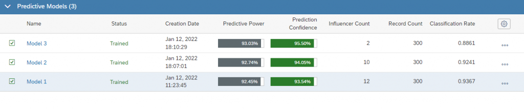
We can see that the predictive power and confidence is further increased when we have only the top 2 influencers.
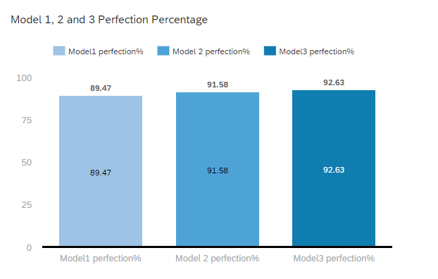
Now, let us compare the output of these 3 models with the actual output. Out of 95 students, model 1 predicts 85 students correctly, model 2 predicts 87 students and model 3 predicts 88 students correctly.
So, model 3 is the one having high prediction success rate.
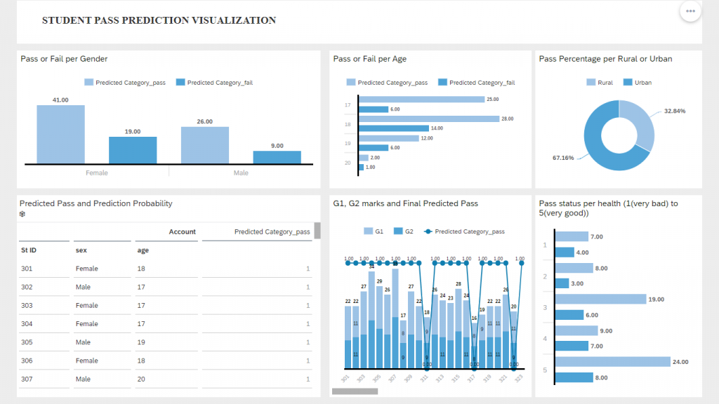
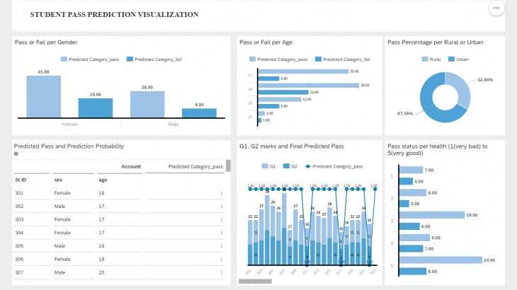
6. Visualization
Consuming the final 3rd Model data in a story for visualization purpose. The story consists of key performance indicators like pass prediction status for various dimensions.