Introduction
This blog post highlights some of the improvements for customers designing their stories for mobile devices.
Classic Story Responsive Layout
Let’s first look at the feature which are supported as part of the Classic Story Responsive Layout:
Font Scaling
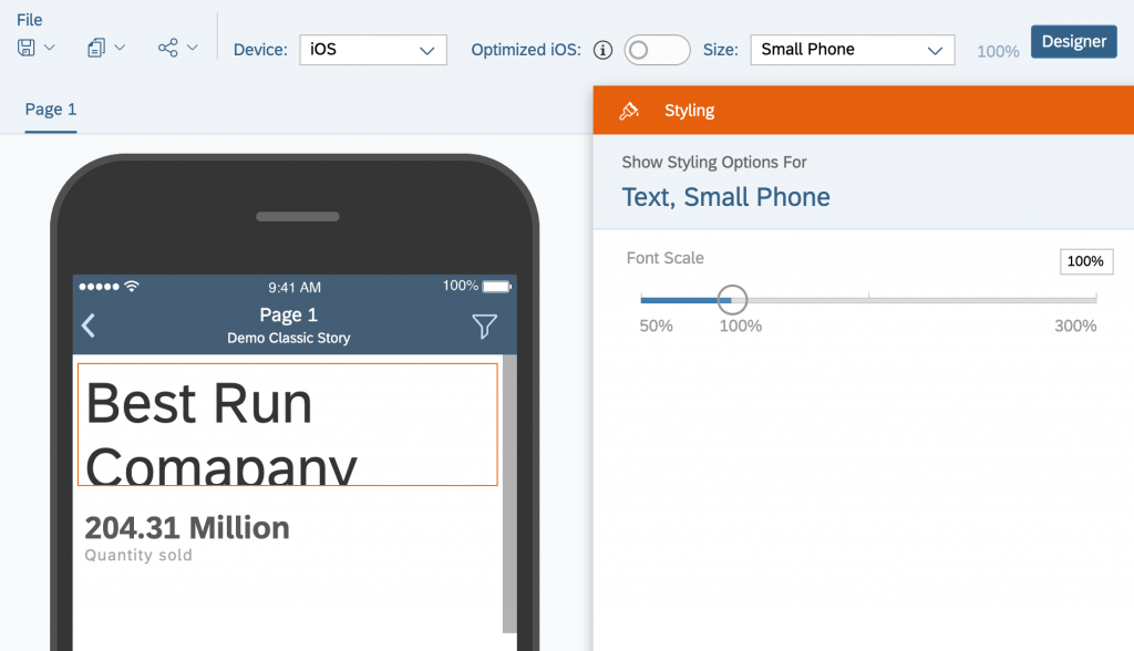
The Device Preview (accessibly in the edit mode toolbar under format) allows overriding the Font Scale, to ensure text fits appropriately on all devices:
Disable a tile on mobile
In edit mode, you are able to disable a certain tile (like a line which is used as a design element in the web layout, or a complicated chart you don’t want to show) for mobile devices:
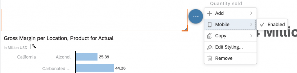
However, this option is only available in the edit mode, not within the Device Preview.
Advanced Responsive Layout
Now we will go through the improvements released as part of the Advanced Responsive Layout.
Live device preview
Previously, only the font scaling was adjustable while the device preview was open. For all other actions, including hiding a tile on mobile, the user needed to disable device preview, do their changes, and open device preview again to see the changes.
Now, instead of a device preview button, we show a device bar at the bottom during edit mode, which allows you to directly select a device:

Regardless of which device you select, all edit functionally will be enabled, including actions like adding or moving widgets.
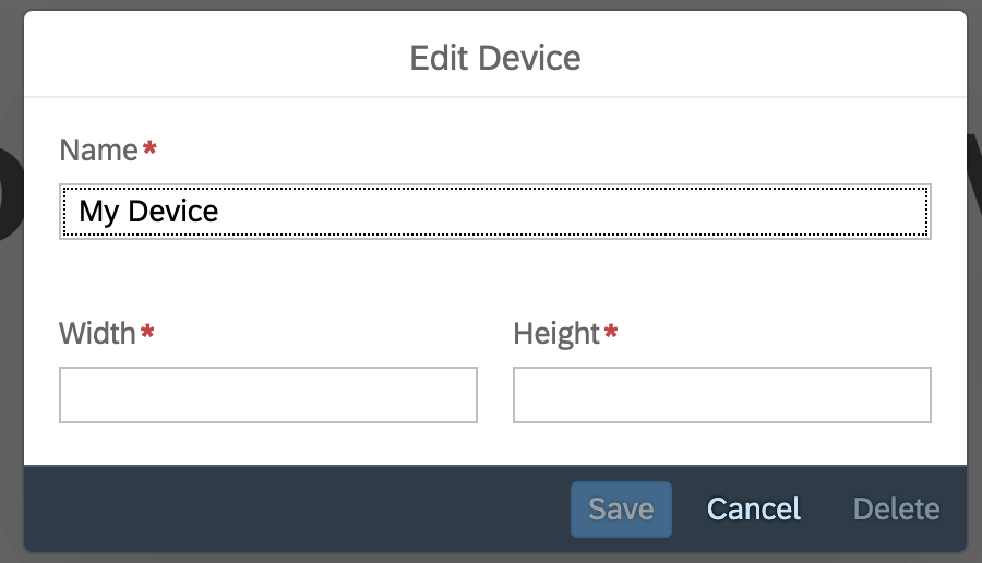
Custom devices
As part of the device selector, you now also have the option to add a custom device. While we kept the previous options like small and large phone as well as tablet for iOS, you can now add your own devices as well. With the existing categories we grouped similar screen sizes into one category, but with custom devices you can now individually fine-tune layouts for devices which were previously grouped together.
Responsive Rules
Responsive Rules are the biggest change to how you can design stories for mobile consumption. To access them, first select the device you want to modify the rule for in the device bar, and then open the builder panel on the right hand side and select a lane:
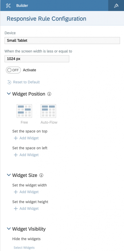
While editing these rules, keep in mind that that responsive rules automatically cascade from Auto or larger devices down to smaller ones.
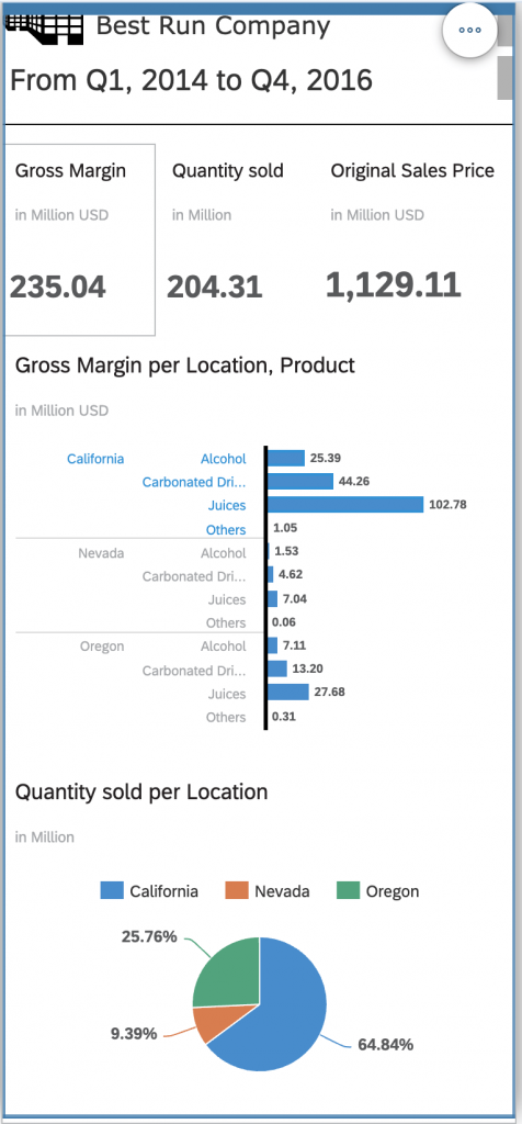
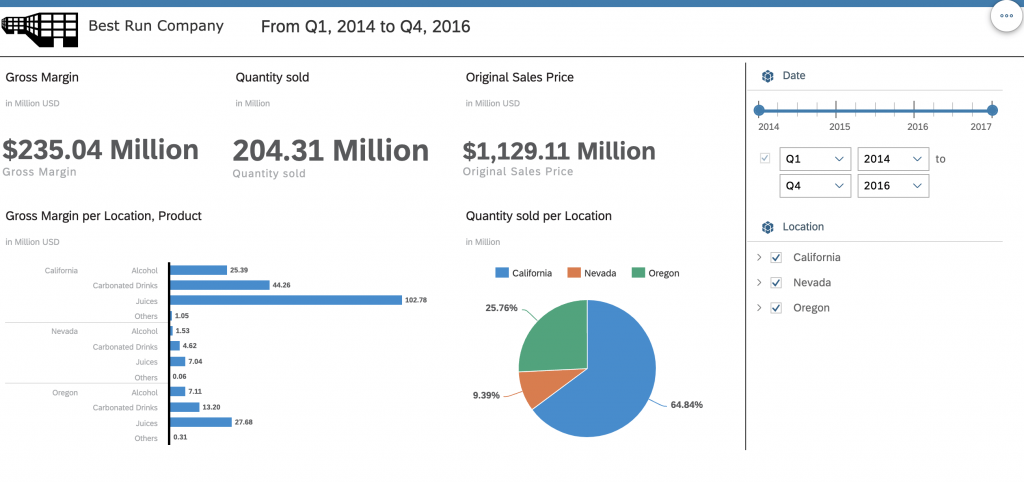
To show you how to use them, I will adjust the following example story to look good on a phone using responsive rules:
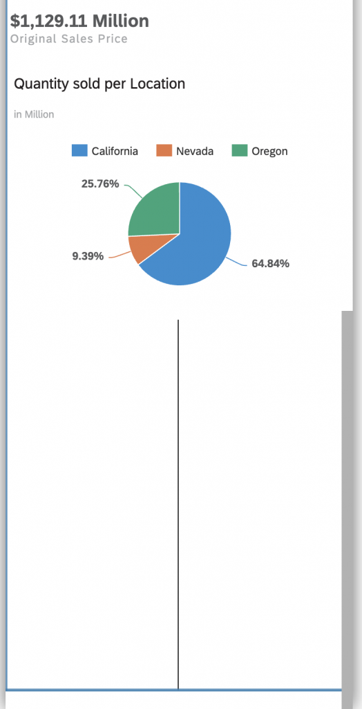
When I change the device to Small Phone, it will look like this by default:
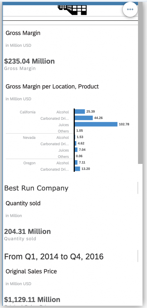
You will instantly notice several problems:
- The logo and company name are no longer next to each other
- The three numeric point KPIs are also scattered across the page
- The bar chart is not tall enough to display all bar at a glance, and requires scrolling
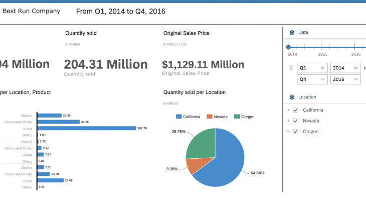
- When you scroll down in the preview, you will also notice that the divider we used on web to separate the input controls on the right does not look like it belongs there: (Note that for mobile all input controls and story filters are shown in a panel like before)
The first problem we want to fix is the ordering of the tiles. In the Classic Story Responsive Layout there was no option to influence the positioning of tiles except via grouping them in different lanes. The Advanced Responsive Layout offers multiple ways to do this.
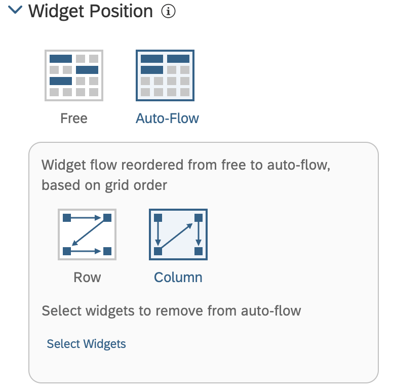
Free Positioning allows a flexible positioning of each widget in the lane, including overlapping, while auto-flow reassembles more of the Classic Story Responsive Layout where widgets are automatically arranged. The later is the default positioning for phones, and it now comes with a new option to flow the widgets by row or column. As our layout is designed to be read row by row, we can switch the option to row and have a look at the updated preview:
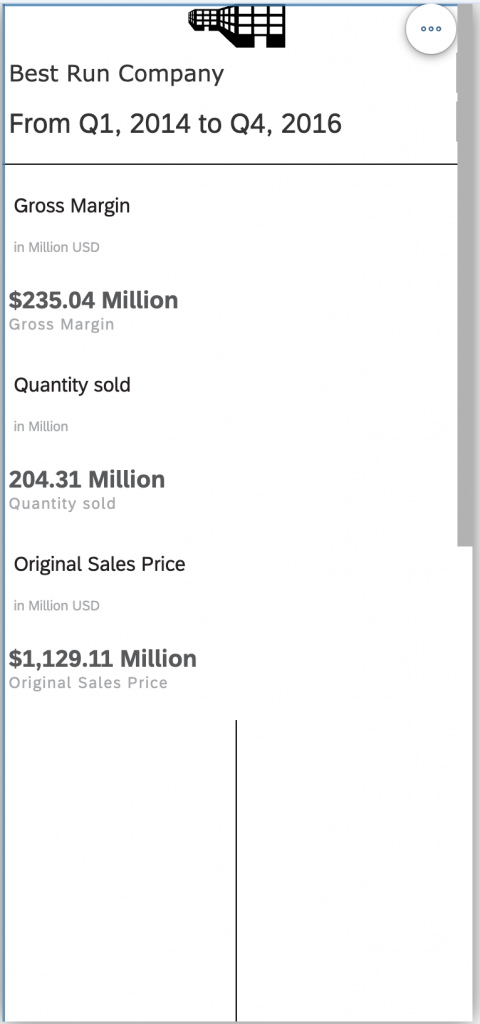
You notice that problem one and two have been addressed. However, there is further room for improvement to the layout of the title as well as KPI widgets.
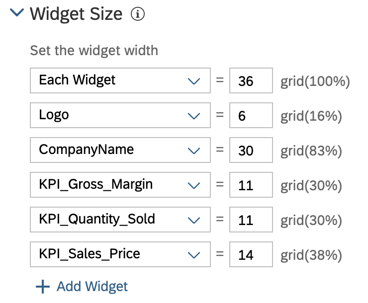
You are now able to configure widgets to display side-by-side on phones! For this, simply modify the Widget Size rules – you will notice the default rule on phone is the show each widget at 100% width, however you can override or even delete this rule:
To ensure the KPIs fit nicely, we can also tweak some of the already existing options of the widgets, like hiding the scale and unit, as they are already present in the subtitle. (Please note that these settings continue to apply to all devices.)
Let’s have a look how our story looks now:
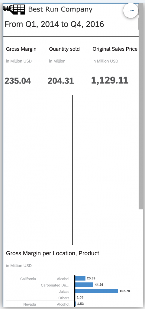
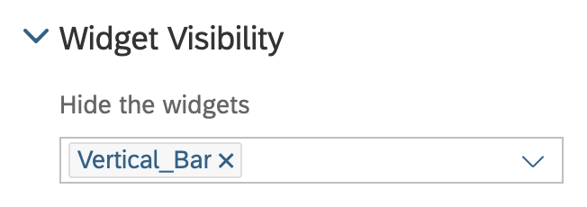
Next, we should hide the vertical line. On the Classic Story Responsive Layout you are only able to hide a tile for all mobile devices at once, but now you can configure show/hide in the responsive rules per device. This allows you for example to display some elements on web and tablets but not phones, or even add phone specific elements.
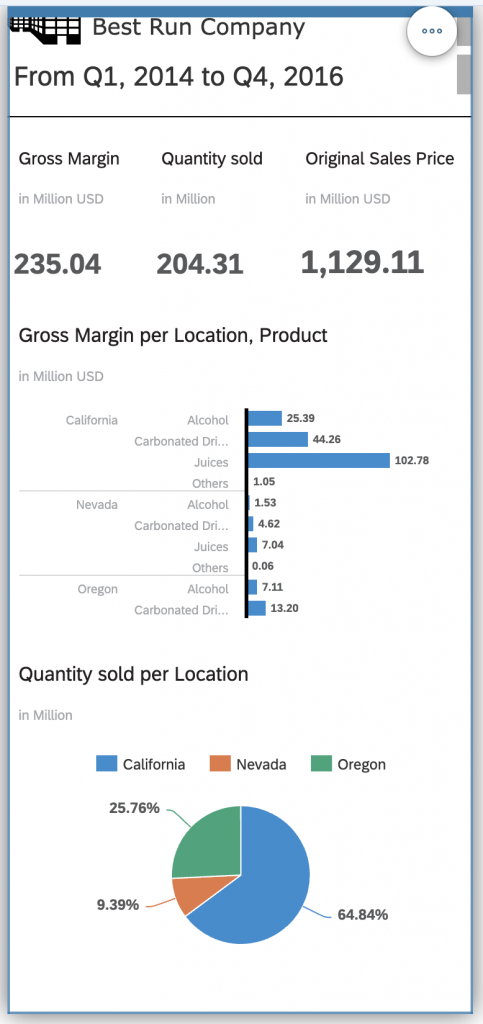
Our story now looks like this, and problem four is fixed:
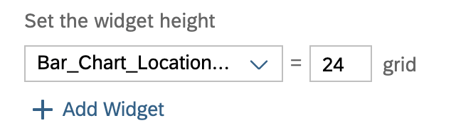
As a last step, we need to make sure the bar chart displays all bars without scrolling, to fix problem number three. As part of the widget sizing, you can now control the height of widgets as well. This allows you to make sure all content is displayed at a glance without requiring any interactions:
Finally, let’s reveal the finished story: