Everyone knows first impressions are critical. When meeting someone we’ve all been told to look the person in the eye, extend a firm handshake, speak clearly, etc. The same principles apply to a website’s UX these days as well. First impressions are key and can go a long way to bringing someone back to your site time and time again. While a computer screen cannot shake your hand physically, it can be just as engaging (or disengaging) as any interaction with a human being in real life.
Therefore, the last thing an organization wants to do after investing time and money into a new LMS is to lose their employee base straight out of the gate by a bad first impression. This is true for any IS application, but with the criticality around preparing your workforce for the future and the heightened emphasis on employee training these days, this first impression is more important than ever before. Unfortunately, this topic can get lost in the shuffle of other LMS project related activities. In this blog I highlight the SuccessFactors Learning home page for learners, new additions that recently came out to the home page in the b1411 release, and what you should consider when making this important first impression to your employees (along with scenarios/examples for reference).
The LMS Tile-Based UX
Anyone familiar with SuccessFactors knows about the tile-based user interface that is common across the suite. The LMS is no different in regards to the end user Learner interface. While not labouring on tile-based design itself, I do want to call out the tiles available in the LMS for learners that can be used to form their user experience in the system.
| Tile | Description | New in b1411? |
| My Learning Assignments | Displays all learning Items assigned to user, whether by self-assignment, auto-assignment, manager assignment, etc. Reflects course title, assignment types/due dates, and quick links to next actions (i.e. – Register Now, Start Course, Request Approval) | |
| Find Learning | Provides quick text-based search of course catalog or link to browse full catalog. | |
| Learning History | Reflects recent course completions for user (in past 30 days) and provides link to full learning history. | |
| My Curricula | Provides visual overview of user status with respect to all curricula assigned (i.e. – whether curricula completion is overdue, due in 30 days, due later, etc.). | |
| My Employees | Provides visual overview of user’s subordinates’ status for their learning, if user is a manager (i.e. – Due in 7 days, Overdue, etc.). | |
| Links | Lists various links for user to other areas in the LMS as applicable (i.e. – links to Approvals, Dashboard, Easy Links, Options & Settings, etc.). | |
| Available Offerings | Provides short list of upcoming scheduled offerings for courses on the user’s learning plan. Quick visual representation of potential scheduled offerings that may interest the user instead of requiring user to search for upcoming offerings manually. | |
| Recommended | Quick view tile showing any courses that have been recommended to the user (via Assignment Profiles). | |
| Bookmarks | Quick view tile showing any QuickGuides that user has bookmarked for future reference. | |
| Featured | Quick view tile showing any courses that are featured in a catalog that the user has access to. | |
| Self-Assigned | Reflects courses from user’s learning plan that have been self-assigned, providing user a short list of assignments that s/he has done directly for their own learning purposes. Note – self-assigned courses will NOT be shown in the My Learning Assignments tile when this tile is in use. | |
In addition to the standard tiles provided above, custom tiles can be created in the LMS and made visible to users as needed. These custom tiles function similar to the use of custom tiles in BizX. Custom tiles can be made visible to certain Organizations only as well as made only visible during certain date periods.
Home Page Tile Enhancements with b1411
The b1411 release saw some pretty significant updates to the learning home page tiles that are available within the LMS. As noted in the table in the prior section, several new tiles were introduced, in addition to new tile sizes for several previously existing tiles and some new functionality for managing the learning home page layout. The table below provides a summary on the b1411 enhancements to the learning home page.
| Enhancement | Details |
| Landing Page Management Actions |
|
| Newly Introduced Tiles |
|
| New Tile Sizes Available |
|
Making That First Impression (or Creating a New One)
One of the great things about SuccessFactors Learning is the flexibility that is provided in laying out the home page for your employees. Admins can manipulate the landing page configuration for learners in the LMS from the Admin Portal by going to System Admin -> Configuration -> Landing Page Settings. From here, an admin can manipulate the landing page default used for all employees in the following ways:
- Define which tiles are Used (Visible) or not
- Specify the Default Size of each tile displayed on screen
- Specify the order in which the tiles are displayed on screen
- The screen is generated from left to right, going down as the allowable width of the screen is reached by the default tile placement by row.
While you do not have complete free reign on designing the layout of the learning landing page, the capabilities provided can give you numerous ways to set the layout. But before you run off trying to become the puzzle master by making the tiles fit together as nicely as possible, some thought should be given toward the impression you’re trying to make toward your end users. I always try to keep in mind the marketing aspect of the LMS with clients, meaning if you really want your LMS to be a success within your organization, how will you market it appropriately to your employee population? The UX of the LMS plays a big role in this process. Consider the following points as you think about the layout design of your learning page.
What functionality are we using in the LMS for end users?
First and foremost, determine what the canvas for your learning home page should even include. This should come out of your LMS implementation as is, but don’t overlook it. Are your admins going to be actively managing course recommendations or featuring courses contained in the catalog? Are you a push organization when it comes to learning and do not allow users to take trainings other than what is assigned directly to them? If you answer no to any questions like these – then don’t clutter the learner’s landing page with tiles that are of no use to them. An organization needs to be honest with themselves and what their admins can handle. Don’t include tiles for functionality that the admins will not ensure is kept fresh and up-to-date. If a user can’t see the forest through the trees, your first impression may be so scattered about that your employees miss the point of your LMS to begin with.
What end user functionality is most important to our organization’s learning strategy?
Don’t answer ‘everything’ here as I won’t buy it. While I understand you want to do everything well, consider the end user’s experience. What is most important to them when they first access their learning home page? Is it seeing their learning assignments prominently on screen? Is it ensuring they readily identify where they can search the catalog. Or is it highlighting communications from the learning team, whether those be through custom tiles or the use of course highlights like Recommendations or Features? Consider Google for a moment – the main purpose of their website is to allow users to search the web, so they don’t place their search bar in the bottom right hand corner of the screen. Likewise, you shouldn’t put the key tiles involving your user’s highest interactions with the LMS in awkward places either.
Examples Please…
So hopefully by now you see my point and understand thought should be given to how you layout the learning page for you employees within the LMS. The following examples can help you visualize how the layout design of the learning landing page in the LMS can come together in various real-world scenarios.
Priority on Searching and Learning Assignments
For organizations that offer robust training catalogs for users to actively search and take part in their own training plan, keeping the Find Learning tile front and center should be of importance. Also ensuring end users are constantly reminded of their learning assignments and upcoming scheduled offerings is a common need as well. For this scenario, the search and learning assignments tiles should be most prominent, balanced potentially by the Available Offerings tile. Tiles of secondary importance, like Learning History, My Curricula, Recommendations, etc. (if used) are placed at the bottom portion of the page.
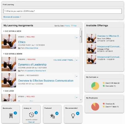
Key highlights of the above design include:
- Find Learning tile at top, full width of page, very prominent to influence user to search and browse offerings.
- User learning assignments and corresponding available offerings secondary under catalog search, but still prominent for user on screen.
- Status titles for Bookmarks, History, Featured courses, Recommendations, and Curricula/Employee status in balancing positions in lower region of screen for reference.
Push Cultures
For organizations that have a Push culture for learning where users are assigned trainings to take instead of having the capabilities to search training catalogs and take trainings on their own initiative, a different layout should be recommended. In the extreme case where an organization does not give employees the ability to search a catalog, the Find Learning tile should be hidden completely. Other tiles then also become not needed due to their dependency on catalog searching, user registration, etc., like the Featured and Recommended tiles. In these scenarios, what’s important is the user is well aware of his/her learning assignments, upcoming scheduled offerings for classroom based training, and their Curricula/Employees status as required.
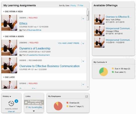
Key highlights of the above design include:
- No abilities to search catalog or other functions not utilized (i.e. – Recommendations, Featured, etc.)
- My Learning Assignments and corresponding Available Offerings at the top center of screen.
- History, Links, and Curricula/Employee status underneath in secondary positions.
Pull Cultures
For organizations that put more responsibility into their employees’ hands as far as their training development goes, other tiles may creep up the list of importance than the traditional bread winners like the catalog search and learning assignments. It’s great to see organizations and admins get fully involved in the LMS and actively manage course recommendations for various parts of the employee population and feature new/important courses within the catalogs. The new QuickGuide functionality is also a great way to get SME’s in the learner population involved in building quick training materials in the LMS and making them available to the full population.
In this scenario, and with the changes that came with the b1411 release, I advise the use of a top banner of small tiles that summarize this various information to a user so as to keep it front and center and on their minds instead of getting lost in only thinking what is on the My Learning Assignments tile is important.
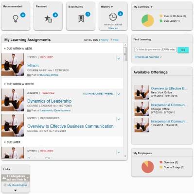
Key highlights of the above design include:
- Top row meant for Status highlights with small tiles displaying information on Recommendations, Featured courses, User Bookmarks, History, and Curricula Status.
- Middle of page focused on core LMS needs, displaying user Learning Assignments balanced by Find Learning tile for quickly searching catalog and Available Offerings tile for highlighting upcoming scheduled offerings of interest.
Hybrids (There’s Always Another Way)
Most organizations won’t fit into just a Push or Pull culture when it comes to their learning strategy. Typically there is a blend depending on company culture, resources, etc. For our last scenario, let’s get a little specific and different with the design (just for kicks).
Imagine a smaller company that does not offer classroom/scheduled-based training. All their offerings are online, but they do make it a priority to not just throw online courses out in a catalog and rely on their employees to take training on their own initiative. They assign trainings to individuals as needed and actively feature courses at certain times but do not try to manage course recommendations. They are not utilizing the QuickGuides functionality in the LMS as of yet but do use the Easy Links extensively to provide users further links to various pages of interest for learning and want to ensure users do not miss these resources.
They also want to distinguish for users what trainings are assigned to them directly vs. trainings that users may self-assign on their own accord. They value a compact, balanced UX while giving users the ability to easily access what they need. The design below is an option to meet this unique requirement in an effort to maximize the user’s experience with the LMS and display information as efficiently as possible.
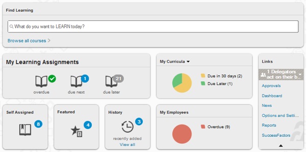
Key highlights of the above design include:
- Considering the overall preference toward a compact/balanced home page, the My Learning Assignments tile is defaulted to be compressed to save screen space.
- The Self-Assigned tile is used in order to separate self-assigned learning vs. other learning assignments that show up on the My Learning Assignments tile. Both tiles are compressed by default.
- As the company only offers online training, the Available Offerings tile is hidden.
- The Find Learning tile is give precedence at the top of the screen, full width as in prior scenario.
- The remaining tiles are placed and balanced underneath the Find Learning tile, with the Links tile being expanded by default to list all Links to the user.


