Introduction
SAP Analytics Cloud provides us with functionality of using shapes and symbols in user Story. But there is no standard mechanism to use conditional formatting on them. In current blog, we will explore the capabilities of R Visualization in achieving this functionality.
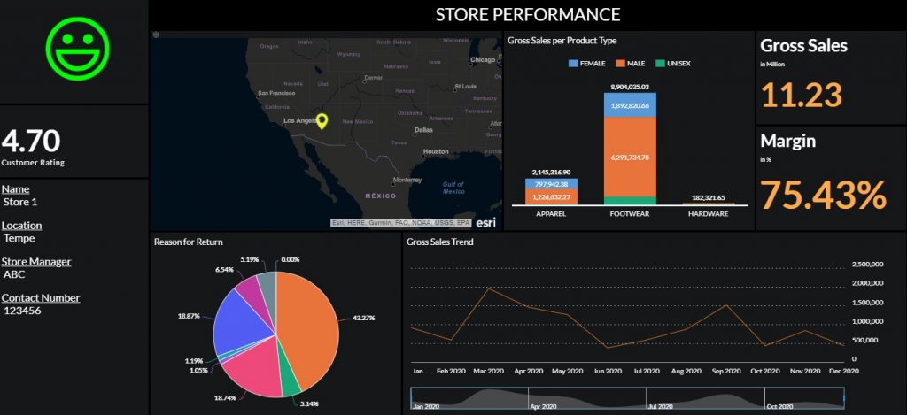
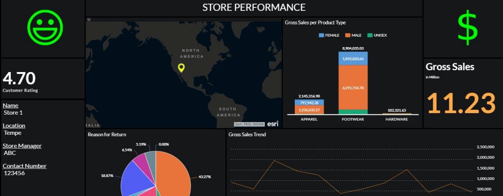
We will consider a Store Performance story for demo purpose. This story depicts various KPIs measuring the performance of a store along with details like location, customer rating etc. Our goal is to incorporate a smiley shape which should change dynamically based on customer rating of store. Customer rating is measured on the scale of 0 – 5.
| Criteria | Smiley with Conditional formatting |
| Customer Rating < 2 | Disappointed Smiley with Red color |
| 2 < Customer Rating < 4 | Neutral Smiley with Orange color |
| Customer Rating > 4 | Happy Smiley with Green color |
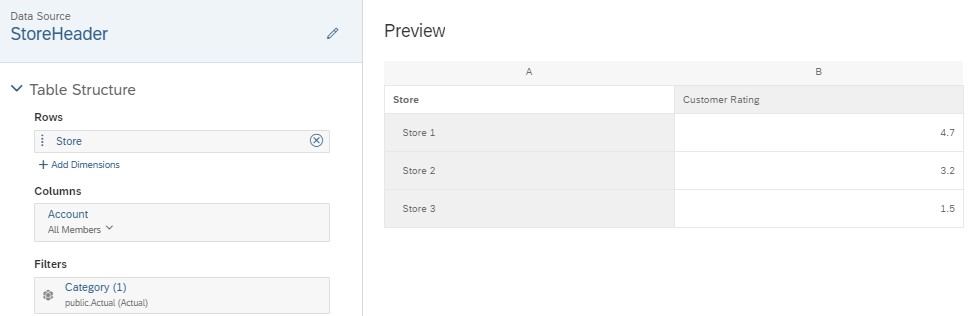
Following is our Store rating data
| Store | Customer Rating |
| Store 1 | 4.7 |
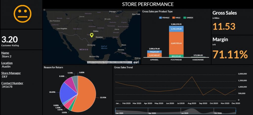
| Store 2 | 3.2 |
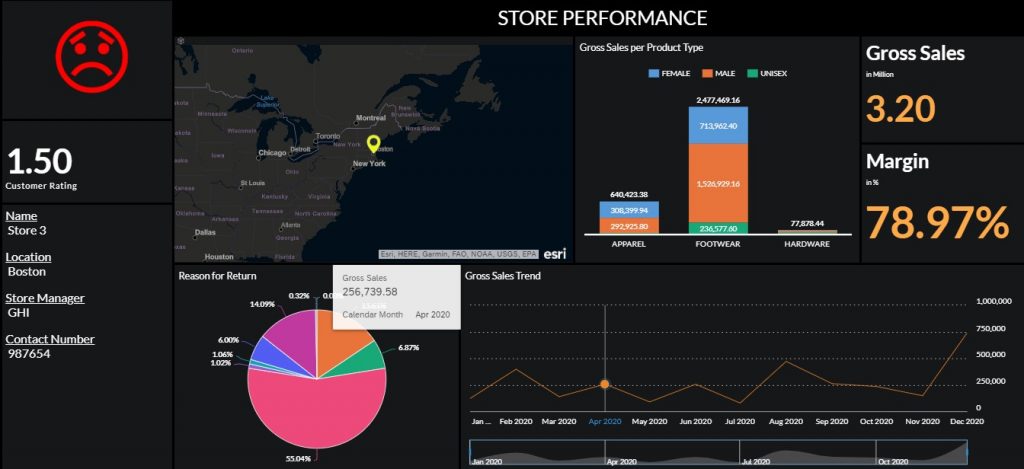
| Store 3 | 1.5 |
Implementation
Step-1: In edit mode of Story, navigate to “Insert” and click on “+” button. Click on “R Visualization”.

Step-2: Map the model as Input Data and select the relevant dimension and measure. Check the preview data.
Step-3: Click the Add Script option and input the following code in Editor pane. Click Apply button.
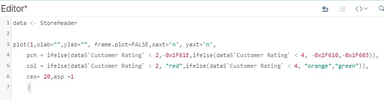
data <- StoreHeader

plot(1,xlab="",ylab="", frame.plot=FALSE,xaxt='n', yaxt='n',

pch = ifelse(data$`Customer Rating` < 2,-0x1F61E,ifelse(data$`Customer Rating` < 4, -0x1F610,-0x1F603)),

col = ifelse(data$`Customer Rating` < 2, "red",ifelse(data$`Customer Rating` < 4, "orange","green")),

cex= 20,asp =1

)
Step-4: Complete the remaining layout of Story. Create a filter to select 1 store at a time to test the feature.
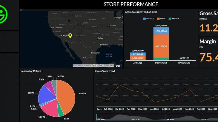
Step-5: Select Store 1 in filter. Story should depict Happy smiley with Green color as customer rating is 4.7
Step-6: Select Store 2 in filter. Story should depict Neutral smiley with Orange color as customer rating is 3.2
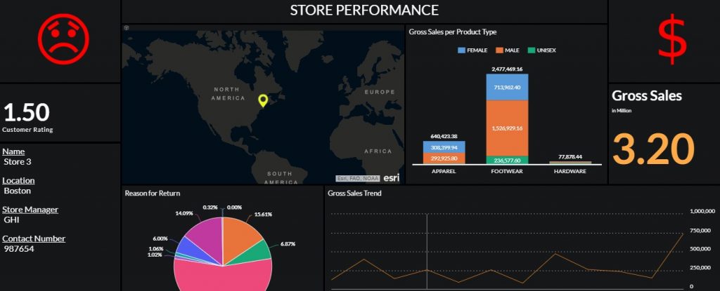
Step-7: Select Store 3 in filter. Story should depict Disappointed smiley with Red color as customer rating is 1.5
We have made use of graphical argument ‘PCH’ for depicting Smiley in our story.
Similarly, we can apply conditional formatting to other symbols/shapes which are supported by PCH.
For demo, we will apply conditional formatting to $ symbol. The $ symbol should appear Green if Gross Sales is greater than 5 million. For other cases, it should appear Red.
Step-8: We will utilize following script for new R visualization:
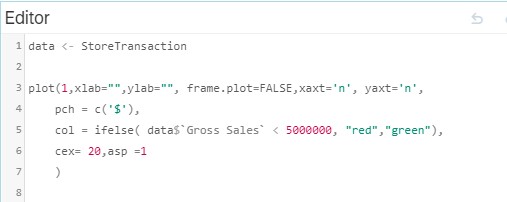
data <- StoreTransaction

plot(1,xlab="",ylab="", frame.plot=FALSE,xaxt='n', yaxt='n',
    pch = c('$'),
    col = ifelse( data$`Gross Sales` < 5000000, "red","green"),
    cex= 20,asp =1
)Step-9: Select Store 1 in filter. Story should depict $ symbol with Green color as Gross Sales is 11.23 Million
Step-10: Select Store 3 in filter. Story should depict $ symbol with Red color as Gross Sales is 3.2 Million


