Introduction
Have you ever wondered why it is important to learn CSS3 as a part of learning UI5 application development? Well, a simple answer can be to add styles in our application. Although true, this answer will barely explain the real power of beautification the CSS3 possesses. Let’s explore adding styles to our UI5 application and making it react to different screen sized devices through Media Queries.
Technical Environment
SAP Web IDE for UI5 Application Development.
Procedure
Step 1:
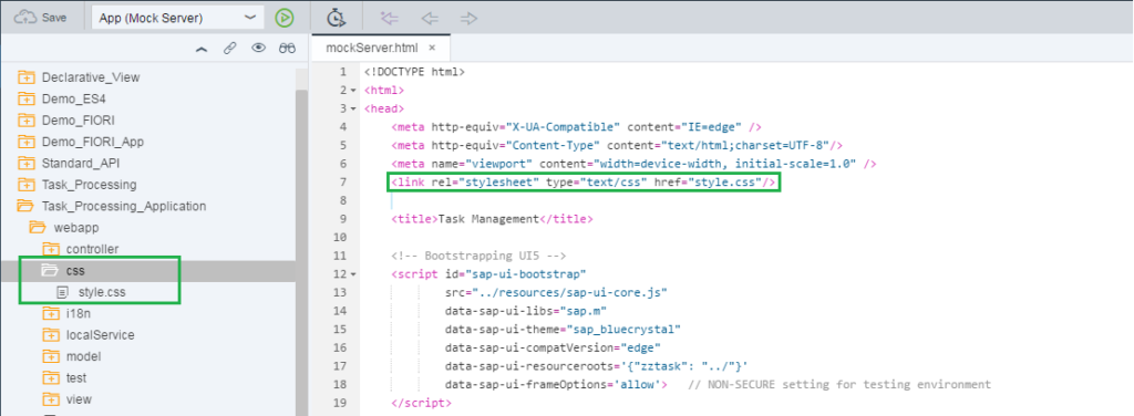
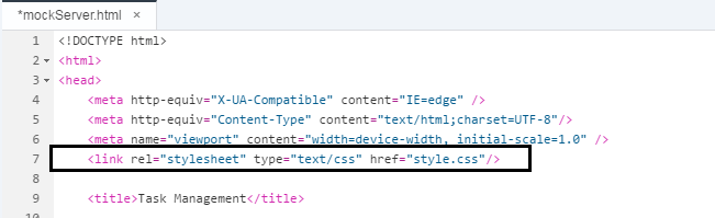
Create a UI5 application using the templates available. Since we have seen multiple examples of creating applications using templates, I am sure you can quickly create your own application with required data. (in case you have issue, let us know, we will put something on how to create app using templates). Note, once a master-details application is built, unlike UI5 application template, in Webapps folder there exists no CSS file to add styles. The first step to adding our own style should be to add a folder under the Webapps and naming it as CSS. Certainly, this CSS folder is going to hold our stylesheets. Interested readers can ask, can’t we add styles directly to the HTML files? The answer is an emphatic YES but adding internal styles make the HTML clumsy and unnecessarily lengthy. To build our applications properly modularized, it is always recommended that you create an external CSS file and link it to the respective pages.
Step 2:
Now create a CSS3 file by right clicking on CSS folder and selecting New ->File. You must add the file extension as .css(i.e. if your file name is “styles” then you should write-“styles.css”).
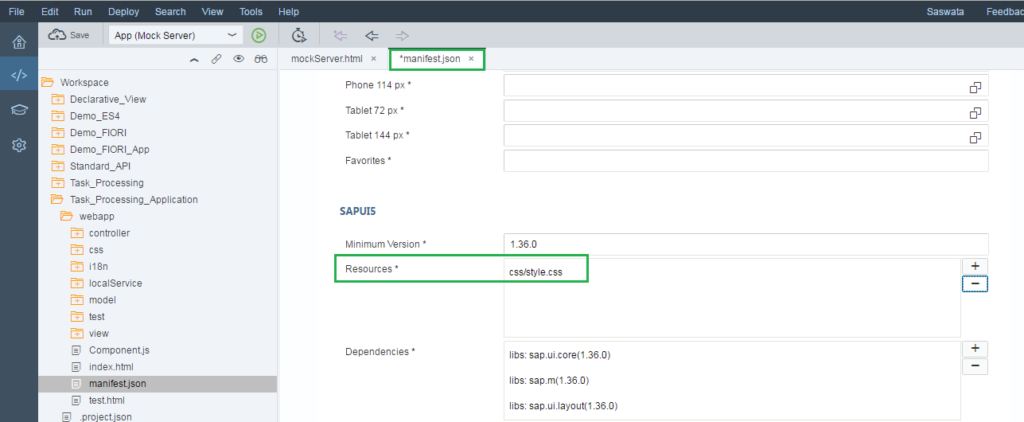
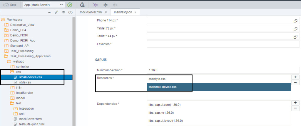
Remember, this CSS file is treated as an external resource to the application which needs to be additionally loaded at the time of rendering. So we need to add the CSS file path as a Resource section of the manifest.json file.
Step 3:
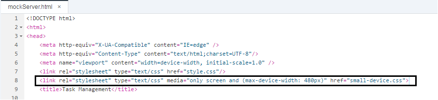
Now that your file for styles is ready, you must link it to the HTML pages so that those get applied at the time of rendering the application in the browser. To establish the link between HTML and css3 the following tag needs to be declared in the header section of the concerned HTML file.
Step 4:
Before writing the actual logic of CSS3 let’s discuss the ways you can apply CSS3 in the SAPUI5 application.
Step 5:
Out of the 3 methods explained in the article, we will take the last approach to apply CSS3. It is certainly understandable that we cannot go with the first two approaches since we have Master-Detail architecture in our application and our pages are designed as views. Interestingly enough, sapui5 have standard CSS library documents which get loaded at the time of rendering the application. Those govern the default styles we see at any application created. Now for our customization, we need to overload the standard style classes. For our esteemed readers, I found a few classes which are extensively used for customizing application appearance. Some basic changes have been introduced in the classes to change the look and feel of the application.
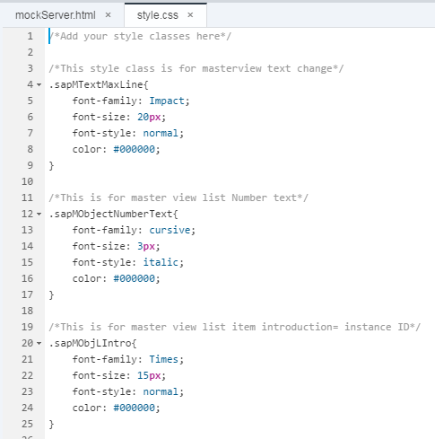
The entire “Style” CSS file.
Add your style classes here
This style class is for masterview text change
.sapMTextMaxLine{
font-family: Impact;
font-size: 20px;
font-style: normal;
color: #000000;
}
/This is for master view list Number text/
.sapMObjectNumberText{
font-family: cursive;
font-size: 3px;
font-style: italic;
color: #000000;
}
This is for master view list item introduction= instance ID
.sapMObjLIntro{
font-family: Times;
font-size: 15px;
font-style: normal;
color: #000000;
}
This style class is for master view panel background color change
.sapMSplitContainerMaster{
box-sizing: border-box;
background-color: #bfbfbf;
width: 320px;
float: left;
left: 0;
}
This is for Master View List Background
.sapMListBGSolid .sapMLIB{
background: #ffffff;
}
.sapMLIB .sapMObjLItem{
padding: 10rem;
}
This is for the Master view list individual item bottom border
.sapMLIB{
border-bottom: 1px solid #cce6ff;
border-top: 1px solid #cce6ff;
font-family: cursive;
color: #000000;
}
This is for the Master view list item display
.sapMObjLListModeDiv{
display: flex;
-webkit-box-orient: horizontal;
-moz-box-orient: horizontal;
-ms-box-orient: horizontal;
-webkit-box-align: center;
-moz-box-align: center;
-ms-box-align: center;
flex-direction: row;
align-items: stretch;
}
This is for hover action on any Master View list item
.sapMLIBHoverable:hover{
background-color: #d9edf5;
}
This is for after selecting an item on any Master list item
.sapMLIBFocusable:focus {
outline: 5px solid #d9edf5;
outline-offset: -1px;
background-color: #d9edf5;
}
– This section is for Detail view styling –
/This is for overall background color/
.sapMSplitContainerBG {
background-color: #cccccc;
}
This is for the items header
.sapMBarChild{
font-family: Impact;
font-size: 16px;
}
This is for the item ID and Instance ID
.sapMObjectIdentifier{
font-family: Times;
font-style: italic;
}
This is used for item level number unit=Createdby
.sapMObjectNumberUnit{
font-family: inherit;
font-size: 13px;
}
This is for item text like ID and Instance
.sapMText{
display: inline-block;
box-sizing: border-box;
white-space: pre-line;
word-wrap: break-word;
font-family: Arial,Helvetica,Times;
cursor: text;
font-size: 1.5rem;
line-height: normal;
color: #000000;
}
Step 6:
Till now we have been working with only one CSS file (style.css) and have been completely indifferent about the device specific customization. What if we want our application to look differently in mobile/tablet than that it appears in desktop? Here comes the concept of Media Queries of CSS3. Media queries enable the responsiveness of the application design. To add media queries separately we need to have one more file (can be done in a single file, but for better understanding, we will separate). Also, don’t forget to add this as a separate Resource file to your application.
The entire “small-device” Stylesheet.
This is for device specific usage
@media only screen and (max-width: 480px), only screen and (max-device-width: 480px) {
This is for Master View List Background
.sapMListBGSolid .sapMLIB{
background: #668099;
}
This style class is for masterview text change
.sapMTextMaxLine{
font-family: Impact;
font-size: 20px;
font-style: normal;
color: #000000;
}
This style class is for masterview text TitleName change
.sapMTextMaxLine{
font-family: Impact;
font-size: 20px;
font-style: normal;
color: #000000;
}
This is for master view list item introduction= instance ID
.sapMObjLIntro{
font-family: Times;
font-size: 15px;
font-style: normal;
color: #000000;
}
This is for master view list Number text
.sapMObjectNumberText{
font-family: cursive;
font-size: 3px;
font-style: italic;
color: #000000;
}
}
Styles mentioned in this stylesheet should get triggered when the screen size reaches 480px. By the screen size, you can specify your own customization for device specific appearance.
Step 7:
Now run your application with mock data and change the device dimension to experience the power of CSS3.
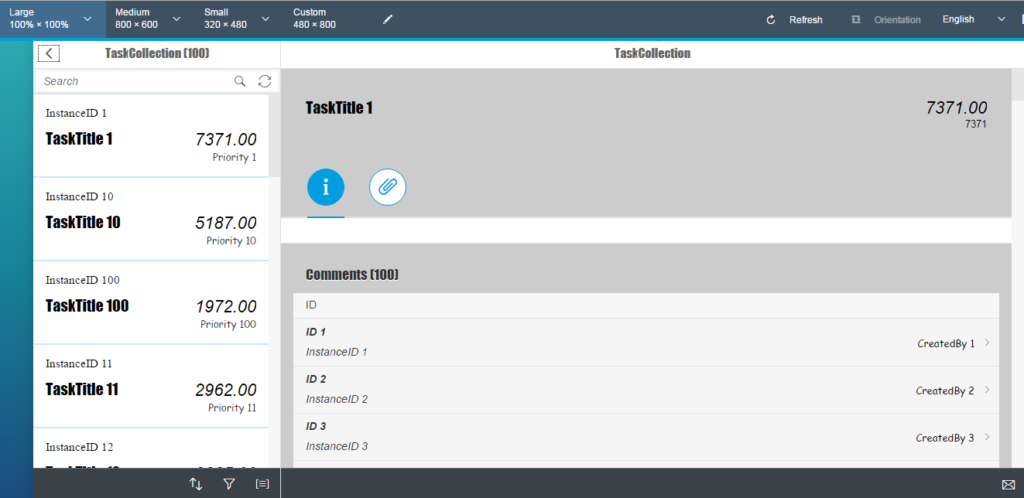
Desktop View

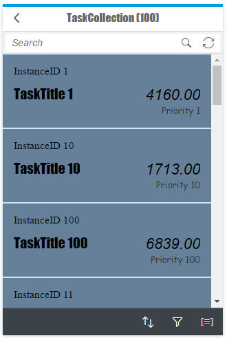
Small Device View(when device width reaches to 480px).
Did you notice, our app is responsive enough to adapt the layout as per the device size? Since our SAPUI5 app is expected to work across devices, we should take special care to take advantage of the media queries and provide exhilarating experience to our end users.


