Why do we need that?
Since performance analysis for SAP Analytics Cloud needed third party tools like the google chrome developer tools, expert knowledge and of course time. Now we collect the performance statistics for you and store them in an internal SAP Hana view. You don’t need to go through the network traffic, check request by request and map it to the widgets and backend systems. This is now done automatically.
When do I get it?
With Wave 2021.02 and 2021.Q1 QRC Release the Analysis Application called Performance Analysis Tool will be released.
Where can I get it?
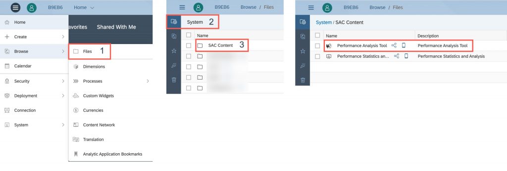
It will be deployed per default into your system folder directory into the SAC Content folder. You don‘t need to deploy it from the Analytics Content Network. Everything will be available out of the box for your convenience. This system folder has already been introduced with Wave 2020.14 and 2020.Q3 QRC.
The SAC Content already contains the following Analytic Models:
- SAC_STATISTICS_MDS_QUERY_PERF (Backend Statistics)
- SAC_USER_FRIENDLY_PERF_ACTION (Frontend Statistics)
- SAC_PERFORMANCE_E2E (Network Statistics and now Single User Executions)
They aim to give you insights into Backend, Network and Frontend related Statistics.
This part of the Performance Content helps you to analyze a single Story or Analytic Application run. The Performance Analysis Tool is built on top of the Analytic Model SAC_PERFORMANCE_E2E which has already been deployed.
How can I use it?
Once you run the Analytic Application and the Performance Analysis Tool starts you will see a search bar. This search bar has a default filter for the current day, but can be adjusted to your needs.
To further narrow the search you can also set User and Resource. Resource can either be a Story or an Analytic Application.

What’s in it?
Overview and Filter Bar
Once you enter the analysis part of the application you will see an overview of the Story or Analytic Application, you are about to analyse. But before we go into more detail of the single sections of this overview, let’s have a look at the top of the page. There is the option to go back to the start or selection screen where you can select another execution for analysis or change the filter criteria to update the selection. As it is case dependent whether you want to see the analysis in seconds or milliseconds we provide the opportunity to switch between the two formats at the top right corner of the page.

Some of the widgets on the overview section can also be used to filter the tables and charts below on the same page. This overview can be divided into five sections.
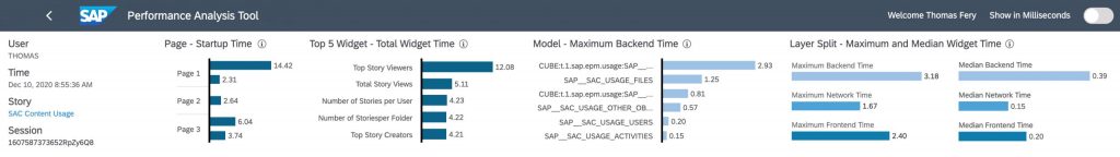
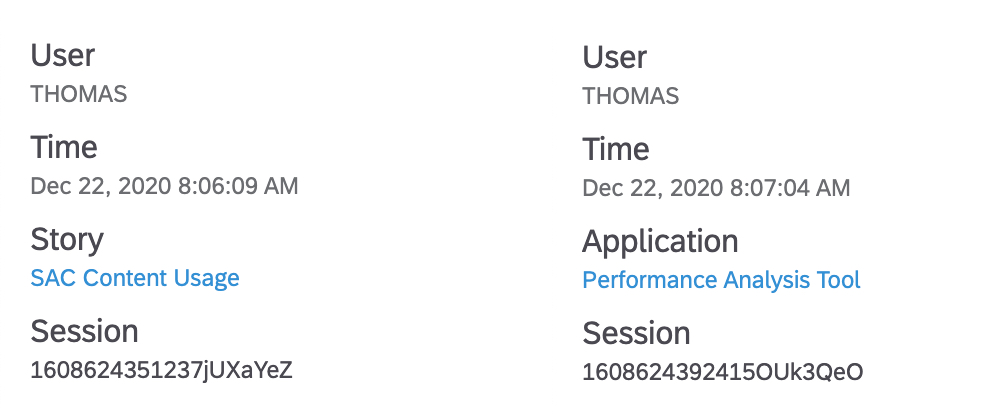
The first of them are details of the user and opened resource. We have information on the user, the timestamp, the Story or Analytic Application and the session ID. The combination of resource ID and session ID is unique. Further we have the opportunity to open the investigated resource directly from the Performance Analysis Tool. This might be helpful to understand the design, structure and complexity.
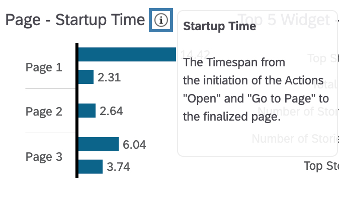
Next to this section we have information of the single pages that were part of the workflow that we are analysing. For each page that has been used we see the startup time. This is the time from the initiation of the action like open story or go to page until the last widget on the page has been fully rendered. Hover over the bars shows action start time and action for the page. If a page has been visited n times it will appear n times like here Page 1 and Page 3.
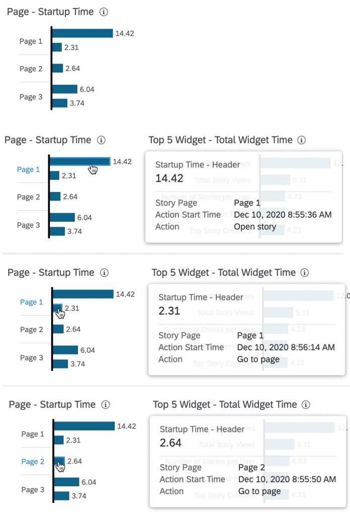
Note: The Widget can be used to filter the three tables and four charts below.
Third the Top 5 Widgets are listed. These widgets are resource wide across all visited pages. The times shown are the sum of the single processing times of the widget, the total processing time. This means if a widget has been loaded more than once, because a page has been visited multiple times or filter criteria have been changed, they sum up.
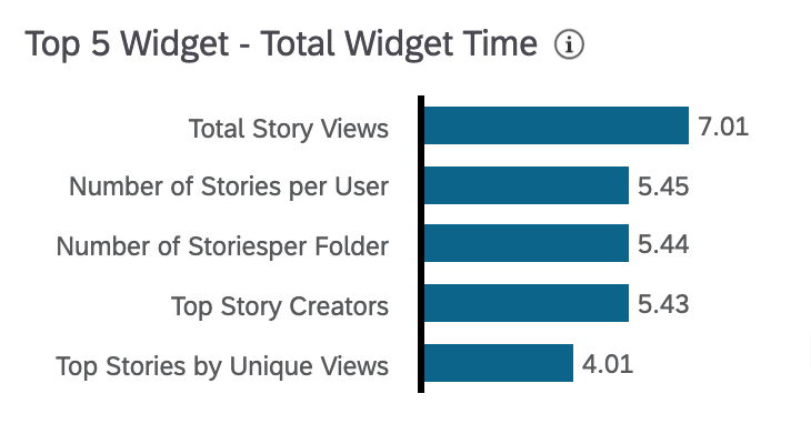
Note: The Widget can be used to filter the three tables and four charts below.
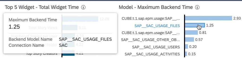
Next to the Top 5 Widgets we see all models that were actively used during the execution and their maximum runtime in the backend system. Only their single maximum value is shown here.
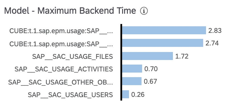
Hover over the models show the connection that is being used by the model.
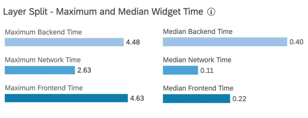
The last section in the Header is the the Runtime Distribution per Processing Layer. This section contains two widgets that allow you to compare the maximum times per processing layer with the median value of the respective layer.
Help and Information of each Widget
You might have noticed that each of the widgets has an information icon added. This icon pops up a short explanation for the widget and used measure.
Processing Information
We provide you three table views. The Runtime Distribution, the Page Load Time and the Widget Drilldown.
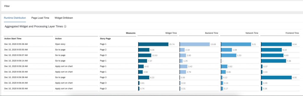
Runtime Distribution
The Runtime Distribution which can be seen in the picture below lists the Action Start Time, Action and Page. We decided to show the total processing time per per action. So please don’t confuse this total processing time with the end to end time of the action. These are the aggregated values for each widget that has been triggered by the specific action. Also the times per layer are aggregations over all widgets triggered by the action. It gives an idea of the actions total processing time and thus, impact per layer.
Page Load Time
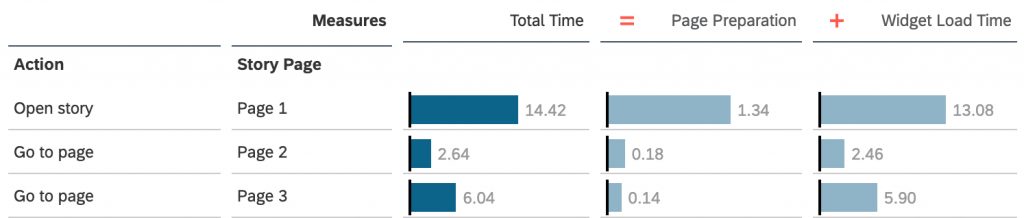
The Page Load Time shows the true end to end time per action. It is structured similar to the Runtime Distribution but uses different measures and no aggregation. We show the total time per action. This is the elapsed time from initiating an action until the last widget on the page has been rendered. This total time can be split into page preparation and widget load time.
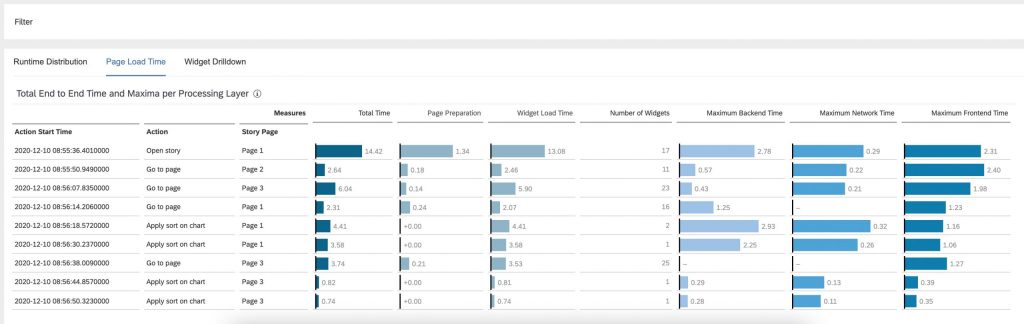
The page preparation is the time from the action start timestamp until the first widget starts loading. The widget load time is the the time from the start of the first widget until the last widget has finished rendering. The sum of both is the total time or the end to end time.
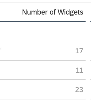
To get an idea of the complexity of the action or page we show the number of widgets per action or page.
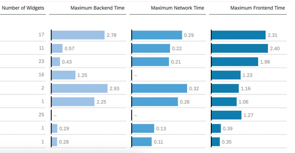
This view is rounded off with the maximum values for each processing layer.
This means on the one hand we see that in this case for Open Story on Page 1 one of our 17 widgets took 2.78s in the backend system, the same or another one took 0.29s in the network and the same or another one took 2,31s in the frontend.
On the other hand we can directly detect actions that had no backend interaction and have only been processed in SAP Analytics Cloud.
Widget Drilldown and Filter Bar
The Widget Drilldown drills into information on single widget level per action, model or page. This is where the filter bar above the three views gets helpful. We see always our current filter state, which applies to all views and the charts that are below the views. The filter bar can be used to remove filters. They are set via the overview section or selections within the table views. In this example I set a filter on Page 1 and the Open Story action.
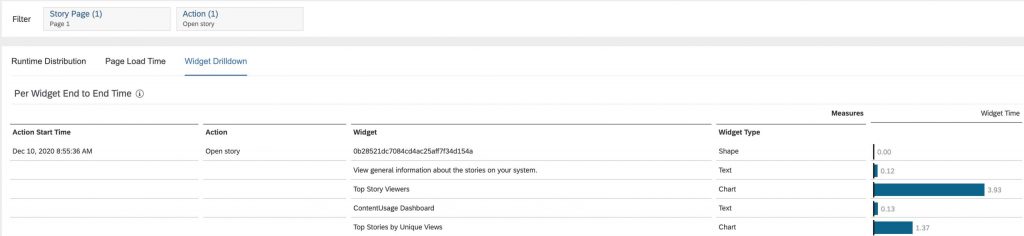
We get now a complete list of all widgets that have been rendered on Page 1 for Open Story like widget name, widget type and end to end time per widget.
But there is even more information for each widget to analyse in the widget details.
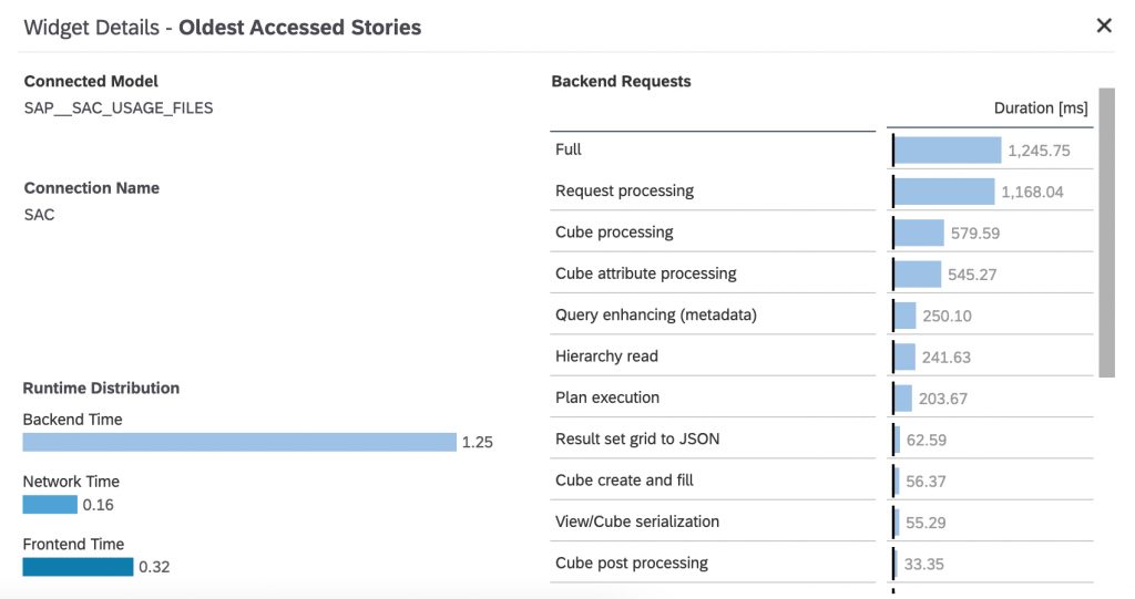
Widget Details
Once an entry in the Widget Drilldown view has been selected, another filter on this widget is being set and widget specific details slide into the view.
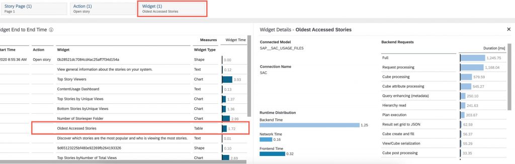
These Widget Details contain information of the Model that is used by the selected widget, the connection that is used by the model, the runtime distribution for the widget and the full backend requests.
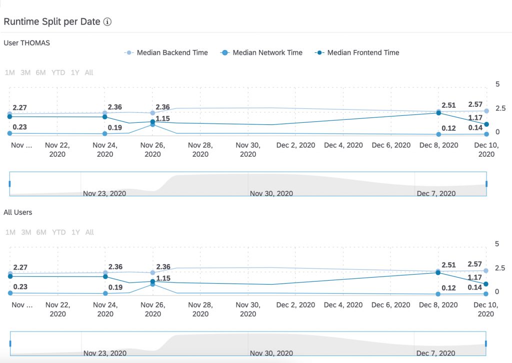
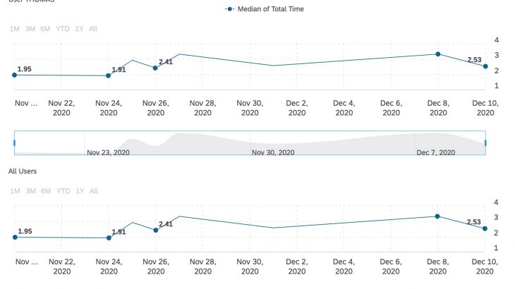
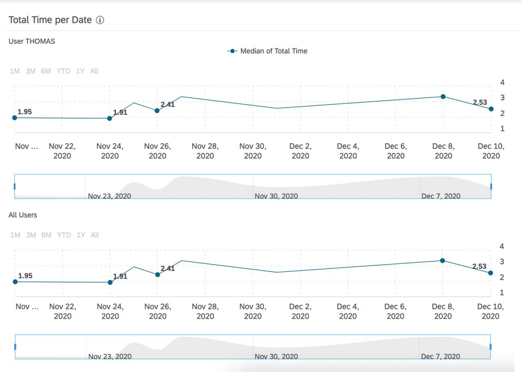
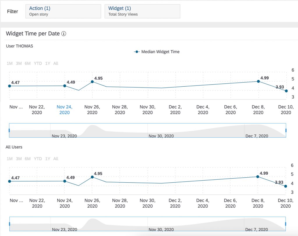
Time Series Charts
The last part of the Performance Analysis Tool are the time series charts. They allow you to compare the execution times of a single user to the user community. This can be done on page level as well as on widget level. The filter mechanism is the same as described in the Widget Drilldown and Filter Bar Chapter. There are two groups of each two time series charts. The charts on the left focus on median runtimes whereas the charts on the right visualise the distribution of the runtimes per layer.
Total Time per Date and Widget Time per Date
Once a filter on widget level has been applied, the charts measures and titles change form Median of Total Time and Total Time per Date to Widget Time per Date and Median Widget Time.
Runtime Distribution per Date
The chart group on the right follows the same logic. Once a widget level filter has been applied, they date up and reflect the runtime distribution for the single widget. The titles and measures stay the same.