GENERAL CONSIDERATIONS
Dealing with Stories is at the core of any planning process. When it comes to data entry, all the way to advanced analytics and comparison reports, every input and output is to be found under this module.
One must however consider that the way Stories are leveraged in a planning context is fairly different in nature to a standard Business Intelligence use case. As an example, planning users rely intensively on the table (or grid) component whereas BI visualizations often use more graphical objects, i.e. charts.
Moreover, even basic concepts such as filters can be used with a different intention in planning versus BI. Looking at the Date (or Time) dimension for example, when filtering on a member, a BI user mostly seeks at restricting the displayed data to that time member only. With Planning, Time is often considered as a reference point and filtering on Time means pointing to that particular period, but also, almost systematically, making a comparison with previous periods and displaying future values such as forecast.
As a result, this document will not go through all the numerous features and functions available in stories in every context, which could be quite endless, but instead will focus on some key aspects for the planning community as they have a specific consumption of SAP Analytics Cloud Stories.
ASYMMETRIC REPORTS
In a nutshell, building an asymmetric report consists of – in different columns – nesting different combinations of members from 2 or more dimensions. As an example, one may define a report displaying Actuals for the current month, and then Forecast data for the next 3 months.
There are 3 options to create such a report:
- Using the Exclude function in a table
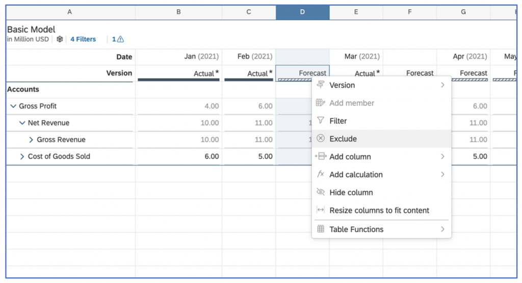
This will result in removing the excluded column from the table, and also from the query itself. The performance of such a design is therefore optimized.
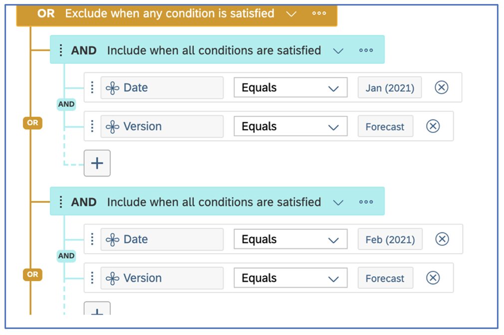
Behind the scenes, an Advanced Filter is being created. It is editable going to the Design panel.
NB: Be aware that the ‘Exclude’ function does not operate when the ‘Unbooked data’ toggle is on. In this case, you should use the ‘Hide’ function instead.
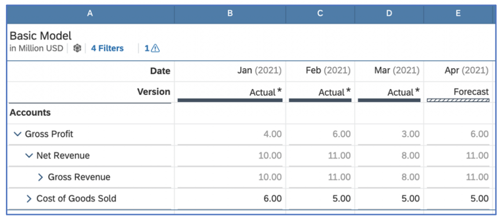
The table will ultimately only query and display the desired columns:
- Using the Hide function in a table
This option is to some extent similar to using the Exclude function. However, it has 2 major differences: - Even though a Hidden column is not visible in a table, it will still generate a data query behind the scenes. It is therefore not as efficient as the Exclude function.
- Its main benefit is that hiding a column will also work in the case of tables using the ‘Unbooked data’ toggle.
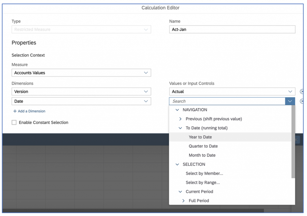
- Using Cross Calculations – Restricted Measure
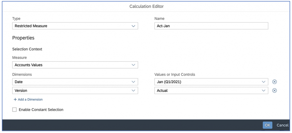
Using cross calculations allow to precisely control the content of each column. Besides, they also allow some flexible options, e.g. for time management such as year to date calculations and so on:
This approach brings up a lot of advanced functionalities. However, creating cross-calculations requires more steps and is more time consuming compared to using the Exclude or Hide functions.
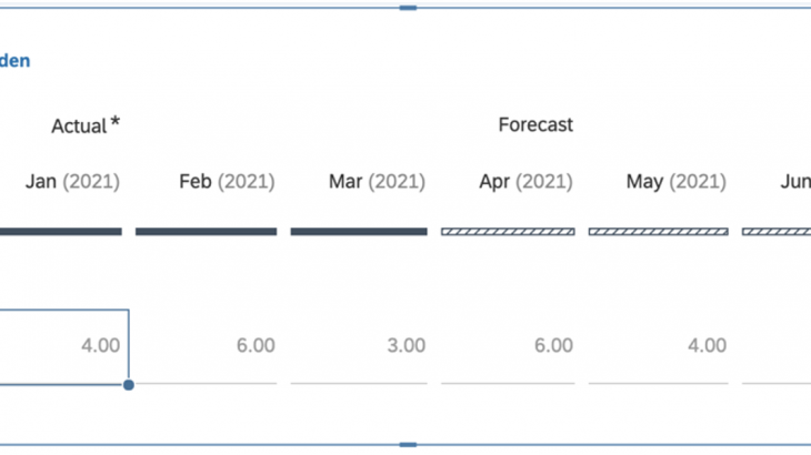
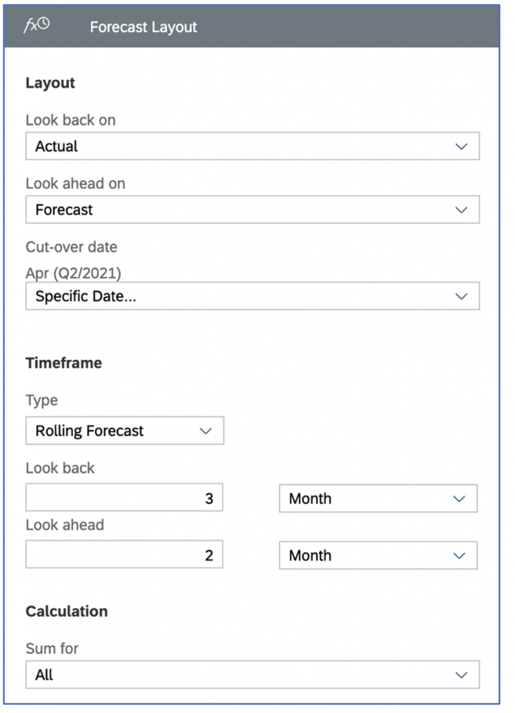
FORECAST LAYOUT
Another approach to building asymmetric reports – under specific scenarios – is to leverage a ‘forecast layout’. This is a built-in piece of functionality that allows a story designer to define multiple ranges where version and time will be independently configured. See figure below:
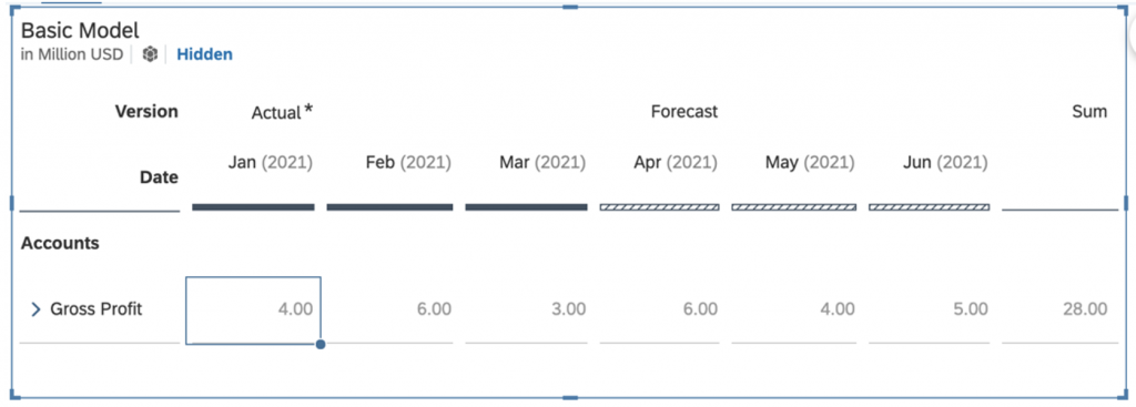
The resulting table will show Actuals and Forecast side by side, with an aggregation spanning across both versions:
If needed, additional versions can be added for comparison purpose.
YEAR TO DATE CALCULATION / YEAR OVER YEAR COMPARISON
Building a comparison report between 2 consecutive years or across 2 versions require to know a couple of advanced options when it comes to building stories and the table object within stories.
These elements are:
- Displaying cumulative data
- Making table calculations
- Creating a variance chart (optional)
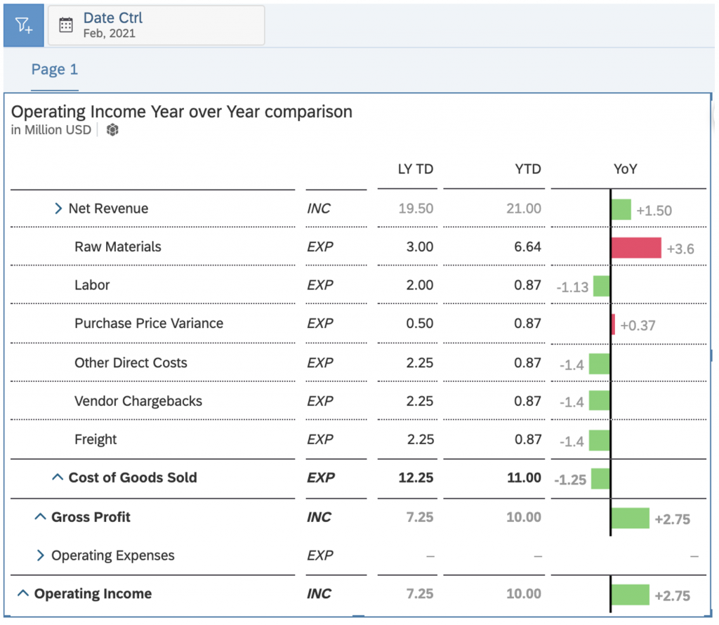
All of the above require to referring to a specific point in time, which will be the period until all P&L figures are aggregated up, as well as the offset pointing to the same individual periods from the previous year.
Snapshot of a typical comparison report (cumulative data at the end of February):
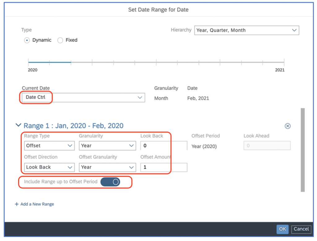
Step1: Building the YTD columns
YTD are computed through cross-calculations. As a result, 2 cross-calculations will be created here. 2 key thing to note is that they have to be created in the form of ranges in order to work, and secondly, they should point to the same date in the form of an Input Control.
Last Year To Date (LY TD)
i. Add a new Cross Calculation named ‘LY TD’
ii. Select a measure e.g. Default Currency (USD)
iii. As values, Select to create a new Input Control, e.g. ‘Date Ctrl’
iv. As values for this Input Control, select the ‘Range’ option
v. Set the Range as below. Do not forget to toggle the option ‘Include Range Up to Offset Period’
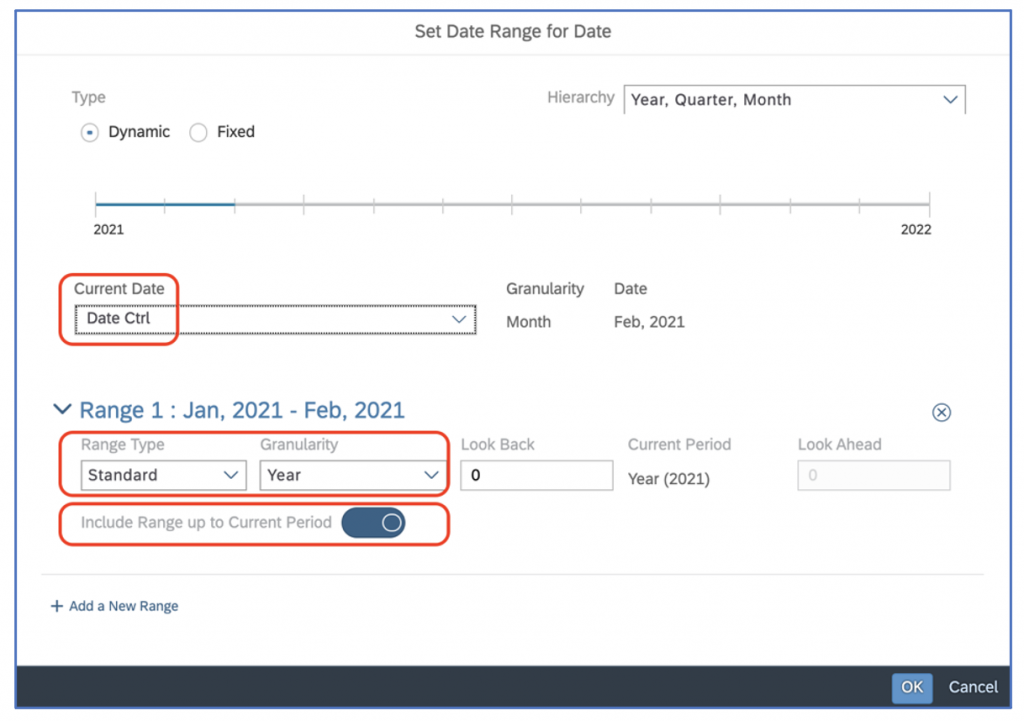
Year to Date (YTD)
i. Add a new Cross Calculation named ‘YTD’
ii. Select a measure e.g. Default Currency (USD)
iii. As values, Select ‘SELECTION à Select by Range…’
iv. Set the Range as below. Do not forget to toggle the option ‘Include Range Up to Current Period’.
Step2: Making table calculations to calculate the year over year variance
- Select the YTD column first
- Select then the LY TD column
- Right click on the selected area
- From the context menu, select Add Column (Single)
- Name the column and check that the formula has been applied correctly (YTD minus LY TD, not the opposite)
Step3: Turn the variance calculation into a chart
- Right-click the column header and select ‘In-cell Chart’
- In the Designer panel, turn this chart into a type ‘Variance’ (bar or pin)
- In the table, select the variance chart cells for all EXP (expense type) accounts
- In the Styling panel, click the option ‘Invert colors for Current Selection’, so that increasing expenses are marked as red versus green.
HANDLING CURRENCIES / CURRENCY VARIANCE CALCULATIONS
Global Corporations require to analyze profitability and the overall performance, regardless of currency rates variations.
As an example, revenue can be above budget, but only for the reason that exchange rates for international entities contributed to this overachievement. In other words, an international company may have achieved budget numbers, and then currency changes improved the performance further in Group Currency.
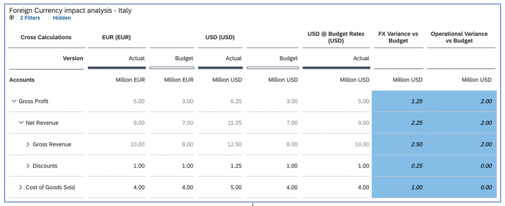
In the illustration above, discounts are identical for Actuals and Budget in EUROS, for the Italian sub. However, in Group Currency (USD), there is a 0.25 difference, which is due to FX differences only.
Let’s review the key steps to build the columns of such a report:
Step1: Add cross-calculations to the columns
Step2: Create 3 cross calculations
EUR / USD / USD @ Budget Rates
- All 3 calculations are ‘Currency Conversion’ type
- EUR and USD have no particular setting, other than pointing to a currency
- USD at Budget Rates is set as illustrated below:
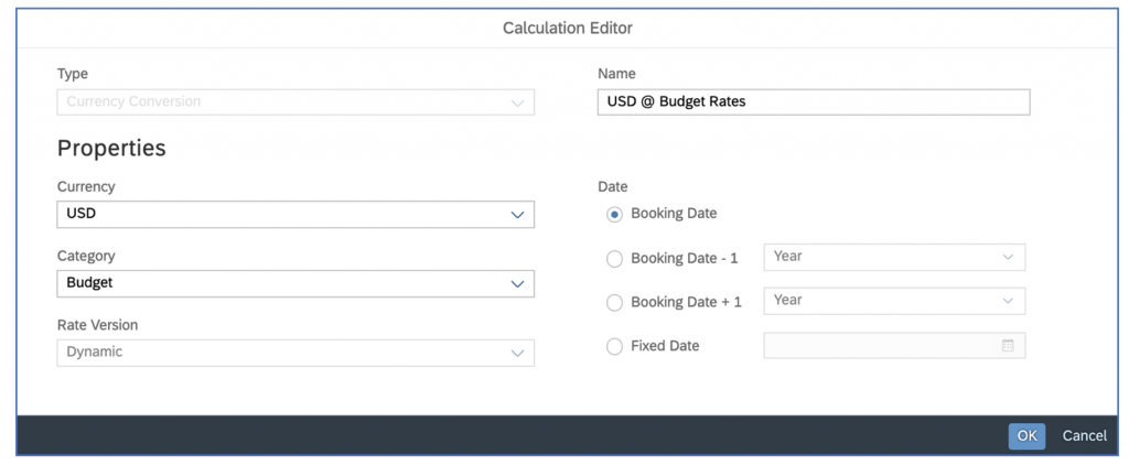
Note: you can also use the screen above to apply different periods’ rates to data (e.g. Actuals at Last Year rates) in order to calculate additional currency variances.
Step 4: Hide the unnecessary combinations of Version x cross calculations (eg. Budget at Budget rates)
Step 5: Add the calculated columns
- FX Variance vs Budget : ‘USD’ – ‘USD @ Budget Rates’
- Operational Variance : ‘USD Actual’ – ‘USD Budget’ – ‘FX Variance vs Budget’


