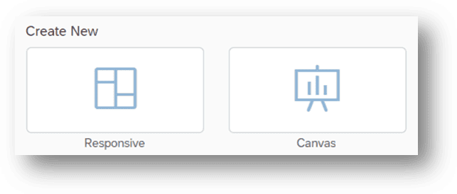
In the second quarter of 2022, SAP Analytics Cloud (SAC) introduced the Optimized Design Experience, marking a significant advancement in data visualization capabilities. This update presents users with two distinct layouts tailored to meet diverse analytical needs:
Canvas Layout: Provides users with precise control over the placement and size of dashboard elements.
Responsive Layout: Designed to adapt seamlessly to various screen sizes and resolutions, ensuring optimal viewing experiences across different devices.
In this blog, we’ll delve into some of the intriguing new features available within these two Page Types. These features will elevate your dashboards, providing enhanced flexibility and usability for your analytics endeavors.
Canvas Layout
Canvas pages are ideal in providing meticulous control over the size and positioning of objects, making them perfect for projects requiring consistency across various devices and screen resolutions.
When developing an intricate dashboard with a variety of charts, indicators, and interactive elements, along with overlapping components that go beyond standard charts and tables, opting for a canvas layout ensures precise pixel alignment and meticulous attention to detail.

SAP Analytics Cloud Canvas layout
Sizing And Positioning in Canvas Layout
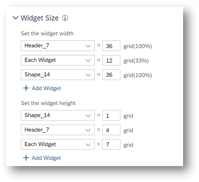
Now, with the Optimized Design Layout, you have the option to make charts responsive by switching their size measurement from pixels to percentages. Yet, it is worth noting that tweaking each chart’s size and placement entails manual work. The Canvas layout is best suited for specialized needs where its benefits outweigh the extra effort required.
Let us picture a sleek dashboard in a Responsive page. Widgets and icons adapt well to different devices, but they struggle to stay centered. Though seemingly small, these alignment issues can detract from the dashboard’s professional appearance.

Now envision the same dashboard recreated within the pixel-perfect Canvas page. Every element stays precisely where you positioned it, accurately.

At 100 percent zoom, we can see that the charts are perfectly aligned.

At a zoom level of 60%, it is evident that the widgets are shrinking in size.

This drawback in the Canvas layout highlights its limited adaptability. However, this concern can be overcome by adjusting the Width and Height parameters as percentages. This modification allows charts and widgets to dynamically resize and adapt to different screen sizes, enhancing overall flexibility.
Canvas Layout, concisely:
- Allows pixel-perfect control over object positioning.
- Ideal for creating complex layouts with intricate designs.
- Enables overlaying objects to create visually appealing dashboards.
- Fixed layout ensures consistent appearance across different resolutions.
Responsive Layout
Responsive pages are specifically crafted to adjust seamlessly to diverse screen sizes and resolutions, catering perfectly to dashboards intended for viewing on mobile devices or any other platforms with varying screen dimensions.
When prioritizing accessibility across a range of devices, fostering collaborative development, and future-proofing your design, Responsive layouts come across as the preferred choice. Their innate adaptability and capacity to provide an optimal user experience make them well-suited for most storytelling needs within SAP Analytics Cloud..

Rules configuration in Responsive layout
Responsive rule configuration provides designers with the ability to create dynamic and adaptable layouts tailored to their content. By establishing rules for various devices, designers can manage the positioning, sizing, and visibility of widgets, ensuring a consistent and optimized user experience. This configuration enables content to seamlessly adapt to different screen sizes, ensuring a visually appealing and engaging presentation across desktops, laptops, tablets, and smartphones.
Upon examination, when the device is set to ‘auto’, all widgets and charts appear correctly.

However, upon switching the device setting to ‘iOS Small Tablet’, it becomes evident that the widgets in the highlighted top lane are collapsed and illegible. To address this issue, responsive rules can be implemented to dictate how lanes behave across different devices.

By activating the ‘Responsive Rule Configuration’ within the right panel, designers can specify whether widgets should be ‘Free’ or ‘Auto-Flow’. Additionally, adjustments to the width and height can be made, as necessary. After modifying these dimensions, it can be observed that the widgets are now appropriately placed, ensuring a seamless and optimized viewing experience across various devices.

Responsive Layout, concisely:
- Automatically adjusts the layout based on the screen size and device type.
- Supports responsive rule configuration for controlling element positioning and visibility.
- Provides flexibility in arranging widgets within lanes.
- Widgets are arranged and sized using a flexible grid system that adapts to different screen sizes.
- Set specific rules for how elements adapt to different screen sizes.
- Rendering on mobile devices for mobile-first design
- Built-in scripting support for advanced customization
Canvas Vs. Responsive
| Feature | Canvas Page | Responsive Page |
|---|---|---|
| Layout System | Fixed, with infinite canvas | Flexible, adapts to different screen sizes using lanes |
| Widget Placement | Absolute positioning, pixel-perfect control | Free placement within lanes, some automatic adjustments for responsiveness |
| Alignment | Requires manual alignment for pixel perfection | Automatic alignment within lanes, may not be pixel-perfect on all devices |
| Responsiveness | Not directly responsive, requires manual adaptations for different screen sizes | Automatically adapts to different screen sizes using lanes |
| Strengths | Pixel-perfect control, creative freedom, complex designs, interactive elements | Easy adaptability, single design for all devices, accessibility |
| Weaknesses | Less responsive, requires more design effort | Limited customization, potential for alignment issues on smaller screens |
| Use Cases | Pixel-perfect dashboards, complex layouts, interactive stories, branding-focused designs | Universal accessibility, simple dashboards, frequently accessed reports |
Choosing the right tool for data visualization and analysis
The primary objective of SAC Stories is to craft immersive and visually compelling data narratives. These narratives serve as dashboards or reports, presenting data insights in a concise and engaging manner for effortless comprehension. When it comes to SAP SAC data visualization, selecting between Canvas and Responsive Page hinges on the unique requirements and preferences of your organization.
The challenge for businesses in choosing between Canvas and Responsive Page lies in weighing the trade-offs between precision and adaptability. Canvas offers precise control over layout and positioning, ideal for intricate designs, but requires manual adjustments for different devices. In contrast, Responsive Page ensures adaptability across devices but may sacrifice pixel-perfect alignment and creative freedom. Businesses must assess their priorities, considering factors like design complexity, user experience, and resource availability, to make an informed decision. Here are some factors you should consider while deciding between choosing a canvas or responsive layout:
Design Requirements: Determine the level of precision and control needed for your project. If pixel-perfect alignment and intricate designs are essential, Canvas may be the preferred choice. For projects prioritizing adaptability and accessibility across diverse devices, Responsive layouts are more suitable.
User Experience: Consider the end user’s experience and the devices they are likely to use. If your audience primarily accesses dashboards on mobile devices or tablets, Responsive layouts ensure optimal viewing experiences. However, if consistency in layout and design across different devices is critical, Canvas layouts may be more appropriate.
Collaboration and Future Needs: Evaluate the collaborative nature of your project and the potential for future updates or changes. Responsive layouts facilitate collaborative development and accommodate future changes more seamlessly. Conversely, Canvas layouts offer more creative freedom but may require additional effort to maintain consistency and make updates.
Conclusion
In conclusion, choosing between Canvas and Responsive layouts in SAP Analytics Cloud depends on the project’s specific needs and priorities. While Canvas offers pixel-perfect control and creative freedom, Responsive layouts provide adaptability and accessibility across various devices. Selecting the right layout ensures a harmonious blend of design precision and user experience optimization.


