
Introduction
In an previous blog post we introduced a new explainable AI feature called the Prediction Explanations. This new feature allows you to understand what factors led to a specific prediction (available for classification and regression). We also explained how to display the explanations for a classification in a story.
The focus was specifically on the Strength as a measure of the impact of the influencers on the prediction. The two advantages of the strength are:
- it can be used equally with classification and regression predictive models
- some standard thresholds exist that allows you to interpret the strength qualitatively (using color coding for instance)
But when predicting continuous numerical values using a regression predictive model, one may prefer to measure the impact of the influencer in the same numeric “unit” as the target. If you are predicting an opportunity value in US dollars, you may want to interpret the measure associated to the explanations in US dollars. You may even want to visualize the explanations using a waterfall chart showing the factors that increase or decrease the predicted value.
The contribution is meant for that. A contribution measure is created automatically when the generating the explanations for a regression predictive model.
In this blog post I will show you how to generate the explanations for a regression predictive model and how to display the explanations in a waterfall chart like the one below.
Scenario
We have a list of sales opportunities that are due to be closed before the end of the year and we would like to use the SAP Analytics Cloud predictive capabilities to get an unbiased estimate of the value of these opportunities. For some selected opportunities we would also be interested knowing what factors have increased the predicted value and what factors have lowered it.
We have prepared two datasets that you can download if you want to recreate this example (use CTRL-s to save the files):
- Sales Opportunity.csv: a training dataset that contains some closed past sales opportunities with the associated value in thousands USD (United States Dollar).
- Sales Opportunity Apply.csv: an application dataset with the open sales opportunities that are expected to be closed before the end of the year.
Generate the Predictions and Explanations
First, we need to train a regression predictive model using the Sales Opportunity dataset. Use the settings below.
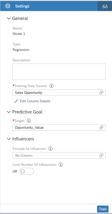
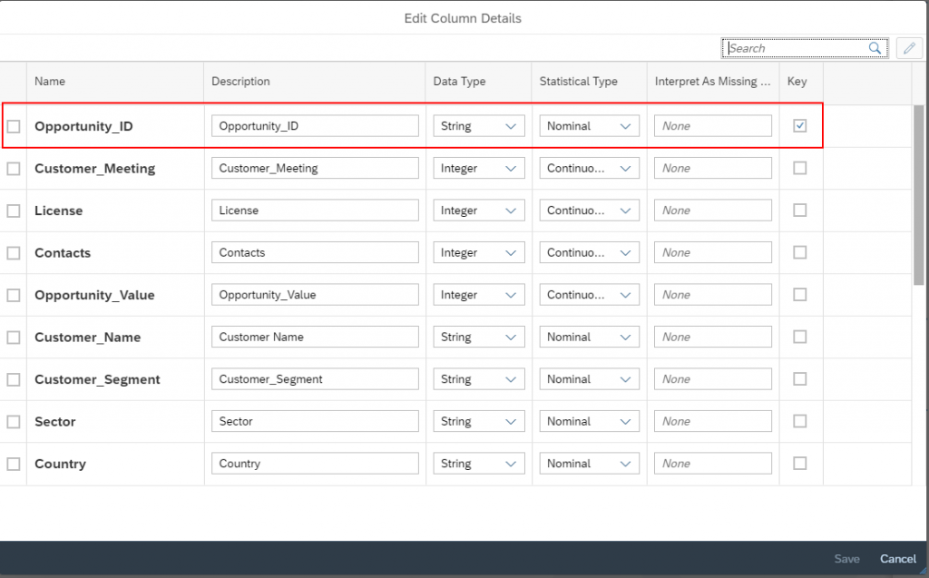
The predictive model needs to know the column that identifies uniquely an opportunity (“the key”). Use the Edit Columns Details link to set the Opportunity_ID column as dataset key.
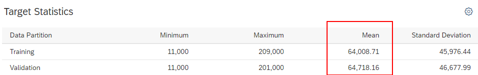
Once the predictive model is trained, we can see in the Overview report a Target Statistics section. Among other statistics I can see that the mean of Opportunity Value column is around 64k USD (the mean is provided by data partition so there are several values). We will talk about this value again later.
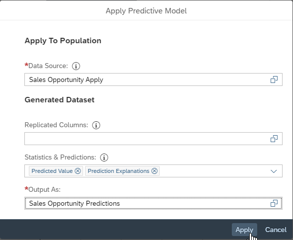
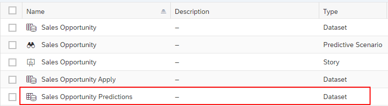
Now, we can apply the model to the currently open opportunities to generate the predictions and explanations into the Sales Opportunity Predictions dataset.
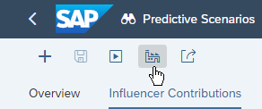
Click the Apply Predictive Model button.
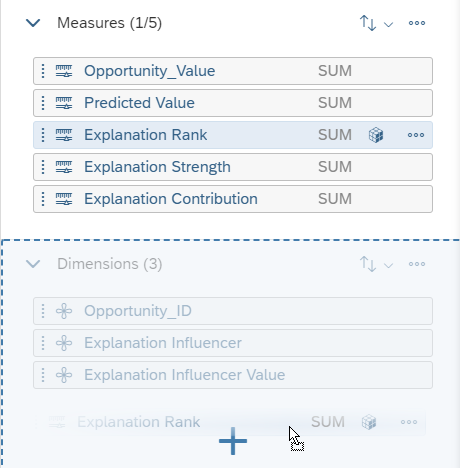
We need to edit the generated dataset. We need to make the column Explanation Rank a dimension (because it contains only numbers it’s created by default as a measure but it’s more convenient as a dimension).
Open the dataset we have just created (click the row that contains the dataset name):
Click the Explanation Rank header to select the column.
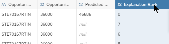
Then, in the right panel, use drag and drop to change the Explanation Rank nature from measure to dimension.
Don’t forget to save this change.
Visualize the Explanations
Setup an Employee Selector
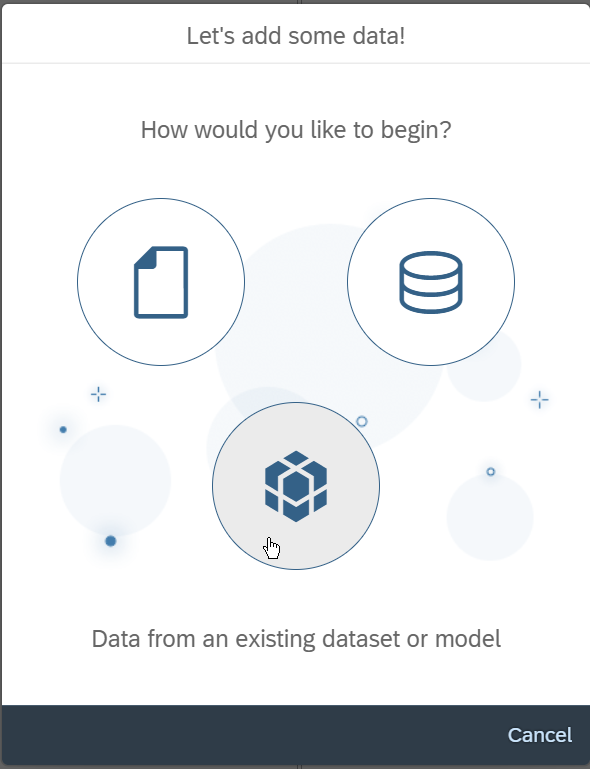
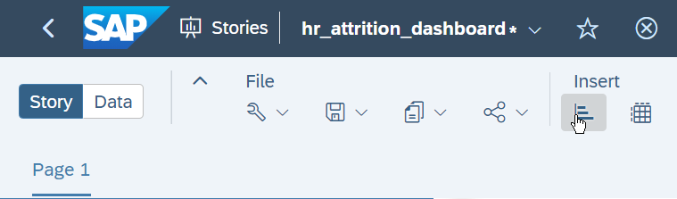
Let’s create a new Story, to visualize the predictions.
In this story we want to see the opportunities with the associated predicted value in a table. This table will allow us to select a specific opportunity and get explanations of the prediction.
Let’s import the dataset where we have generated the predictions (Sales Opportunity Predictions in this example) in the story.
Now let’s add a table.
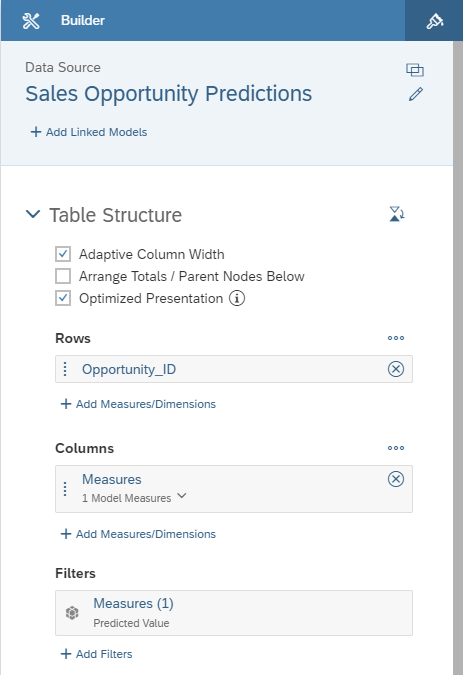
We only need the Predicted Value measure to be selected in the Measures selector.
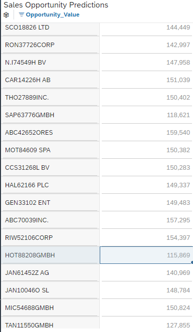
At this stage, you should see a table like the one below.
We want this table to act as an opportunity selector. The way to achieve this in SAP Analytics Cloud is by using the Linked Analysis option.
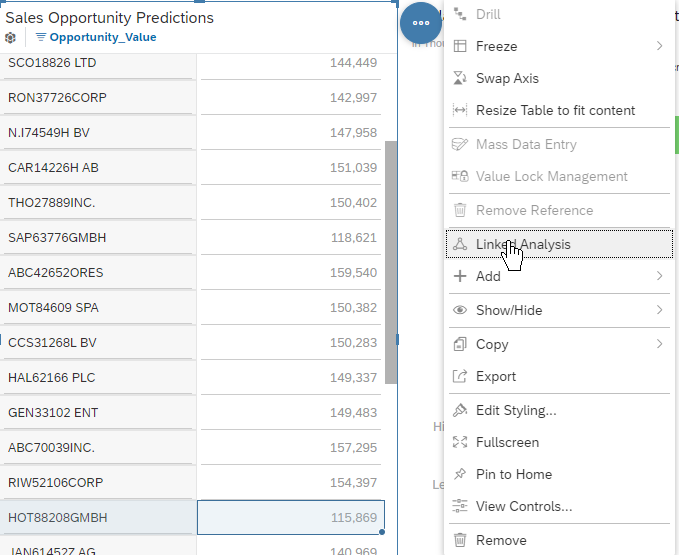
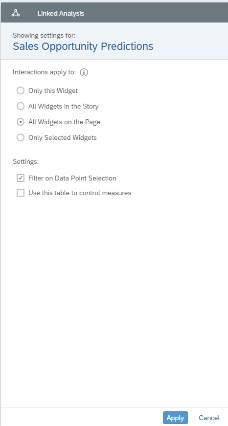
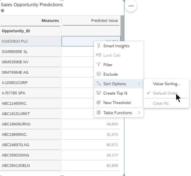
Finally, we will change the table sorting. Right click the Predicted Value column of the table and click Sort Option > Default Order.
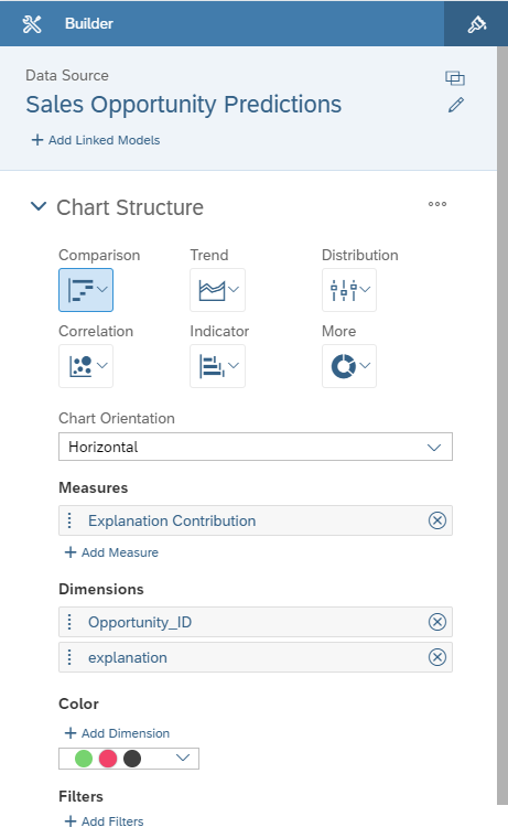
Setup the Waterfall Chart
Insert a new visualization into the story.
Then select Comparison/Waterfall as chart type.
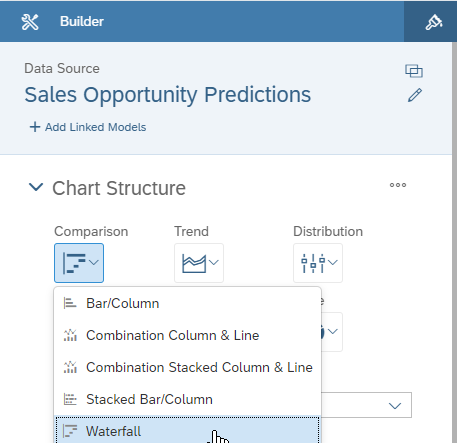
Setup the chart as follows:
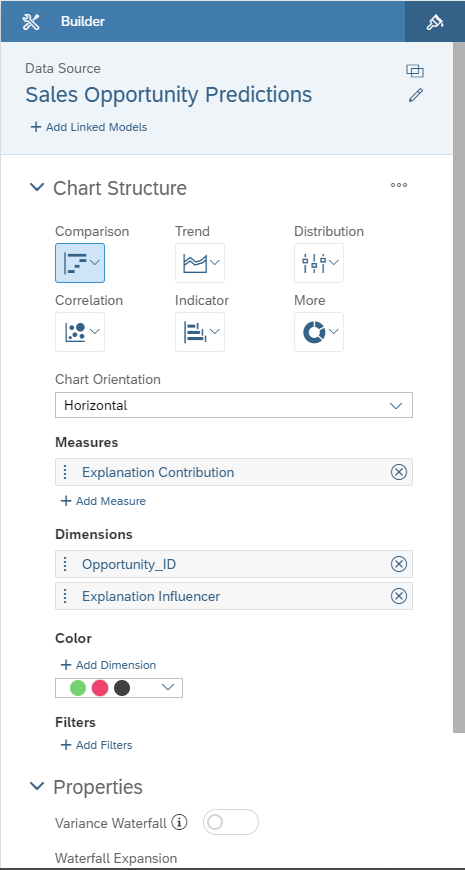
Note that selecting the Opportunity_ID in the Dimensions section is mandatory as it provides the aggregation context for the “total” bar of the waterfall chart (we want the value to be summed by opportunity).
Now select an opportunity in the chart to display the explanations of the prediction.
It’s a good start but we can make it more usable by:
- Making the value associated to the influencer available
- Sorting the bar by decreasing order of importance of the explanation.
This can be achiever thanks to a few simple calculated dimensions.
Before creating the dimensions, be sure that you have changed the nature of the Explanation Rank column from measure to dimension.
First, let’s remove Explanation Influencer from the Dimensions sections of the chart settings.
The rows are ordered by label, so we need to concatenate the rank. To guarantee the rows are properly ordered we need a 0 prefixed two digits representation of the rank (So “1” becomes “01”, “2” becomes “02”…), otherwise 10 would come before 2 for instance.
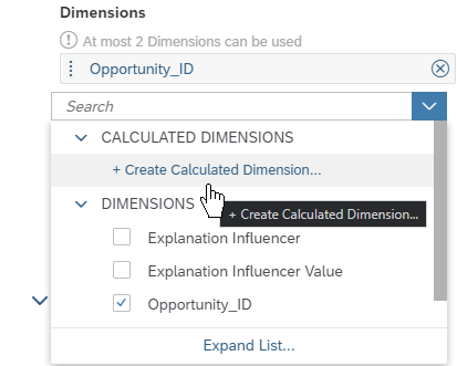
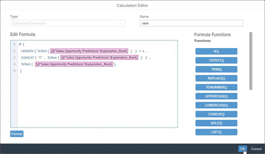
Select Calculated Dimension as type and name the dimension “rank”.
Paste or write the following formula:
IF(
  LENGTH(ToText([d/"Sales Opportunity Predictions":Explanation_Rank]))=1,
  CONCAT("0", ToText([d/"Sales Opportunity Predictions":Explanation_Rank])),
  ToText([d/"Sales Opportunity Predictions":Explanation_Rank])
)
“rank” is just an intermediate calculation to make the formulas simpler, so remove it from the list of dimensions in the waterfall chart settings panel and click Add Dimension/Create Calculated Dimension… again.
Select Calculated Dimension as type and name the dimension “explanation”.
Paste or write the following formula:
CONCAT([d/"rank"].[p/ID],
  CONCAT(" - ",
    CONCAT([d/"Sales Opportunity Predictions":Explanation_Influencer].[p/Explanation_Influencer],
      CONCAT(" = " , [d/"Sales Opportunity Predictions":Explanation_Influencer_Value].[p/Explanation_Influencer_Value])
    )
  )
)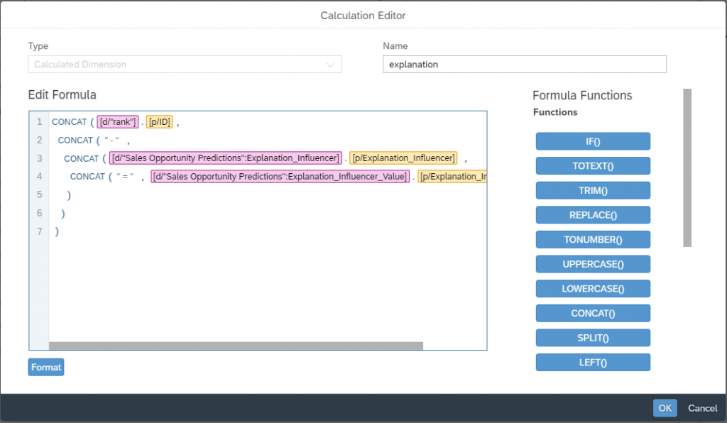
Now the waterfall chart settings should look like below:
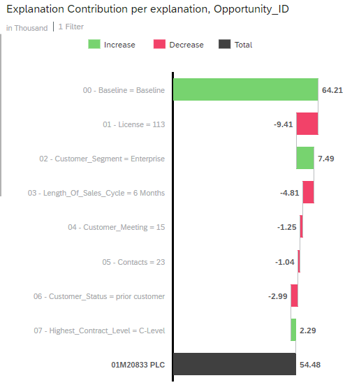
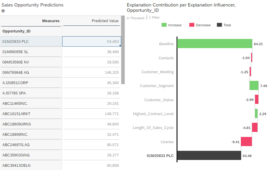
The waterfall chart should look like this if you select the first row in the table:
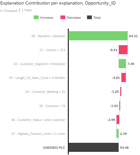
How To Interpret This Chart?
Independently of the use case and dataset you may use, the explanations for a specific prediction will always contain a Baseline generated influencer associated to the rank 0. This is the base value for any prediction. The baseline is simply the average of the target (in our case the average of the opportunity values) as seen in the training dataset.
The other bars of the waterfall chart represent influencers of the dataset and the associated value is an increase or a decrease that can be interpreted in the target unit. We are predicting an amount in thousands USD, so the value of each bar can be interpreted as an increase or a decrease in “thousands USD”.
Using our example above we can say that:
- The average value of an opportunity is 61.24k USD. This is the base for the prediction.
- The influencer with the highest impact is the number of licenses. It decreases the predicted value by 9.41k USD.
- The second most impacting influencer is the costumer segment. The fact that the prospect is in the “enterprise” segment (which in this dataset denotes a medium-sized company) increases the predicted value by 7.49k USD.


