The past few weeks have been straight out of an unpleasant movie. We have witnessed how one microscopic organism, crept out of a seafood market and inch by inch, human by human, charted an unprecedented journey across the globe. In one swift move, nature has thrown down the gauntlet and the only armour we really have, is our own immune system and – information. As it turns out, the information at least is publicly available.
So it is, that in this blog post we will track the illustrious career of this seemingly ubiquitous virus as it goes about redefining the new “normal” of our times. We also attempt to foretell its next move. What we need is a tool that can crawl around the numbers and prod the patterns out to make a reliable prediction. SAP Analytics Cloud lends itself to the task, in what I find to be the easiest and by far the fastest way, to get a predictive forecast up and running. It uses a nifty feature named much humbly and without fanfare as – you guessed it – “Forecast”. Without further ado, let’s roll our sleeves up and dive into this rabbit hole!
Step 1: Get the data
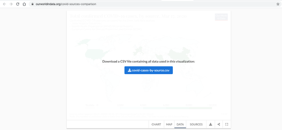
There are three key sources providing regular updates of COVID-19 cases and deaths globally and by country: Johns Hopkins University, the World Health Organization (WHO) and the European Centre for Disease Prevention and Control (ECDC). All 3 sources are summarised pretty well here https://ourworldindata.org/covid-sources-comparison. On this page there are 2 csv files – one for confirmed cases and one for deaths. I use confirmed cases in this blog post, but you may well use the one for deaths and perform the same analysis. Download the csv file to your local machine.
A snippet of the data looks like this.
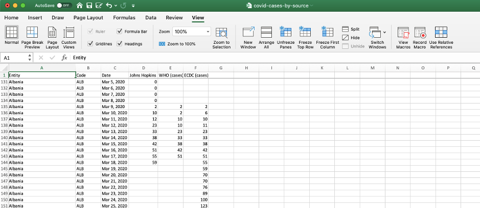
You can see the numbers from all 3 sources, John Hopkins, WHO & ECDC. I will use John Hopkins in this blog post.
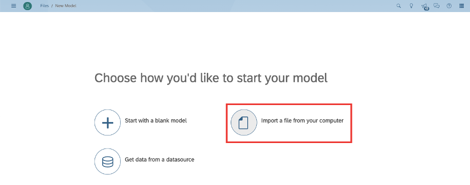
Step 2: Upload the data to SAP Analytics Cloud
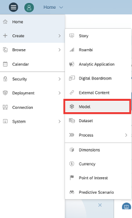
We begin by creating a model.
Our file is on the local system, so the choice is straightforward.
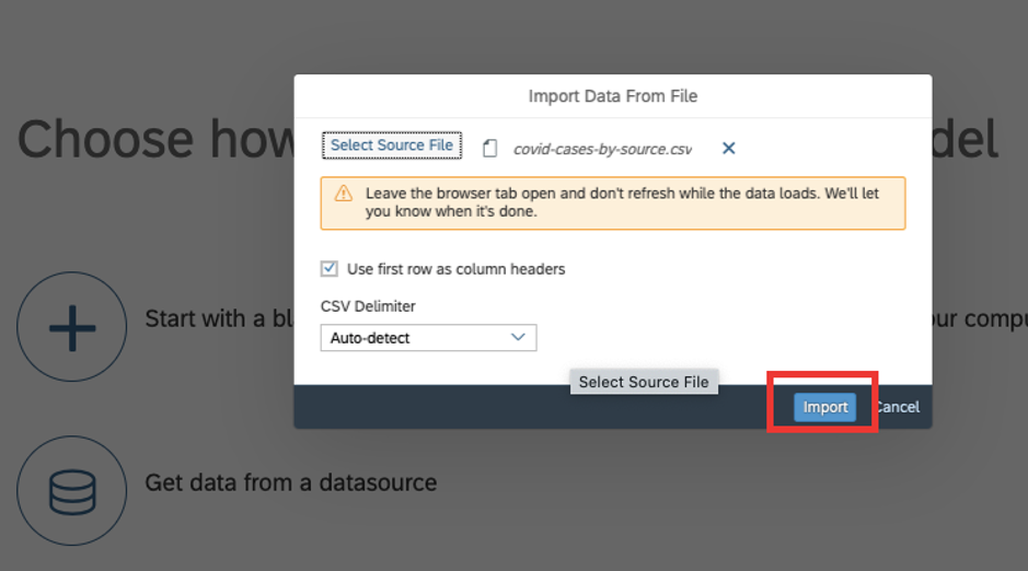
You will be prompted to select your file from your location.
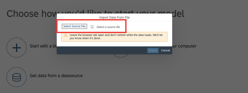
Allow SAP Analytics Cloud to detect the file type and headers. Hit Import.
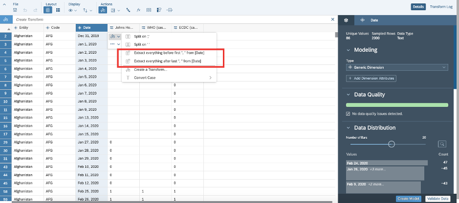
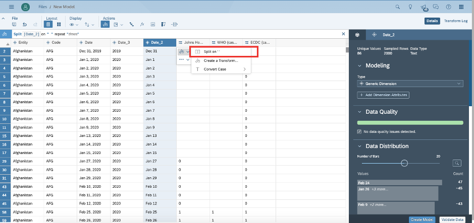
Your data is in. For our time series forecast to work correctly, we need the Date format to be recognised correctly. This file has data in MMM DD, YYYY, an unusual date format. We will juggle the fields around to bring it to a form SAP Analytics Cloud can recognise. First, we separate the date, month and year. Subsequently we will concatenate the fields to resemble MMM-DD-YYYY (which is one of the many accepted date formats). Click on extract everything before the “,”. Subsequently click on extract everything after the “,”. This should give you 2 columns.
Click on Split on “ “ to separate the MMM and DD fields.
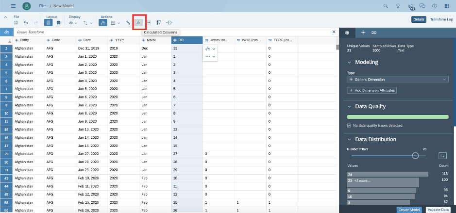
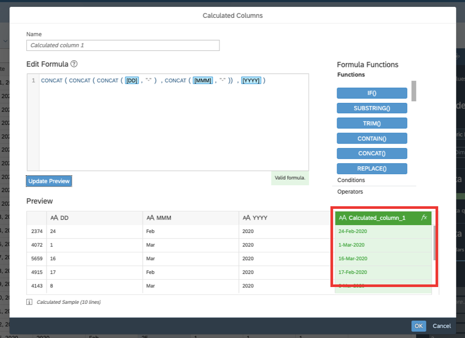
Double click on the headers to rename the fields. Once renamed to YYYY, MMM & DD, click on the fx in the ribbon to create a new column in desired format.
Enter the below formula. And click on preview to take a look at the formula sample results.
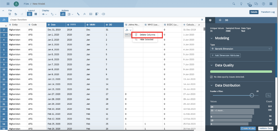
I delete all other columns to keep things simple.
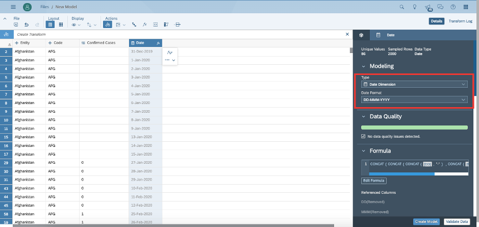
Lastly, I click on the Date field and update the Type to Date. The date format is auto selected. You can click on the Date Format to review the other accepted date formats. Once done, click on create model at bottom right.
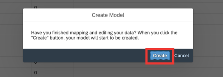
After validating the data and checking for errors, you will be prompted to confirm that you wish to create the model. Hit create.
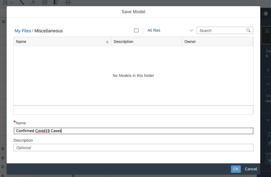
Save your file in a folder location of your choice, on the Cloud tenant. Hit ok.
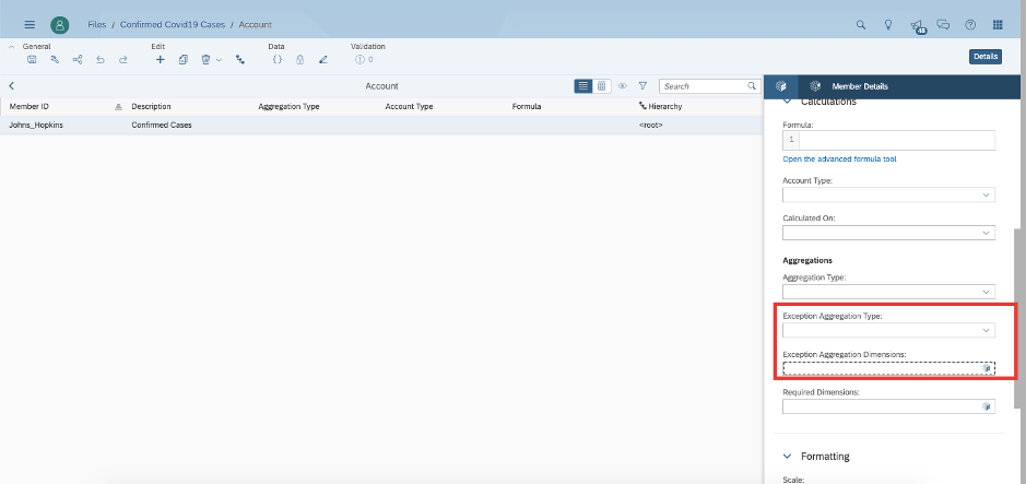
And you’re done! But wait. The numbers in the raw file are cumulative. This essentially means that Day 1 has x cases, Day 2 has x+y cases, Day 3 has x + y + z cases and so on. To meaningfully add up all the numbers, I need each entry to be the new cases of that day. That is Day 1 to be x, Day 2 to be y and Day 3 to be z and so on. Thankfully, a few clicks can fix this in SAP Analytics Cloud. Click on Model on top right and click on Account.
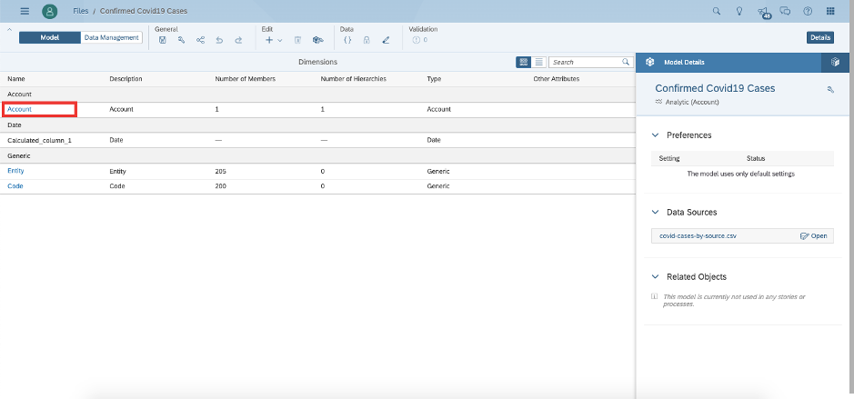
Click on John Hopkins (or whichever is the source you wish to use for forecasting) and on the Member Details tab on the right, scroll down to Exception Aggregation Type. This basically informs SAP Analytics Cloud that the aggregation is not a straightforward sum. It will need to select the latest value of the cases by date and use that for aggregation.
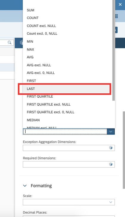
Select Last in the Exception Aggregation Type.
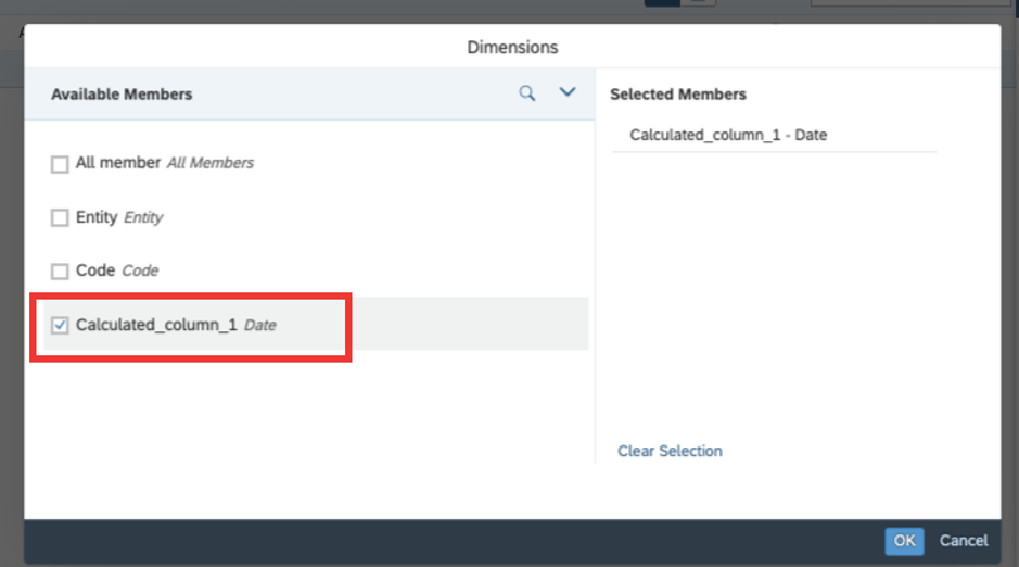
Select the Date field as the Exception Aggregation Dimension.
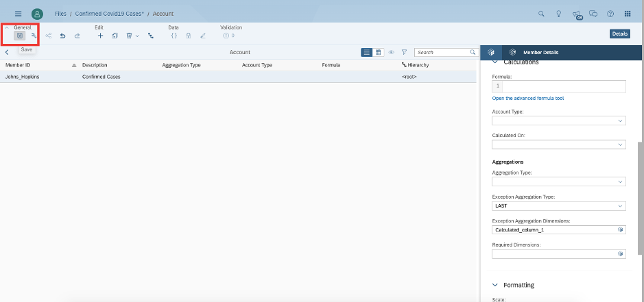
Hit save on the model to finish data preparation.
Step 3: Create your forecast
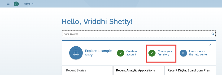
We start, by creating a story. Go to Home and click on create a story.
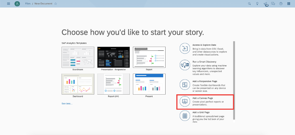
On this page choose from the readily available templates or build your own story from scratch based on your needs. I choose canvas, but you can really choose any starting point.
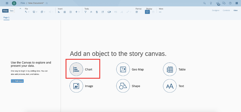
I will add a chart to start.
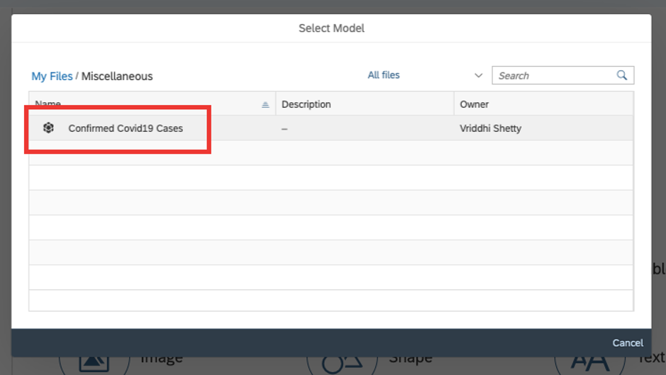
I will be prompted to select a data model. I will select the one I just created.
In my newly created chart, I will select the chart type as line.
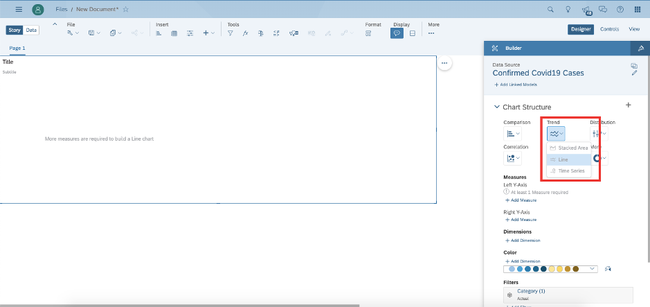
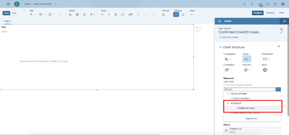
I will add Confirmed cases as the measure for the chart.
And date as the dimension.
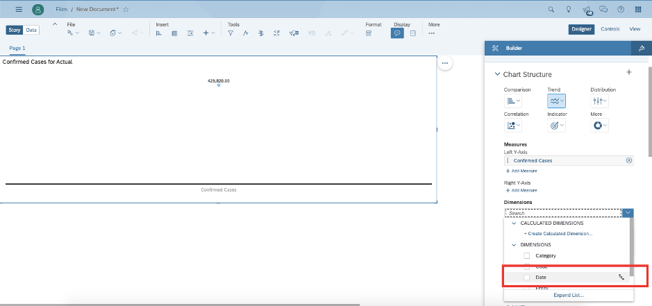
By default, fields with data type date are created as hierarchies. SAP Analytics Cloud recognises the layers of Date to Month to Quarter to Year and refers to this as “levels”. I select level 4 as my display choice. You can play with the other options to understand this better.
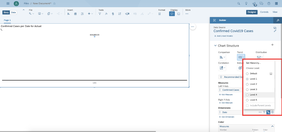
I can see my trend for global cases show up in the chart. I am keen to understand the trend in March, so I drill down further.
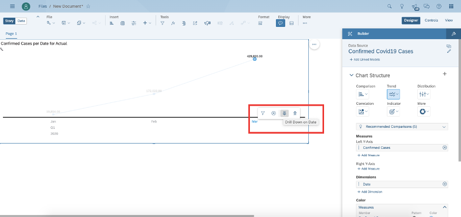
At this point, adding a forecast is a few simple clicks away!
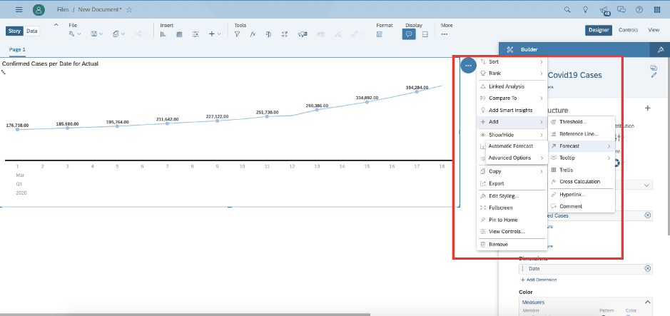
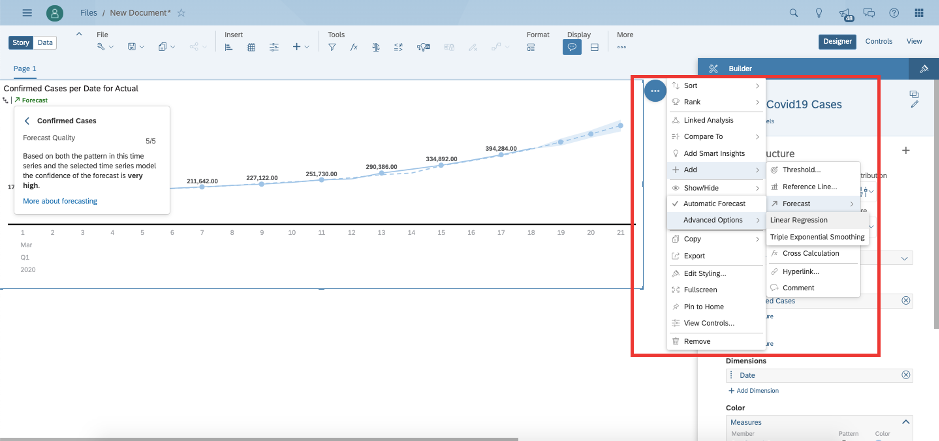
Click on the 3 dots at the top right of the chart to reveal the chart options. Click on Add > Forecast > Automatic Forecast.
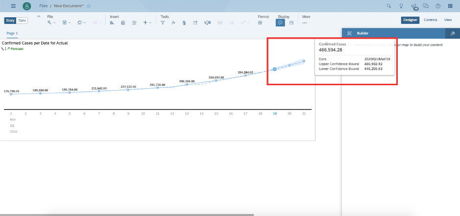
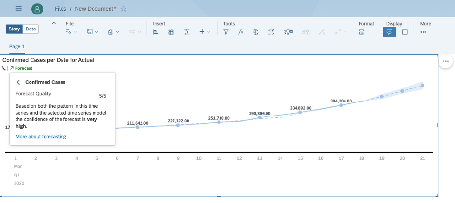
Clicking on a future date, shows me the forecasted numbers for the corresponding date.
Click on the forecast link in green on the chart to understand this forecast a little better. It has automatically chosen 3 time periods to learn from the 3-week period available in this month.
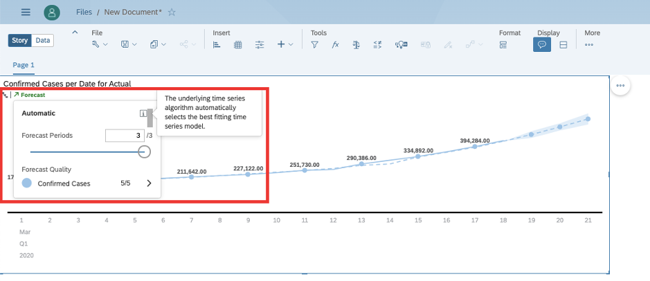
Click on the confirmed cases, to uncover that SAP Analytics Cloud has high confidence in the predicted numbers.
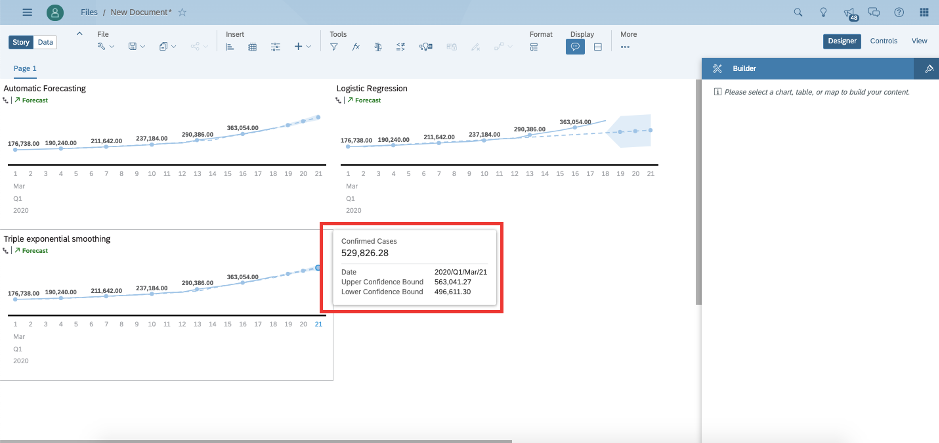
You can play around with the 2 other options, Linear regression and Triple Exponential Smoothing to see the difference in results.
I notice the narrowest confidence bounds on the triple exponential smoothing and settle for this prediction.
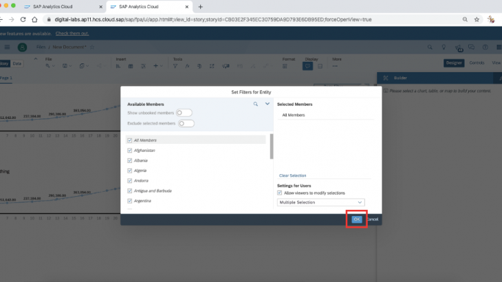
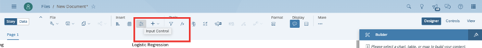
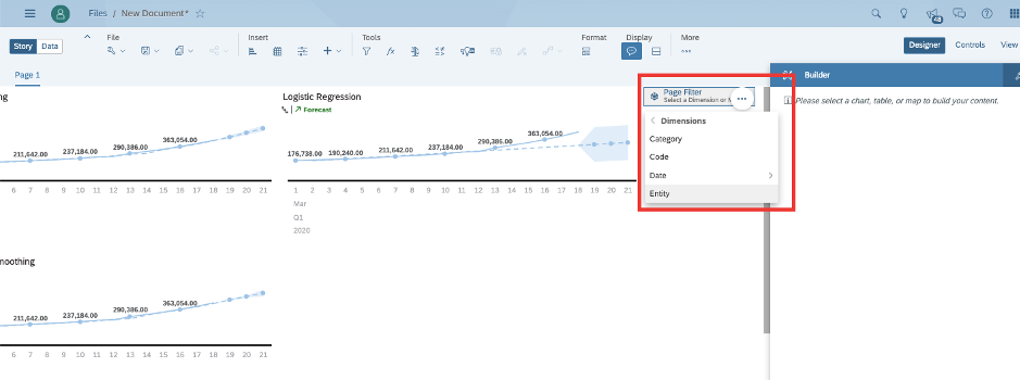
I am now curious to see if this global prediction can be extended to my home country, Singapore. Click on input control at the top to add a page filter.
Select Entity in the dropdown, as this is the Country field.
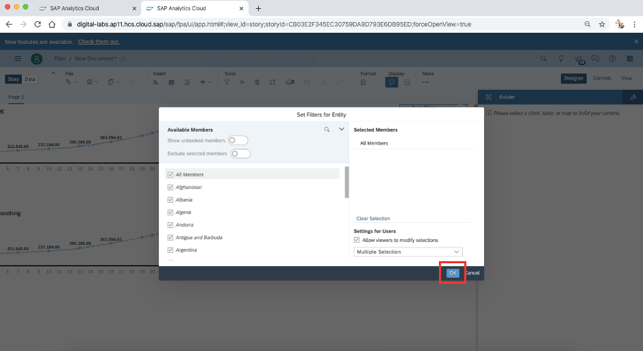
Click on all members to allow all countries to display in filter selection. Hit ok.
Click on Entity and search for Singapore (or any country of your interest).
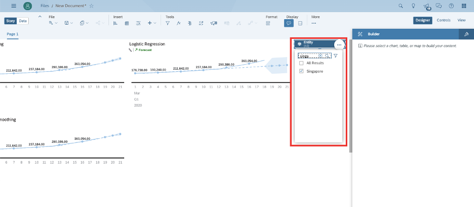
Triple exponential smoothing predicts 345 cases on Mar 19, 385 on Mar 20 and and 425 cases on Mar 21. At the time of this blog post, I am aware that the true cases reported in Singapore on these dates were 345, 371 and 432 respectively. The first prediction is eerily bang on. The others are in the whereabouts.
For this example, we have used the chart type for line trend. You can change the UI & other options slightly by selecting the chart type for time series. Try repeating the example with time series charts to see the difference.


