
When a planner leverages SAP Analytics Cloud Predictive Planning to create predictive forecasts, he can gauge accuracy using the measure called Horizon-Wide Mean Absolute Percentage Error (HW-MAPE) (Note: In wave 2021.19, it is renamed as Expected MAPE) to evaluate the accuracy of the predictive model. This measure is not exported with the predictive forecasts into a private version of the planning model.
The goal of this blog is to explain how a planner compares the actuals with predictive forecasts and measures in the story the accuracy of these predictive forecasts.
In this blog, I will explain how you can generate the Mean Absolute Percentage Error (MAPE) inside a story. It is of course possible to use other accuracy measures as well.
How the MAPE is calculated
The formula of the MAPE is:
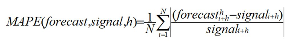
Where:
- forecast is a predicted value
- signal is an actual value
- h is the horizon, or the number of forecasts requested by the user in the settings of the predictive scenario. It refers to the period in the future you want to predict.
This formula shows the difference between predicted values and actual values. The formula is a sum of terms divided by the number of these terms. It is an average of the difference between predictive forecasts and actual values. These terms are called the Absolute Percentage Error (APE).
MAPE is the average of these APEs. The smaller this difference is, the closer the predictive forecasts will be from the actual values.
Let’s see how to compute the MAPE inside a story based on a planning model.
Prepare the Story
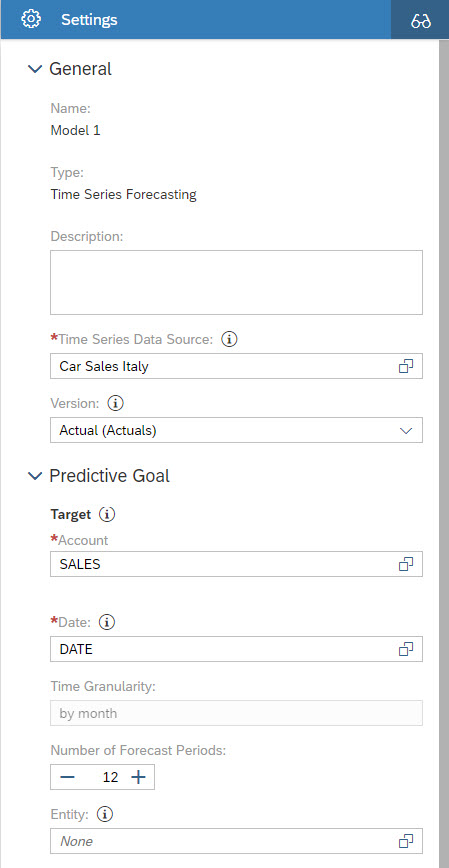
In GitHub there is file Car Sales Italy.xlsx. It contains the monthly car sales amount in Italy from 2015 to 2020. The predictive goal is to plan sales amount for the next twelve months. The first step is to create a planning model from this excel file.
Thus, go to your SAC tenant and open the Modeler. Select the excel file to import it into the Modeler. Do not forget to check the option Enable Planning as shown below.
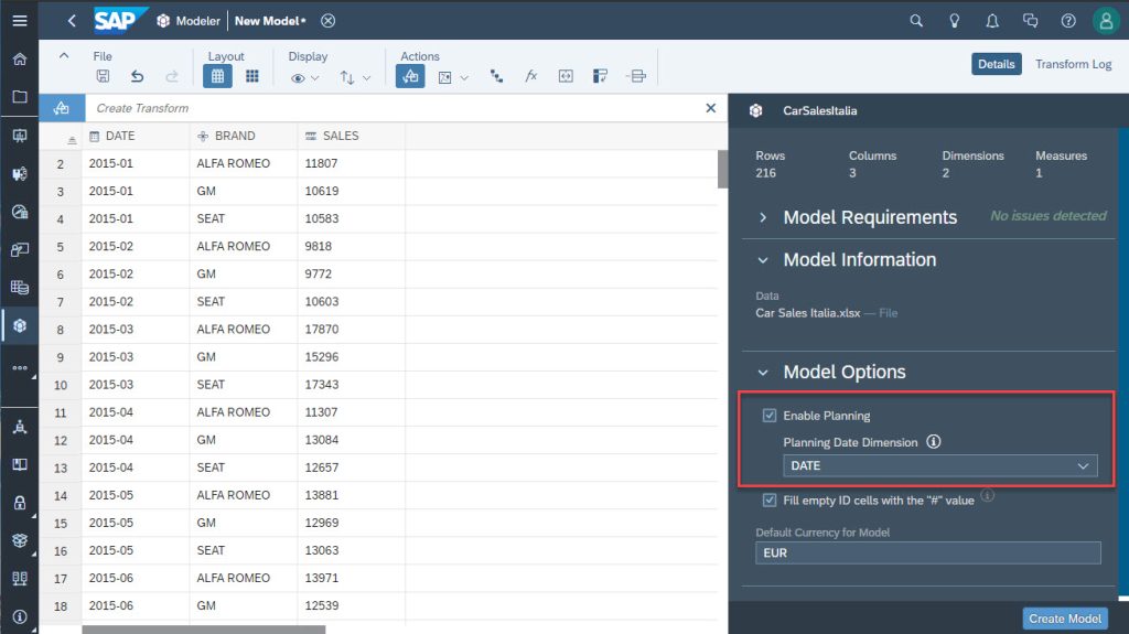
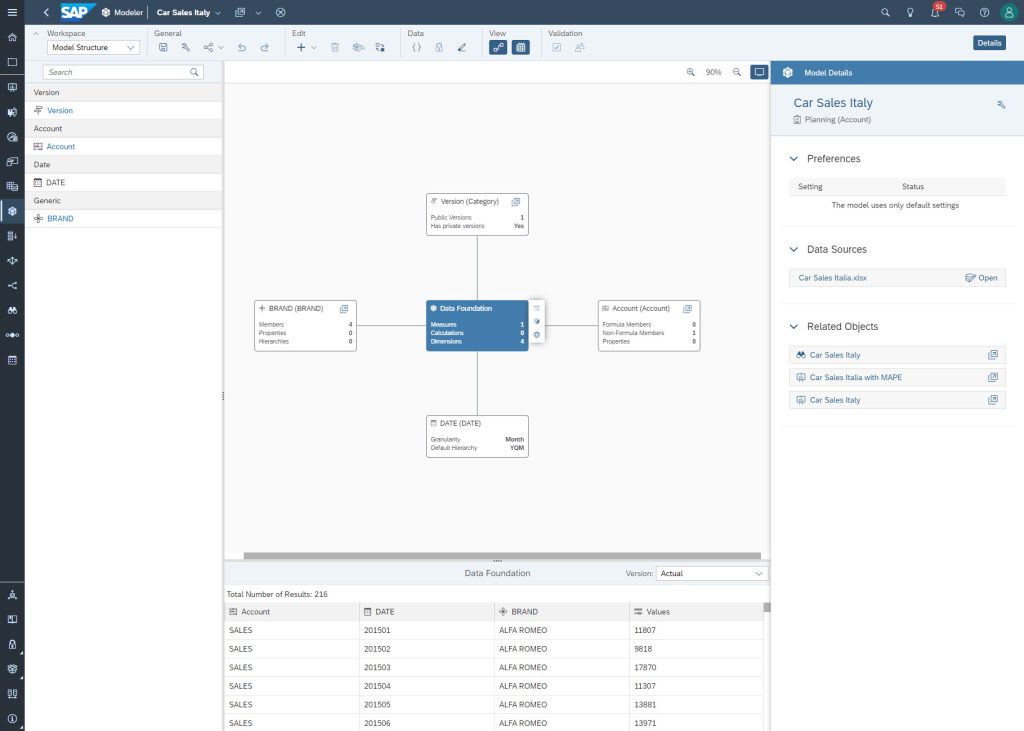
Then click the Create Model button and give it a name. Once done, the planning model will look like this:
Let’s now create a story. In the title bar of the window, there is a contextual shortcut to create a story as shown below.
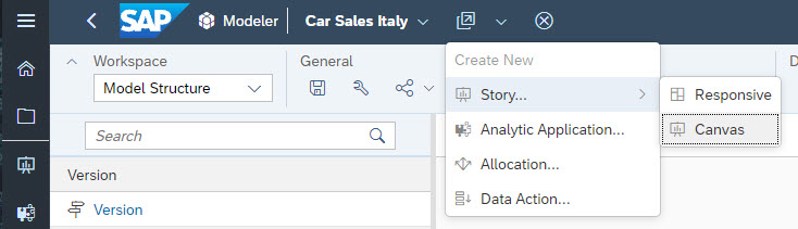
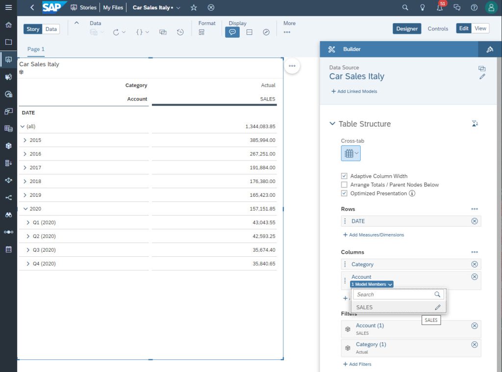
Choose the type Canvas and insert a Table. With this shortcut, a new story is created, based on the planning model we just created. Configure the story as shown in the figure below with the DATE dimension in the rows section and the account SALES in the columns section.
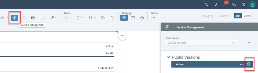
From the toolbar, select the Version Management and click the icon on the right side of the Actuals version.
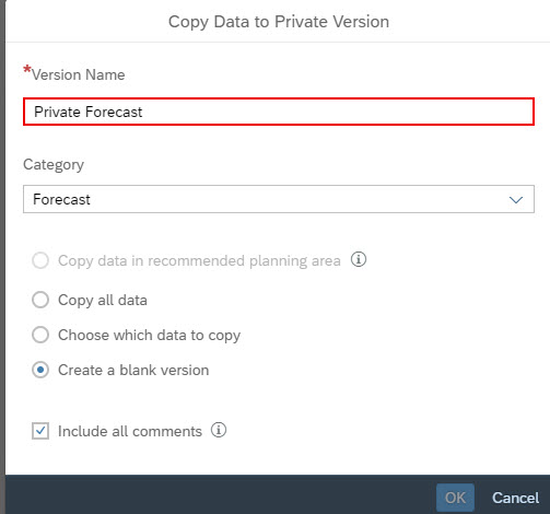
In the Version Management window, create a blank private version. This private version will receive the predictive forecasts.
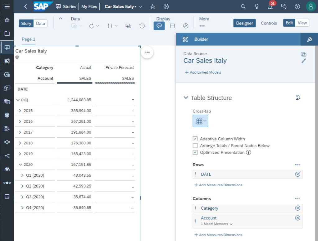
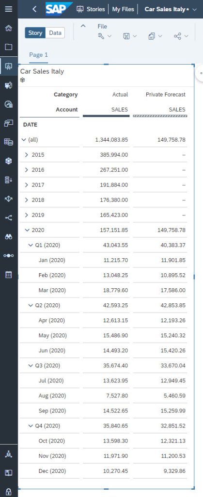
Now, the story looks like this:
Name your story and save it.
Get Predictive Forecasts in the Story
Let’s visualize the MAPE directly into the story. For that, it is necessary to compare the predictive forecasts with the actual values. If we forecast 2021, this comparison is not possible as the historical dataset is available only until the end of 2020 and does not have actual values in 2021.
The solution can be found in the settings of the Predictive Scenario. Thus, let’s create a time series Predictive Scenario. Its data source is the planning model about car sales in Italy. The settings to predict the next twelve months are shown below:
Now, to be able to compute the MAPE inside the story, the Predictive Scenario is set to train the predictive model until the end of 2019. Thus, the twelve predicted months correspond to the year 2020. This makes it possible to compare the predictive forecasts to the actuals.
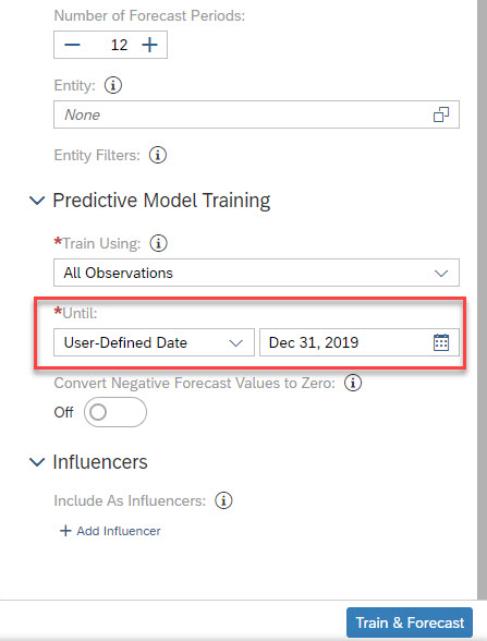
Click the Train & Forecast button to generate the predictive model.
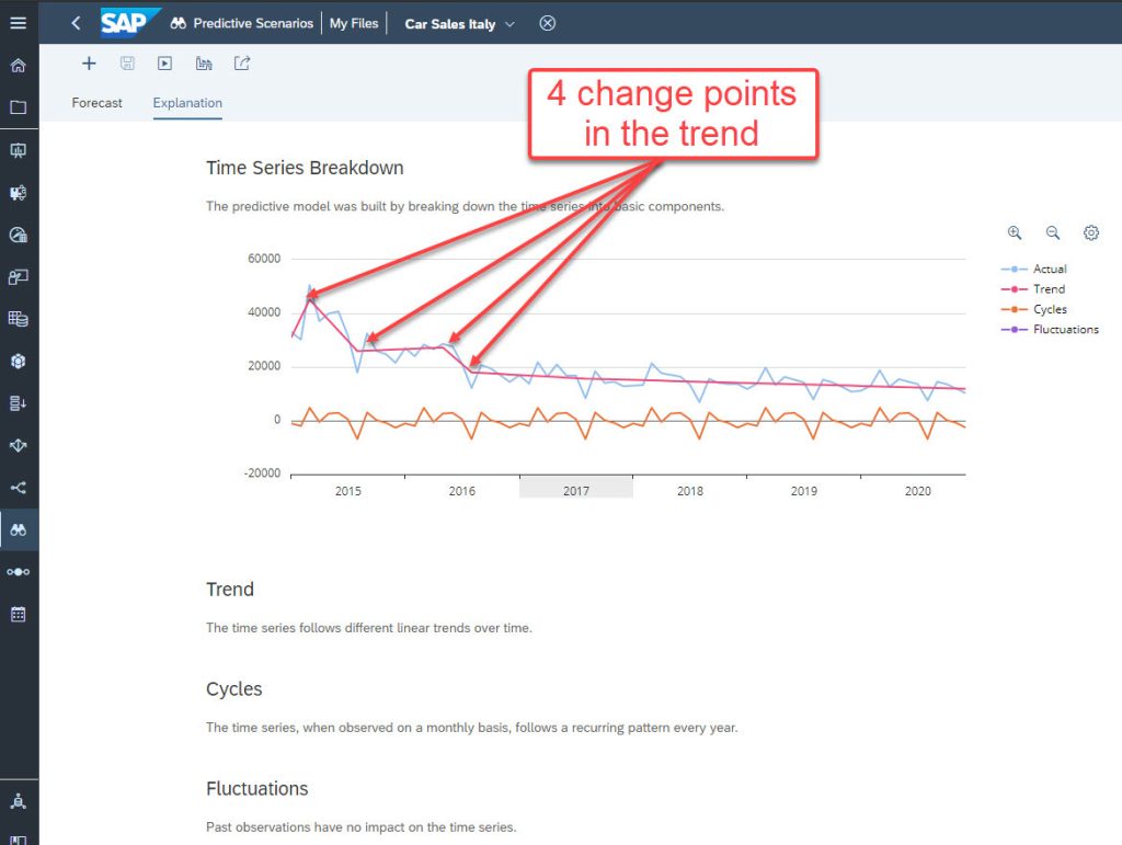
You will get explanations – here SAC Predictive Planning detects a piecewise trend and a recurring monthly pattern every year.
You also get the monthly predictive forecasts for the year 2020.
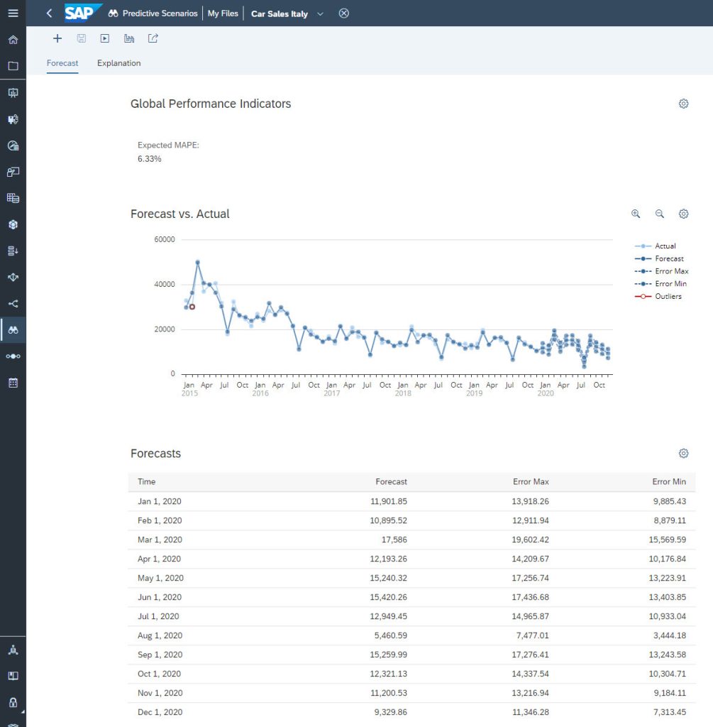
This figure shows an Expected MAPE of 6.33%. A low Expected MAPE corresponds to an accurate predictive model. In this case, we can consider that a value of 6.33% is a good accuracy value. I let you read this blog to have a detailed explanation of the Expected MAPE. It is important to understand that this accuracy measure is calculated based on internal calculations which are not visible to the end-user. The measure included inside the story is the MAPE obtained for the year 2020 by a comparison between actual values and predictive forecasts of 2020.
To do this, the next step consists in saving the predictive forecasts into a private version of the story.
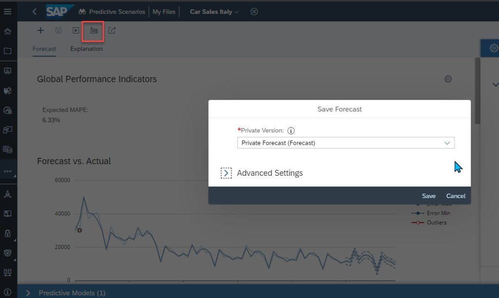
Once applied, the predictive forecasts for 2020 are visible in the story.
Compute the MAPE
Multiple steps are needed to compute the MAPE.
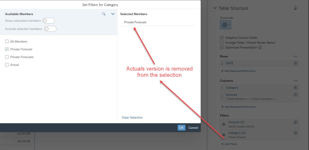
To avoid changing the Actuals version, the easiest way is to filter this version. The filter is set on Category as shown below.
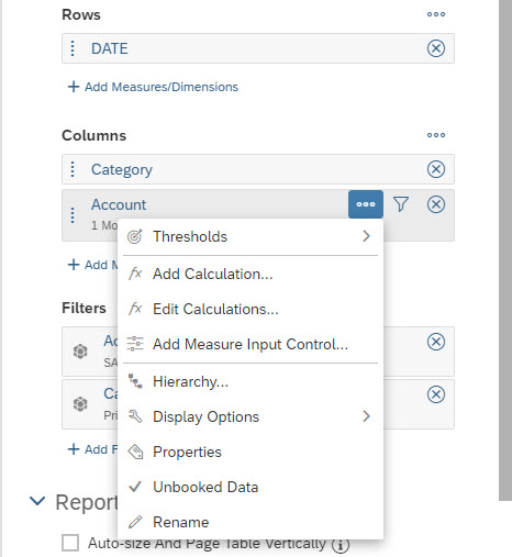
But the car sales measure SALES (actuals) is in the Actuals version while the predictive forecasts are in the private version. You need to have SALES also in the private version. It is easy to add a calculation in the Account dimension as shown below.
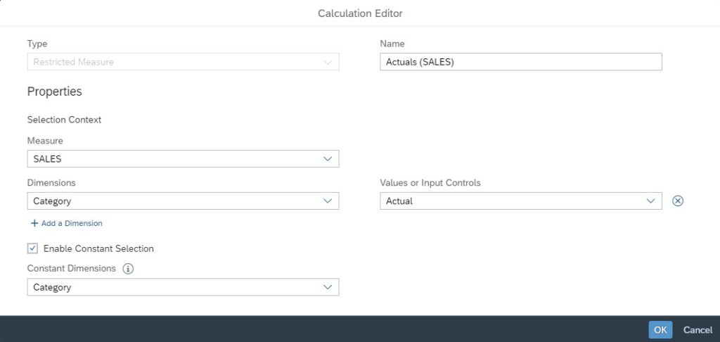
To do this, click on the three dots beside Account and select Add Calculation…
In the Calculation Editor, select a Restricted Measure whose name is Actuals (SALES). The values are copied from the measure SALES of the category Actual. It is important to check Enable Constant Selection on the dimension Category. This makes the new variable available to all versions.
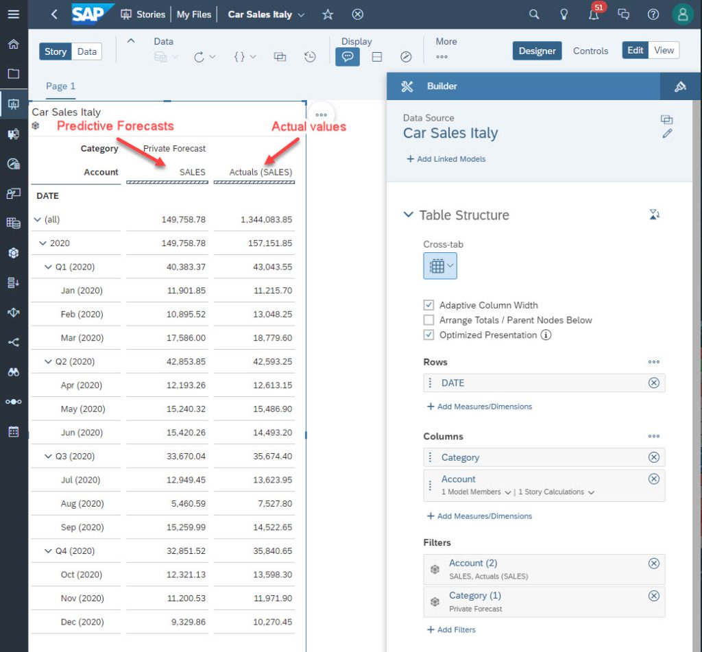
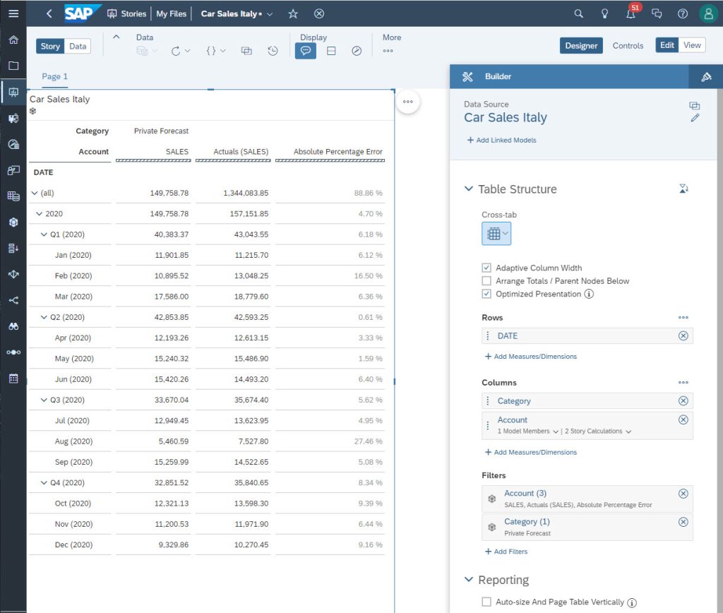
The story will now look like this:
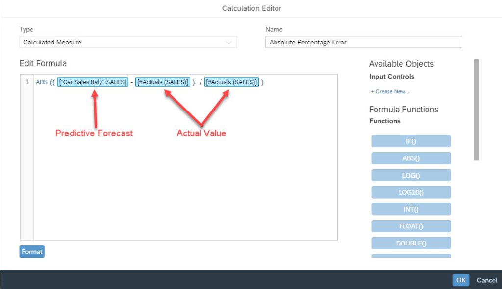
The next step is to compute the Absolute Percentage Error (APE) for each month. The formula to get the APE is:
APEm = ABS((forecastm – actualm) / actualm)
Where m stands for a month.
To do this, click once again on the three dots beside Account and select Add Calculation…. This time, select the Calculated Measure option in the drop down and name it as Absolute Percentage Error with the formula shown in the figure below:
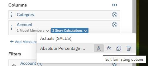
Click the OK button and the story is updated right away. As the APE is a percentage, the best is to format this variable as a percentage. To do this, click the variable and then on the icon to edit formatting options.
Set the Formatting window as shown below:
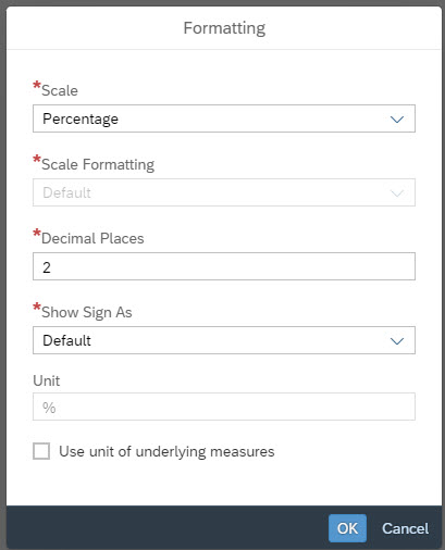
Click OK and the APE is formatted as a percentage.
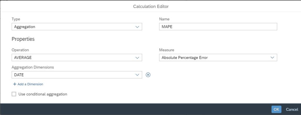
The last step consists of creating a new variable for the MAPE (the average of all the Absolute Percentage Errors). The formula is:
MAPE = AVERAGE(APEm) for m = 1 to 12
Thus, as before, create a new calculation named MAPE. But this time, use an aggregation based on an average of all Absolute Percentage Errors. This aggregation is based on the dimension DATE. The Calculation Editor should look like this:
Change the formatting option as a percentage as done for the APE. The result appears directly in the story. The MAPE for 2020 is 8.56% which is good.
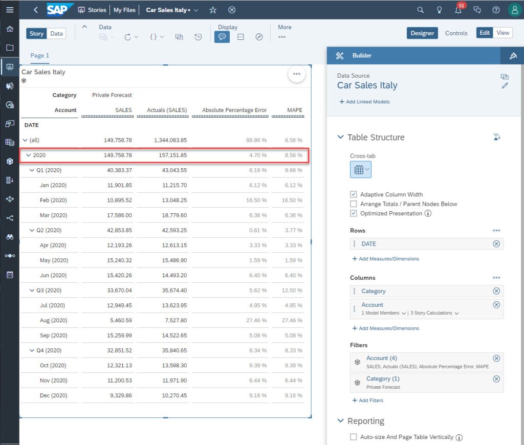
Note: In addition, there are intermediate MAPEs for each month and quarter.


