1. Introduction
Seasonality is an important characteristic of a time series and our Python Machine Learning Client for SAP HANA (hana_ml) offers a time series function called seasonal_decompose() which provides a seasonality test and the decomposition the time series into three components: seasonal, trend, and random noise.
In this blog post, you will learn:
- The definition of seasonality and why we need to decompose a time series data.
- How to apply seasonal_decompose() of hana_ml to analysis two typical real world time series examples.
1.1 Definition
Seasonality is a characteristic of a time series in which the data experiences regular and predictable changes, such as weekly and monthly. Seasonal behavior is different from cyclic because seasonality is always of a fixed and known period while cyclicity does not have fixed period, e.g. business cycle. Seasonality can be used to help analyze stocks and economic trends. For instance, companies can use seasonality to help determine certain business decisions such as inventories and staffing.
1.2 Why we decompose the time series
In time series analysis and forecasting, we usually think that the data is a combination of trend, seasonality and noise and we could form a forecasting model by capturing the best of these components. Typically, there are two decomposition models for time series: additive and multiplicative. It is believed that the additive model is useful when the seasonal variation is relatively constant over time, whereas the multiplicative model is useful when the seasonal variation increases over time.
The real world problems are messy and noise, such as the trend is not monotonous and the real model could have both additive and multiplicative components. Nevertheless, these decomposition models provide us a structured and simple way to analysis and forecast the data. Hence, to identify the seasonality in a time series could help you build a better model. This can happen in the following ways:
- Data cleaning: removing the seasonal component will give you a clearer relationship between input and output.
- Interpretability: provide more information of time series.
In seasonal_decompose() of hana_ml, we provide two phases of functions:
1. Seasonality test
seasonal_decompose() tests whether a time series has a seasonality or not by removing the trend and identify the seasonality by calculating the autocorrelation(acf). The output includes the number of period, type of model(additive/multiplicative) and acf of the period.
2. Seasonal decomposition
based on the model structured in the seasonality test phase, the components of trend, seasonality and random noise are determined.
Overall, seasonal_decompose() of hana_ml offers a easy and fast method to identify the seasonality and decompose the time series. In the following sections, we will show you how to use this function to analysis two real world datasets.
2. Solutions
In this section, the U.S. gasoline retail sales and New York taxi passengers cases are analyzed.
2.1 SAP HANA Connection
We firstly need to create a connection to a SAP HANA and then we could use various functions of hana_ml to do the data analysis. The following is an example:
import hana_ml
from hana_ml import dataframe
conn = dataframe.ConnectionContext('host', 'port', 'username', 'password')
2.2 Use Cases
2.2.1 Case 1: US Gasoline Retail Sales
Dataset link: https://www.eia.gov/dnav/pet/hist/LeafHandler.ashx?n=PET&s=A103600001&f=M
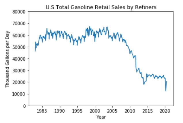
This dataset includes the monthly data of U.S. Total Gasoline Retail Sales by Refiners (Thousand Gallons per Day) from Jan. 1983 to July 2020. Dataset has two columns: Date and Sales, and 451 data points.
The figure below shows the variation of the dataset and there may be a yearly pattern through our observation. From 2008 to 2015, there is a significant decrease of sales. Considering the point of time, we guess the drop could be caused by the 2008 economic crash which had a pronounced negative impact on oil and gas industry. When we look at the data of 2020, there is a steep decline in early 2020 which may be caused by the lockdowns of COVID-19 pandemic in the US.
The dataset has been imported into the SAP HANA and the table name is “GASOLINE_TBL”. Hence, we could access to the dataset via dataframe.ConnectionContext.table() function. Then, We add a column called ‘ID’ to the original DataFrame gasoline_df as seasonal_decompose() requires a integer column as key column.
# Access to the data table
gasoline_df = conn.table("GASOLINE_TBL")

# Add ID column for hana_ml seasonal_decompose() function
gasoline_df = gasoline_df.add_id('ID')

# Show the first 5 rows of dataset
print(gasoline_df.head(5).collect())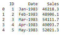
Firstly, because the seasonality is indicated by the autocorrelation lag, we invoke the correction function in hana_ml to calculate the autocorrection(acf) and the result is shown below:
# Invoke correlation function for acf
from hana_ml.algorithms.pal.tsa.correlation_function import correlation
result = correlation(data=gasoline_df, key='ID', x='Sales', max_lag=100)
print(result.collect())

# Visualize the result of CF
import matplotlib.pyplot as plt

cf = result.collect()['CF']
plt.plot(cf)
plt.grid(color='r', linestyle='--', linewidth=1, alpha=0.3)
plt.xlabel('lag')
plt.ylabel('cf')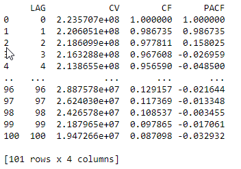
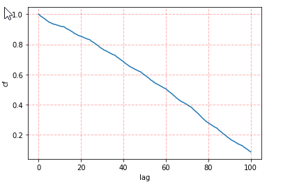
In the beginning, we assume that the data has a yearly pattern so we expect that when the lag is 12, the value of acf is high. However, as this time series is not stationary and the steep decline from 2008 to 2015 has big impact on the value of acf, our expectation is not true and acf is a decreasing curve. In order to identify the seasonality, the trend in the data needs to be removed.
Hence, seasonal_decompose() of hana_ml provides a seasonality test which considers eliminating the impact of the trend. we invoke the seasonal_decompose() as follows:
# Invoke seasonal_decompose function
from hana_ml.algorithms.pal.tsa.seasonal_decompose import seasonal_decompose
stats, decompose =  seasonal_decompose(data= gasoline_df, endog = 'Sales', key='ID')

# show the results
print(stats.collect())
print(decompose.collect())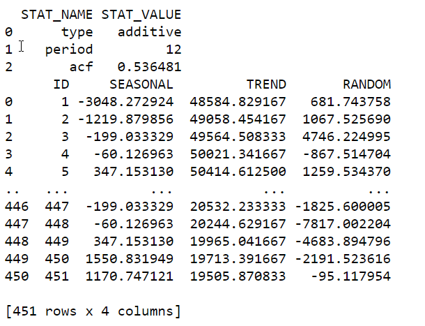
From the result of stats, we could see the period is 12 and the decomposition model is additive. Visualize the output with the original dataset and three components (seasonality, trend and random):
# visualize the seasonal, trend and random
import matplotlib.pyplot as plt

data = gasoline_df.collect()['Sales']
seasonal = decompose.collect()['SEASONAL']
trend = decompose.collect()['TREND']
random = decompose.collect()['RANDOM']

plt.figure(figsize=(12,12))

# obeserved data
plt.subplot(411)
plt.plot(data)
plt.grid(color='r', linestyle='--', linewidth=1, alpha=0.3)
plt.ylabel('SALES')

# seasonal component
plt.subplot(412)
plt.plot(seasonal)
plt.grid(color='r', linestyle='--', linewidth=1, alpha=0.3)
plt.ylabel('SEASONAL')

# trend component
plt.subplot(413)
plt.plot(trend)
plt.grid(color='r', linestyle='--', linewidth=1, alpha=0.3)
plt.ylabel('TREND')

# random component
plt.subplot(414)
plt.plot(random)
plt.grid(color='r', linestyle='--', linewidth=1, alpha=0.3)
plt.xlabel('ID')
plt.ylabel('RANDOM')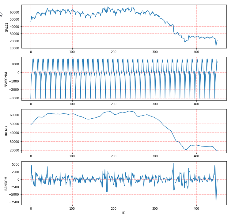
We could also set the decompose_type to be “multiplicative”:
# Select multiplicative model
stats2, decompose2 =  seasonal_decompose(data= gasoline_df, endog = 'Sales', key='ID', decompose_type="multiplicative")
print(stats2.collect())
print(decompose2.collect())

# visualize the seasonal, trend and random
import matplotlib.pyplot as plt

data = gasoline_df.collect()['Sales']
seasonal = decompose2.collect()['SEASONAL']
trend = decompose2.collect()['TREND']
random = decompose2.collect()['RANDOM']

plt.figure(figsize=(12,12))

# obeserved data
plt.subplot(411)
plt.plot(data)
plt.grid(color='r', linestyle='--', linewidth=1, alpha=0.3)
plt.ylabel('SALES')

#seasonal component
plt.subplot(412)
plt.plot(seasonal)
plt.grid(color='r', linestyle='--', linewidth=1, alpha=0.3)
plt.ylabel('SEASONAL')

# trend component
plt.subplot(413)
plt.plot(trend)
plt.grid(color='r', linestyle='--', linewidth=1, alpha=0.3)
plt.ylabel('TREND')

# random component
plt.subplot(414)
plt.plot(random)
plt.grid(color='r', linestyle='--', linewidth=1, alpha=0.3)
plt.xlabel('ID')
plt.ylabel('RANDOM')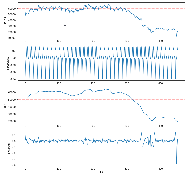
The results show that when decomposition model is multiplicative, the period is 12 but the acf is 0.31923 which is smaller than that of additive model. Hence, if decompose_type is not fixed, seasonal_decompose() will select the additive decomposition model.
2.2.2 Case 2: New York Taxi Passengers
Dataset Link: https://github.com/numenta/NAB/blob/master/data/realKnownCause/nyc_taxi.csv
This dataset describes the number of NYC taxi passengers in 8 months, from July 2014 to Jan. 2015, where the five anomalies occur during the NYC marathon, Thanksgiving, Christmas, New Years day, and a snow storm. The raw data is from the NYC Taxi and Limousine Commission. The data file included here consists of aggregating the total number of taxi passengers into 30 minute buckets. Data has two columns, timestamp and value of passengers, and 10320 instances.
The dataset has been imported into the SAP HANA and the table name is “TAXI_TBL”. Hence, we could access to the dataset via dataframe.ConnectionContext.table() function.
# Access to the data in SAP HANA
twitter_df = conn.table("TAXI_TBL")

# Add ID column
twitter_df = twitter_df.add_id('ID')

# Show the first 5 rows
print(twitter_df.head(5).collect())

# Plot the first 1000 data points
plt.figure(figsize=(12,12))
plt.plot(twitter_df.head(1000).collect()['value'])
plt.grid(color='r', linestyle='--', linewidth=1, alpha=0.3)
plt.xlabel('ID')
plt.ylabel('No. of Passengers')
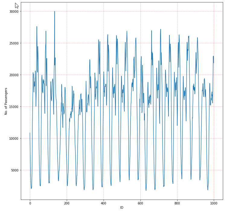
From the figure above, it seems that the number of taxi passengers has a daily and weekly pattern. Hence, we calculate the acf as follows:
# Invoke the acf
from hana_ml.algorithms.pal.tsa.correlation_function import correlation
result = correlation(data=twitter_df, key='ID', x='value', max_lag=1500)
print(result.collect())

# Visualize the result of acf
plt.figure(figsize=(12,12))
cf=result.collect()['CF']
plt.plot(cf)
plt.grid(color='r', linestyle='--', linewidth=1, alpha=0.3)
plt.xlabel('lag')
plt.ylabel('cf')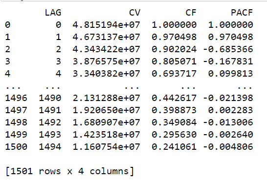
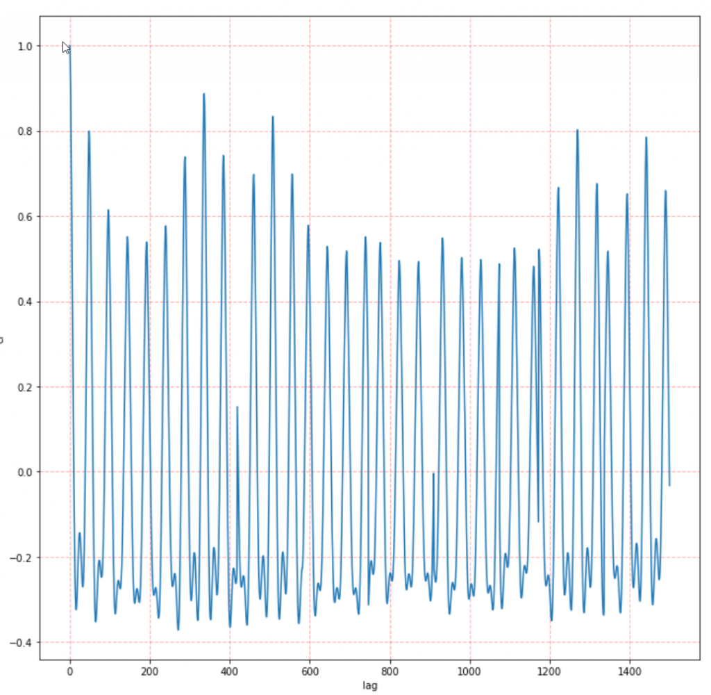
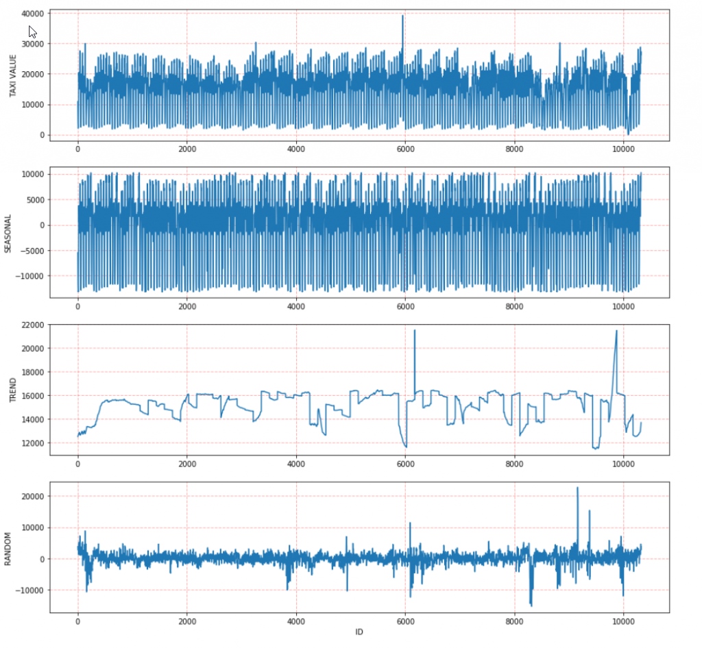
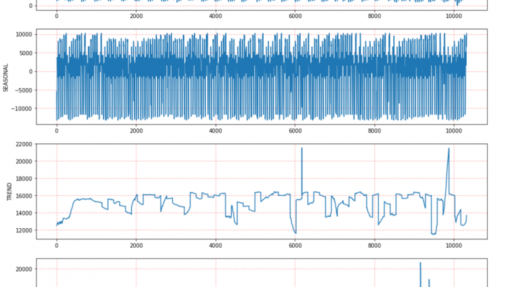
We invoke the seasonal_decompose() and obtain that the period is 336 which is a weekly pattern having the highest value of acf:
#Invoke seasonal_decompose
from hana_ml.algorithms.pal.tsa.seasonal_decompose import seasonal_decompose
stats, decompose =  seasonal_decompose(data = twitter_df, endog = 'value', key='ID')
print(stats.collect())
print(decompose.collect())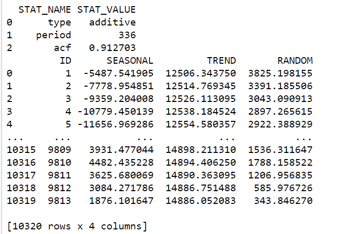
# visualize the seasonal, trend and random
import matplotlib.pyplot as plt

data = twitter_df.collect()['value']
seasonal = decompose.collect()['SEASONAL']
trend = decompose.collect()['TREND']
random = decompose.collect()['RANDOM']

plt.figure(figsize=(15,15))

# obeserved data
plt.subplot(411)
plt.plot(data)
plt.grid(color='r', linestyle='--', linewidth=1,alpha=0.3)
plt.ylabel('TAXI VALUE')

# seasonal component
plt.subplot(412)
plt.plot(seasonal)
plt.grid(color='r', linestyle='--', linewidth=1, alpha=0.3)
plt.ylabel('SEASONAL')

# trend component
plt.subplot(413)
plt.plot(trend)
plt.grid(color='r', linestyle='--', linewidth=1, alpha=0.3)
plt.ylabel('TREND')

# random component
plt.subplot(414)
plt.plot(random)
plt.grid(color='r', linestyle='--', linewidth=1, alpha=0.3)
plt.xlabel('ID')
plt.ylabel('RANDOM')