Recently we’ve prepared a demo for a mobile analytics application by using SAC Analytics Designer, and we’d like to share some experiences and best practices using this demo as an example.
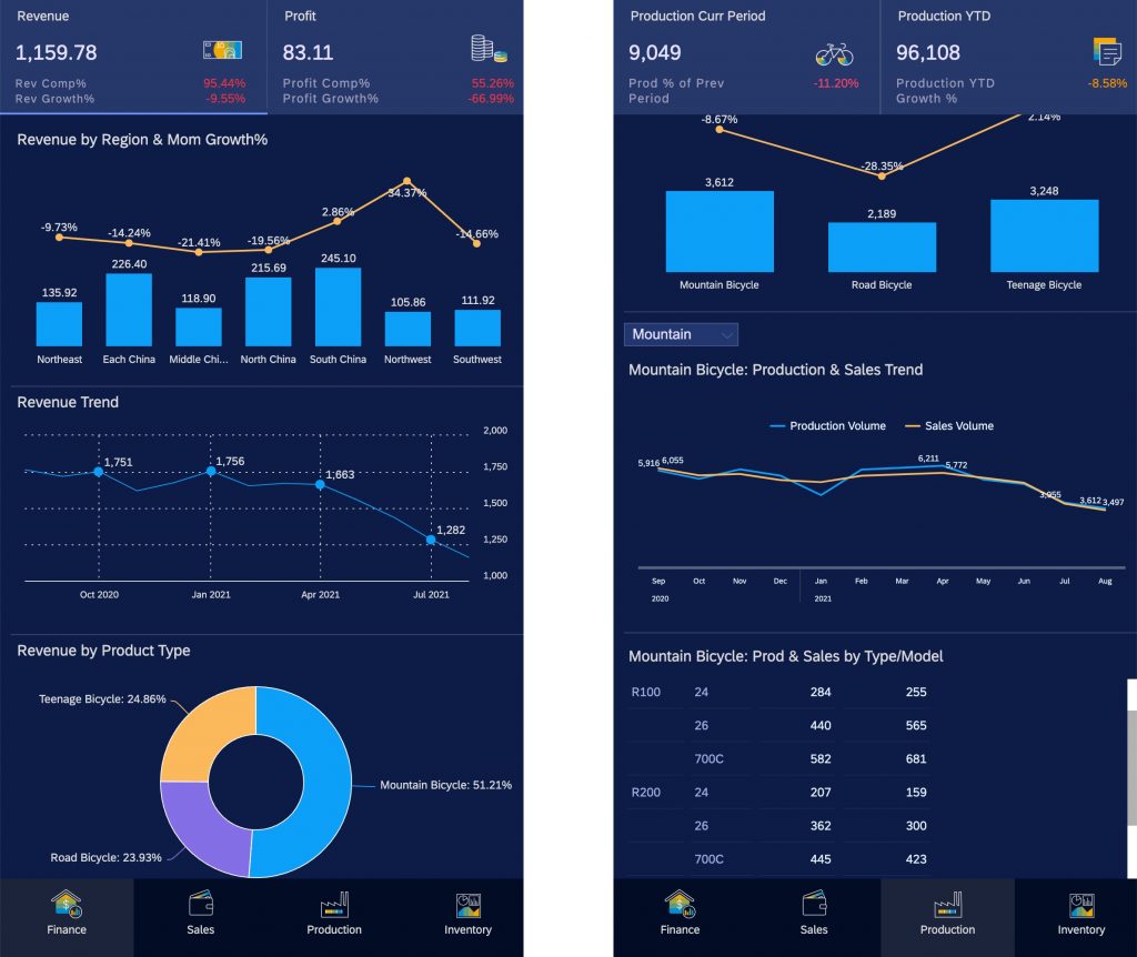
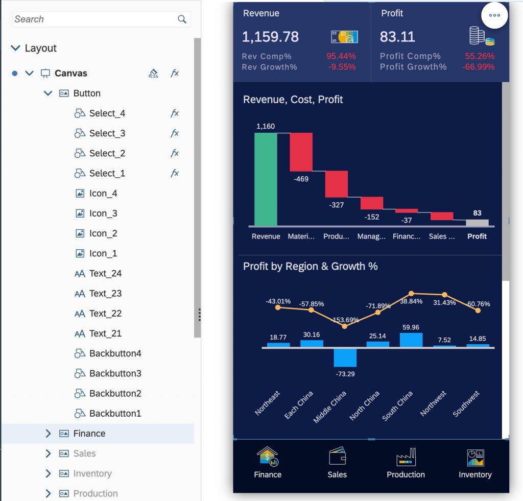
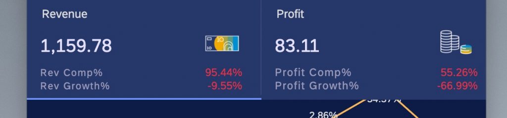
This example is a mobile dashboard to show some KPIs from different perspectives, such as Finance, Sales, Inventory, etc.
1 – Why using Analytics Application
We all know that for SAC Story, you can use a responsive page which is self-adaptive according to different devices. But we will also face some limitations when trying to design a dedicate mobile dashboard, including:
- the adaptive behavior is totally controlled by system, and a single widget will occupy the whole width of the screen
- no overlap of different widgets which makes it difficult for better user experience
- limited user interaction when reviewing the dashboard
But by using Analytics Application, we can leverage some configurations and scripts to customize the layout, the visualization effect, and comprehensive user interactions to provide a better user experience on mobile devices.
And the application can be consumed via native SAC IOS app and browsers on mobile devices (the support of Analytics Application on SAC Android app is on the roadmap already).
2 – How to design an Analytics Application for mobile
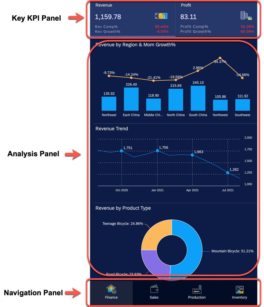
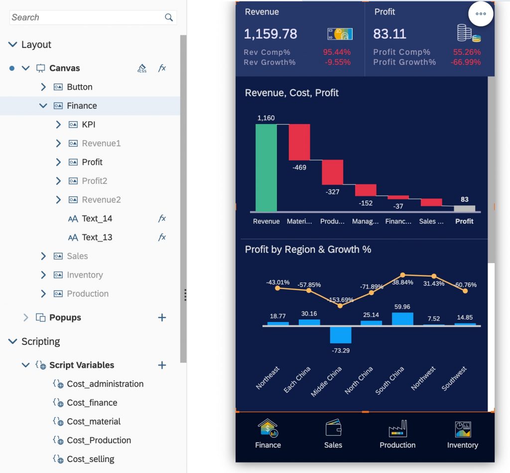
The whole screen is divided into different parts:
- the navigation panel on the bottom, and user can switch to different topics at any time
- the topic panel which includes:
- the key KPI panel on the top, and shows the most import KPIs for the selected topic
- the analysis panel in the middle, and user can scroll the panel for further analysis
Now let’s go to the details for these three panels.
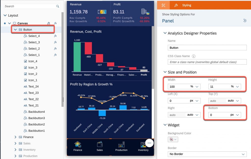
2.1 – Navigation Panel
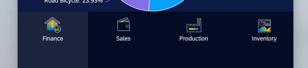
The navigation panel (named “Button” panel) consists 4 blocks representing different topics and each block occupies 25% of the screen width. Each block includes 4 different widgets:
- an image
- a text string
- a front shape (for user to switch between topics)
- a background shape (use different color to indicate which topic is currently selected)
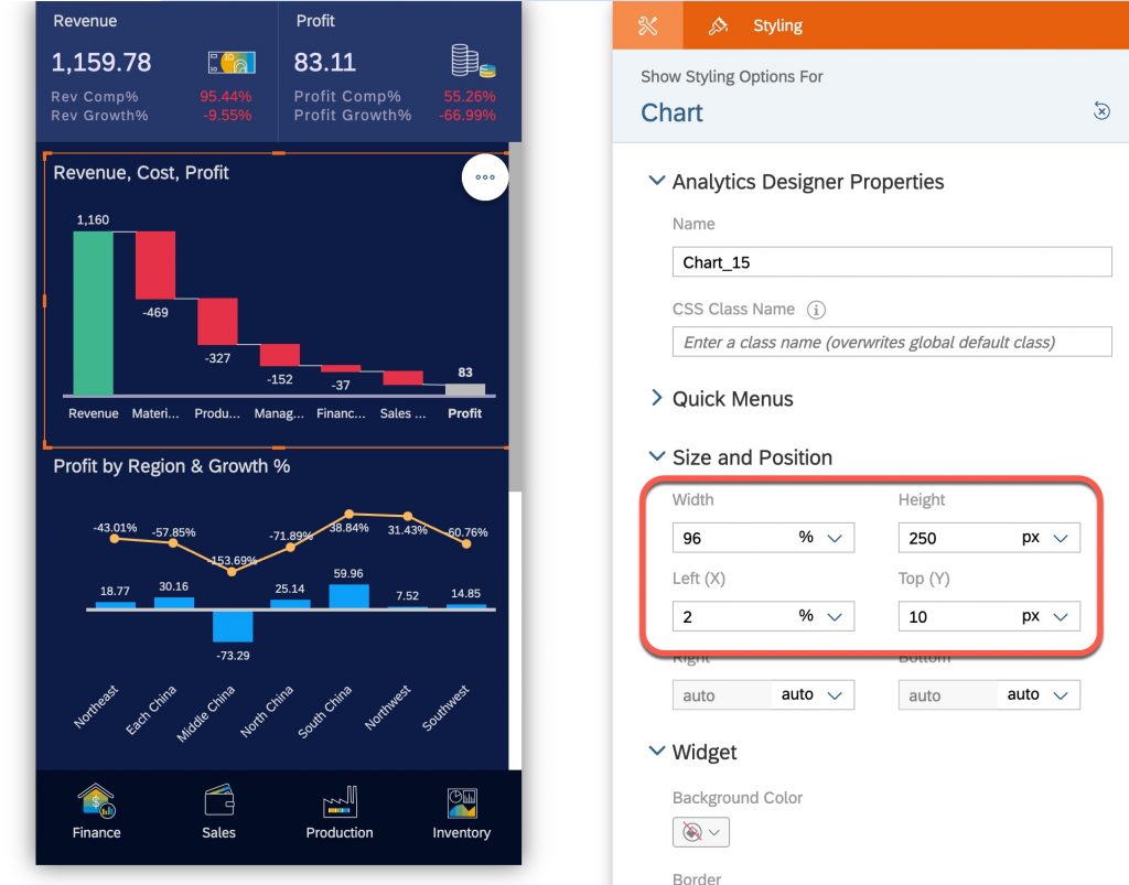
This panel is using 100% of the screen width, and a fixed 11% of the screen height which is started from the bottom of the screen:
And for each block, it will only use 25% of the panel width with different position:
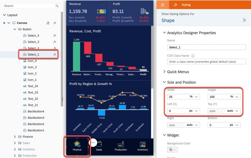
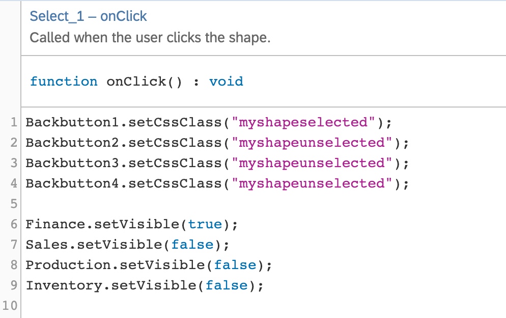
The front shape widget is used to switch between different topics, so it is placed on top of other widgets (to response to the user click) and it is transparent (no color filling).
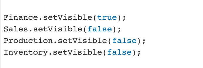
The script of switching topic is quite simple and straight forward. For each shape, when it’s been clicked, just show the corresponding topic panel and hide the others using ‘setVisible‘ method.
Using the first shape (for Finance) as an example, the script looks like:
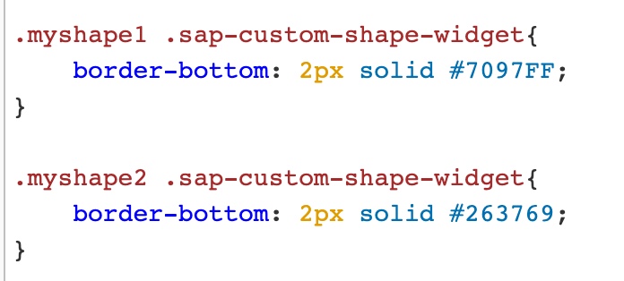
The background shape widget is used to indicate which topic is been shown right now. We can use a different color to differentiate the current selected block with others. We can simply use the CSS style to achieve this.
First we can define two different CSS styles:
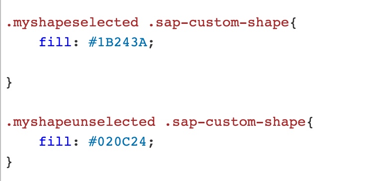
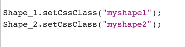
Then in the click event of the front shape, add the corresponding scripts to set the CSS accordingly.
Please notice that for analytics application, the scripts are executed in sequence. So we will need to put the data visualization part at the end to ensure all needed operations are done first.
2.2 – Topic Panel
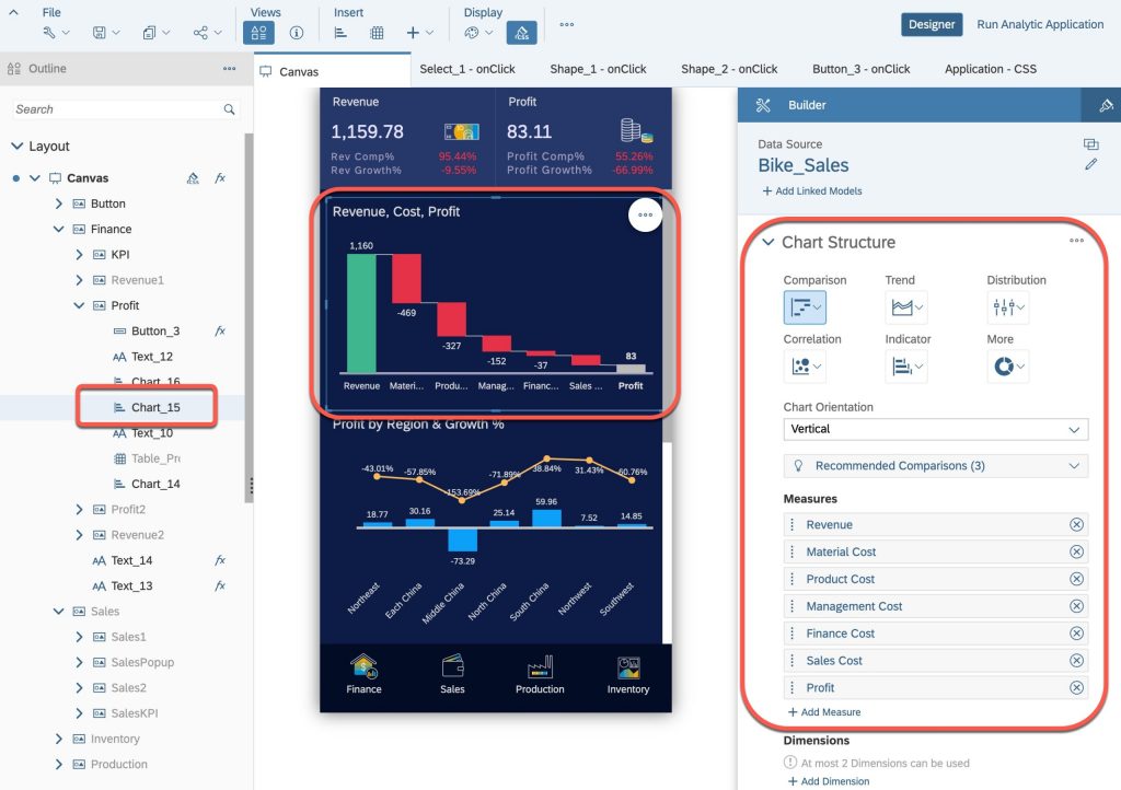
Since there’re 4 topics to be shown in the application, we can design 4 corresponding panels to include the visualization part.
In this example, a topic panel is divided into two parts:
- KPI panel, shows the most important KPIs which is fixed on top of the screen
- Analysis panel, shows the detail information which can contain more information and allows user to scroll up and down
Furthermore, we don’t want to put everything related into one single panel. We can show the related information by user interaction. So we also allow the users to switch different analysis panels when they trigger some actions, like clicking the KPI panel or clicking a button inside the dashboard. So we can prepare some sub-panels inside each topic panel to be switched based on user interaction.
The switching of these sub panels are similar with the behavior of navigation panel by using the ‘setVisible‘ method. And the design of these sub panel is also not complicated, just adding needed charts into that panel like a typical application design.
One tip is the position of charts. For better user experience, we should leave some spaces on the edges of the screen. By testing different options, we finally choose to leave 2% on the edge.
Another tip is a different way to use CSS style. As mentioned before, in this example, user can also click a chart (actually still a transparent shape in the front) to switch between different sub panels. In this case, using different background color may not be a good option anymore.
One possible option is to use the board line:
This can also be defined in the CSS style:
And use the following script to show and hide the boarder line (here “hide” means use the same color of the chart’s background color).
2.3 – Widgets only supported in Analytics Application
Compared with story, there’re more widget types available in analytics application. By using these widgets, we will be able to design an application more fit for mobile user interactions.
2.3.1 – Dropdown list
A dropdown list is added in one of the panel for user to switch between different product types.
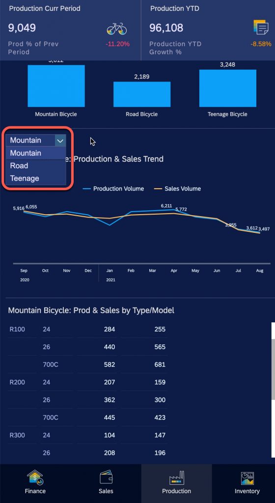
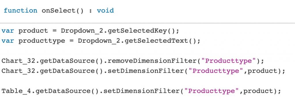
Use the following script to get the value from the selected item and filter the related charts.
Of course, compared with standard input control, using dropdown list will need some additional scripts to interact with the charts. But obviously, using dropdown list can provide more flexibility for your application, since it can not only reflect dimension members, but also other types of selections, such as dimension names or different scenarios, so the charts can be adjusted on the runtime which is not supported when using responsive page of story.
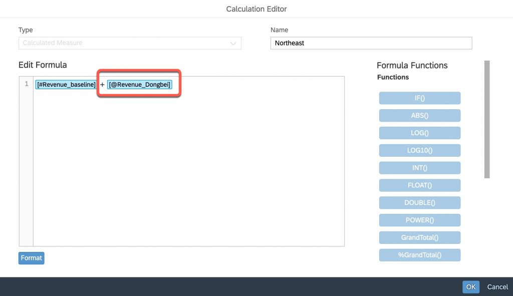
2.3.2 Slider
By using slider in the application, user will be able to run some simulation when reviewing the dashboard.
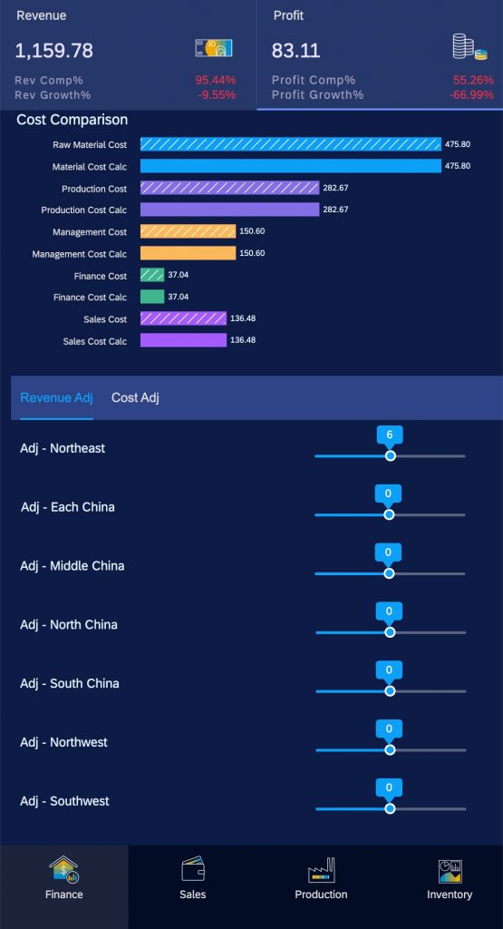
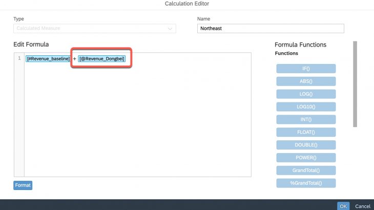
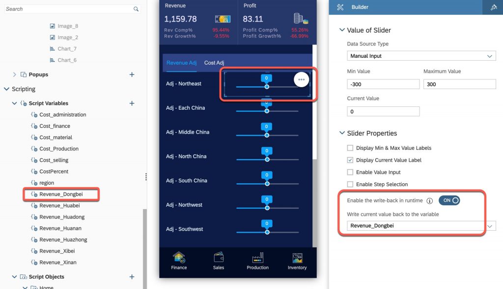
To achieve that, a corresponding script variable needs to be created. And when adding a slider, turn on the write-back setting and map the slider with the variable. So in runtime, the variable will be updated accordingly, and the value can be used in calculation by either calculated measure of scripting.
In this example, this variable is then used in a calculated measure as the simulation result:
2.3.3 Popup dialog
In this example, user can click one line of a table widget, and a popup dialog will be shown.
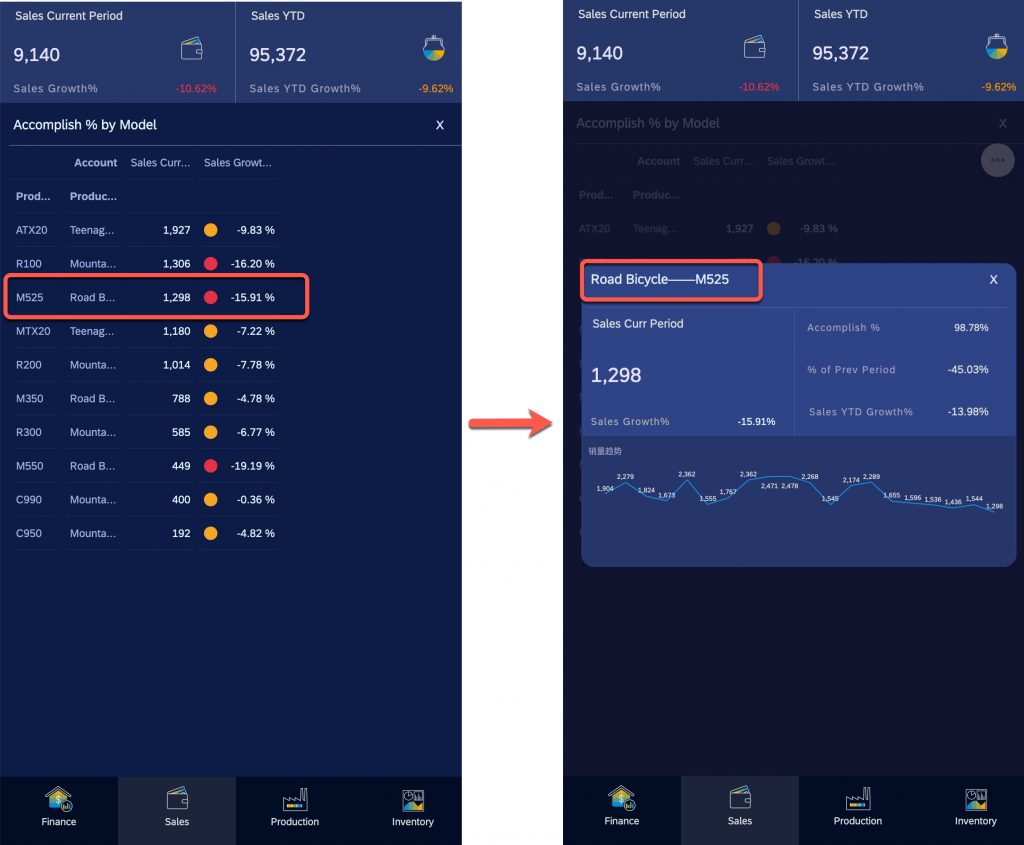
One type of widget only supported in analytics application is the popup dialog. But using popup dialog in mobile application may face some limitations since the position of this popup dialog can not be customized.
In this example, the flow panel is used to simulate the popup dialog. The idea is to create a separate panel (“SalesPopup”), and for this panel, set the background color with 80% of Opacity. So when this panel is displayed, the content of previous panel (table widget) can still be partially visible.
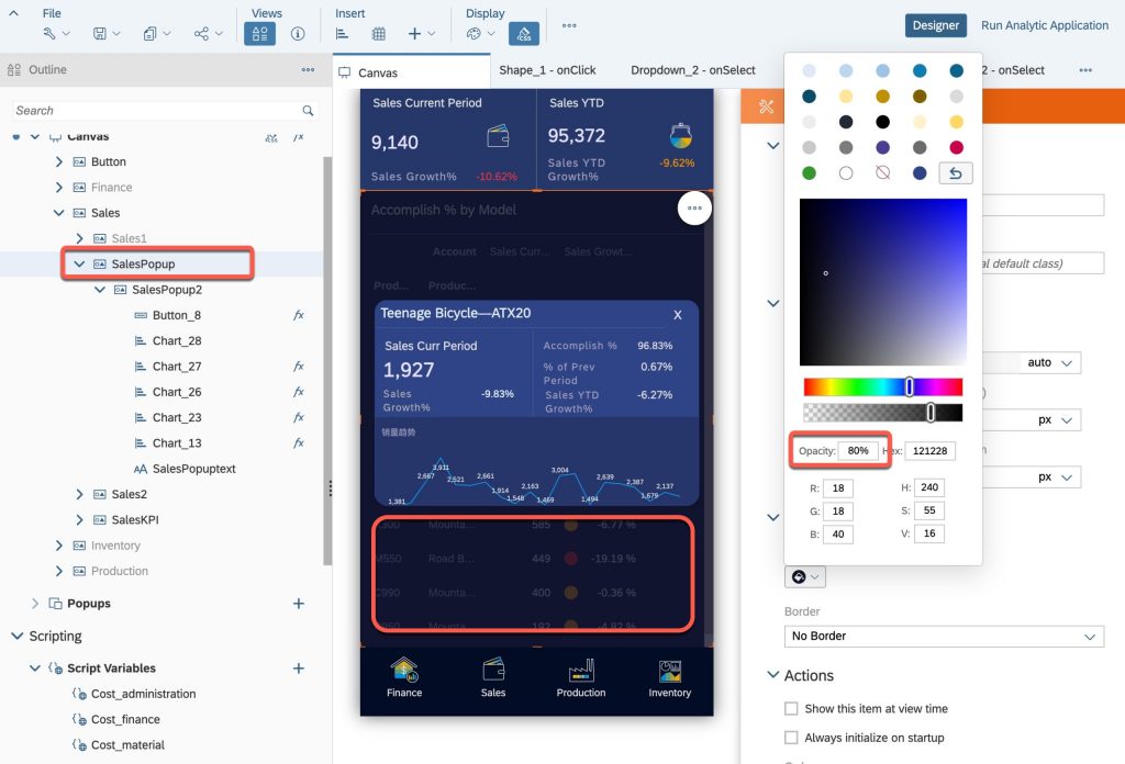
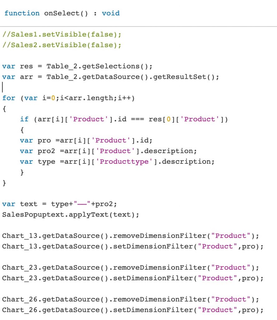
A smaller sub panel can be added to show some detail information for the selected line. To achieve this, a parameter should be passed to this sub panel from the table. The below script shows one possible way to pass the parameter.
3 – Best practice of design a mobile application
3.1 – UX Design
Due to the difference of screen sizes and user interaction, the design of a mobile application could be different with the ones on desktop. So if customer has high expectation of mobile user experience, it would be better to design a dedicated mobile application instead of sharing the same application on both desktop and mobile.
- It may not be a good idea to put everything into one single mobile application. Designer should focus on the key KPIs which are most needed for a mobile scenario.
- Using panel to combine a set of widgets which need to be shown or hidden at the same time. It would make it easier for designing and further maintenance.
- Pay attention to the color management for a unified user experience. Don’t forget the canvas background which should be the same with the panel background.
- Choose the appropriate chart types which fit with the mobile devices
3.2 – Performance
Business users normally will have higher expectation for the performance on mobile compared with desktop. So the performance tuning is also very important for designing a mobile application. Below are some tips regarding the performance best practice.
- Load invisible widgets int the background
- Check this application setting to ensure invisible widgets are loaded in the background
- Disable the setting “Show this item at view time”
- For the panels which are not needed for the first load, enabling this setting will cause additional loading time. Use ‘setVisible’ method when they’re needed.
- This is also applicable for some charts/tables which are only needed for data management.
- Only execute needed scripts for initialization
- Differentiate the features and decide which of them are actually needed when opening the application. Remove those unnecessary scripts from initialization and move them to the place when a certain user interaction is triggered.
- Disable the setting “Planning Enabled” and “Enable Explore”
- Data entry and Explore are most likely not needed on a mobile device. Disable these two settings may save some time.
- Pause refresh and Data refresh option
- Choose the appropriate option for the data refresh and combine with pause refresh API to improve the performance in certain cases
- Remove console.log for the final version
- The console.log is very useful for debug when design the application. Please remember to remove or comment these scripts for the final production version.


