This is the first part of my mini blog series where I will show how to model and consume data in SAP Analytics Cloud. I have decided to use data sets coming from Coronavirus/COVID-19 area and hopefully you might use it in your area of work as well.
In order to do this you’ll need following:
- SAP Analytics Cloud (trial, demo or productive tenant)
- COVID19 data sets
- Time
Images in this blog post are the screenshots that I have made. Data sources that I have used are available (at the time writing this blog post) on
SAP Analytics Cloud is our full blown analytics platform that enables you to make end-to-end decisions with all analytics capabilities in one place. By all we mean BI, planning & predictive/ML in one, single solution. No other vendor has business intelligence (BI), collaborative enterprise planning, and augmented analytics in one platform built for software as a service (SaaS). SAP Analytics Cloud allows you to gain enterprise-ready insights and take action within your business processes. Furthermore we can make smarter decisions faster with artificial intelligence (AI)-driven insights.
In my case I will create & use planning models in SAP Analytics Cloud, but you can also work just with an analytical model.
USE CASE
Let’s first define the business use case that we plan to work on. This is also super important in your non COVID-19 related scenarios, since every platform has several different options how to get to the finish line, so we need to be focused on the outcome. Otherwise it’s just another feature&function POC, pilot, etc.
In our case I want to track the Coronavirus outbreak, by following different KPIs or measures. To be more specific I would like to track the number of confirmed cases, deaths, recoveries, mortality rate. etc. Furthermore I would like to track the progress or dynamics of the disease and how it spreads in different countries. To make my analysis easier, I would also like to visualise data on a map. Since we also need to monitor how it spreads from day to day, I need to make sure to have data organised on a daily basis. At the end of the day, I need to know if I can go to the supermarket or should I wait for better times.
First draft result could look something like this:
Overview page:

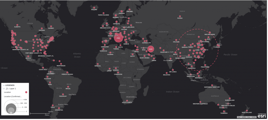
GEO View:
In general we have to perform following tasks:
- build the model by uploading data into SAP Analytics Cloud,
- transform data,
- finalise building a model,
- create story to visualise our data,
- use insights to improve our life.
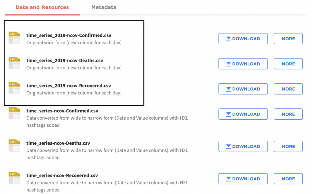
We will work with three different files as specified below (confirmed, deaths, recovered):
We could load them into 3 separate models and then use blending functionality in SAP Analytics Cloud, but for end business user it is easier to consume data just from one model. So we plan to load 3 data sets into one model. All three data sets have the same granularity.
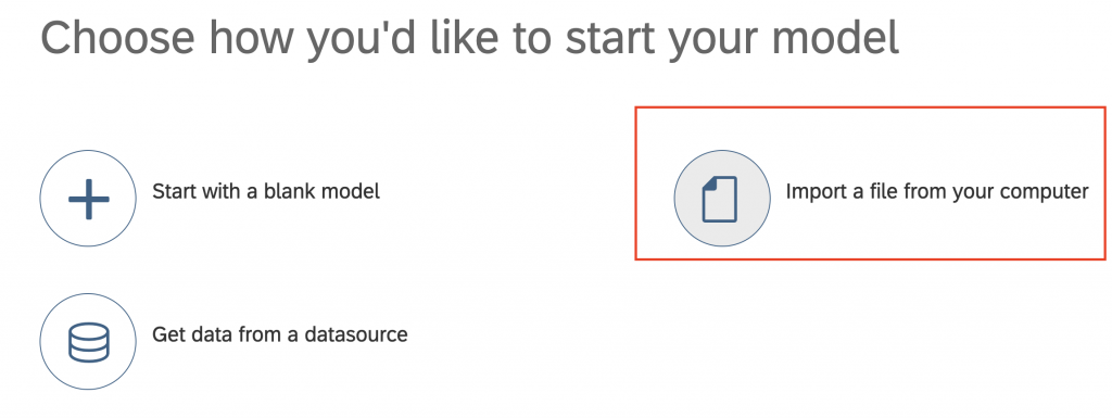
Upload data into SAP Analytics Cloud
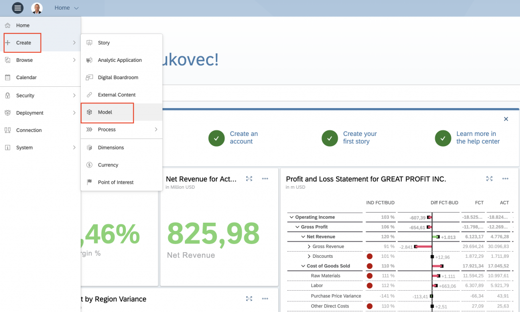
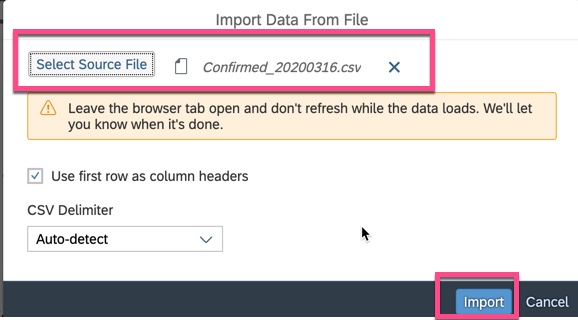
Select Create>Model>Import a file from your computer and use the file with confirmed cases that you have downloaded from the site above.
After the data is uploaded, this is the structure of the data set that we can see in SAP Analytics Cloud.
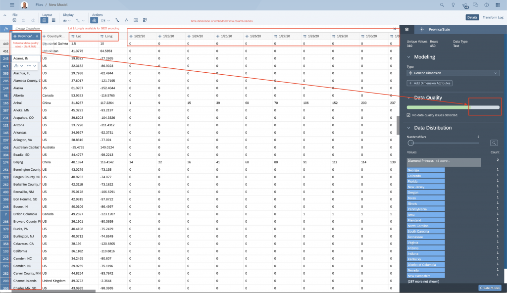
There are several things that are worth pointing out before we proceed with data transformations & modelling.
- First column “Province/State” might have some data quality issues – blank values
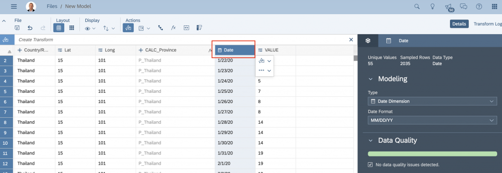
- Date dimension is currently part of the column names. Furthermore, we can expect that every time a new slice of data is added into the data set for a new date, additional column is added at the end of the data set.
- We do have LAT & LONG available in the data set that we can use for GEO encoding (and visualising data on a map).
- Create GEO hierarchy with Province & Country data
- Data is organised as BALANCE in the data set, which means that in this case the number of Confirmed Cases is defined per every date. In that case we would get a complete NONSENSE if we would aggregate data across DATE dimension.
AD1 – Fix data quality problem of “Province/State” column: Since we plan to use “Province/State” as Location ID in our GEO encoding, we need to make sure that this column doesn’t contain any blanks. After further inspection of the data set, we can clearly see that not all countries have data available on the level of province/state. In order to manage this exception properly, we’ll implement a “business rule” where we define a new column called “CALC_Province”. In case the value in “Province/State” column exists we take this one, otherwise we take the value of column “Country/Region”. We’ll use IF statement as shown below. In for better visibility/readability and order to avoid duplicate names in PARENT-CHILD hierarchy and during GEO encoding later on, we will also add “P_” prefix (as Province).
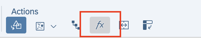
Create new calculated column:
Add IF statement & press ok after you’re done:
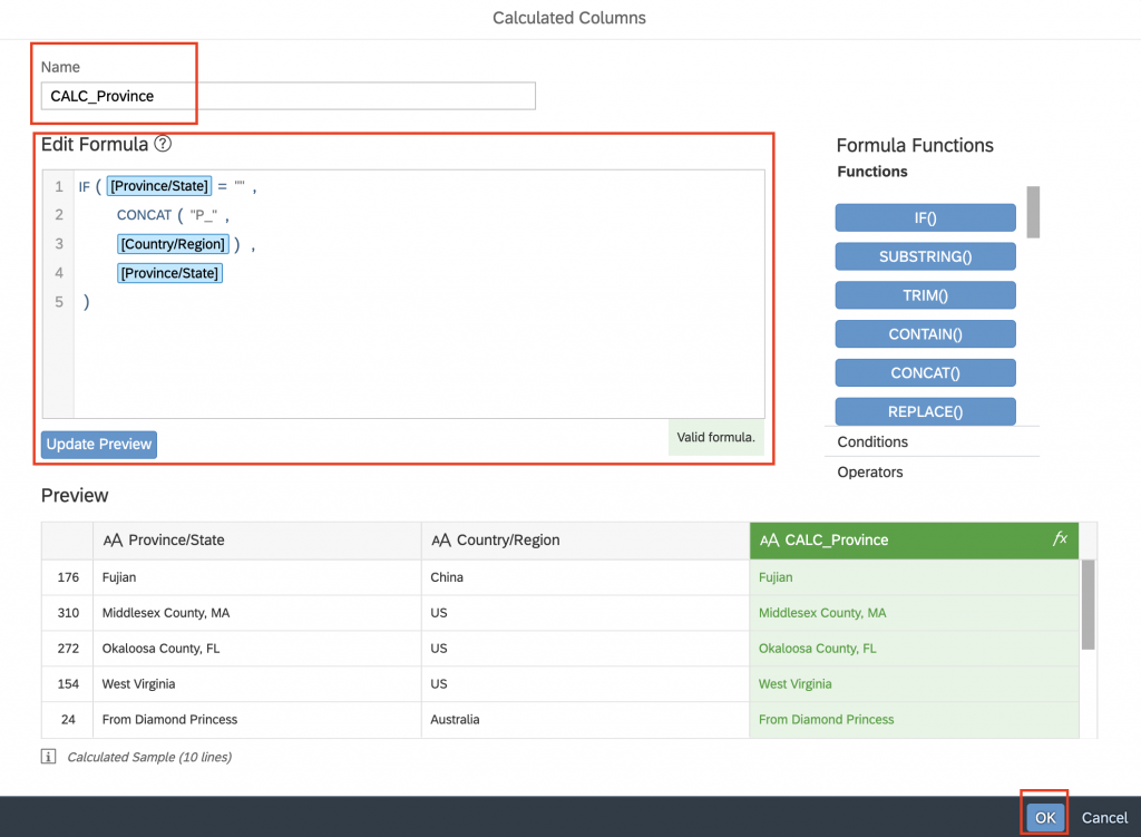
IF([Province/State]=””,
CONCAT(“P_”,
[Country/Region]),
[Province/State]
)
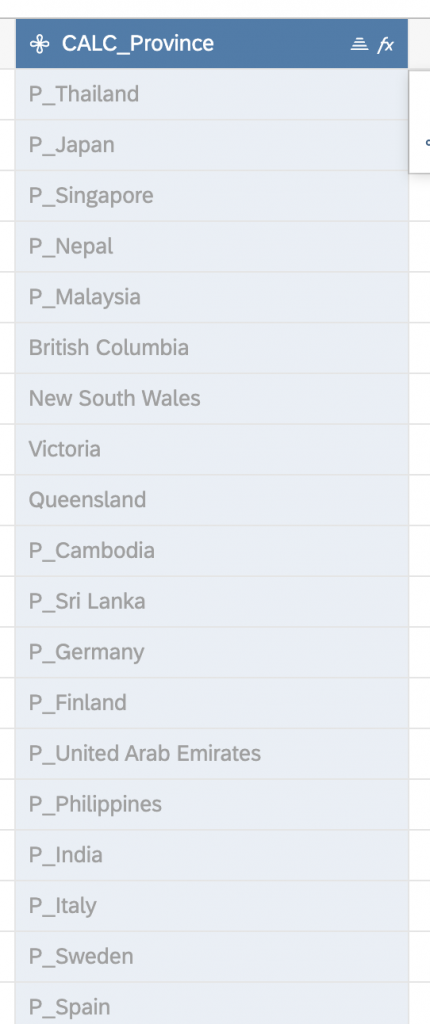
New calculated column is created as shown below:
AD2 – Transpose Date columns to rows: Since the date dimension is currently embedded into column names, we need to use a TRANSPOSE function in order to move data into rows of one date column.
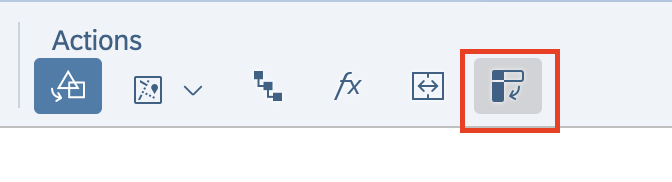
Select “Transpose Columns to Rows”:
In the “Transpose” panel first select all fields and then deselect top 4 fields (Province/State, Country/Region, Lat, Long) and (IMPORTANT), the last field of the data set – calculated column CALC_Province
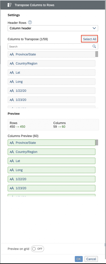
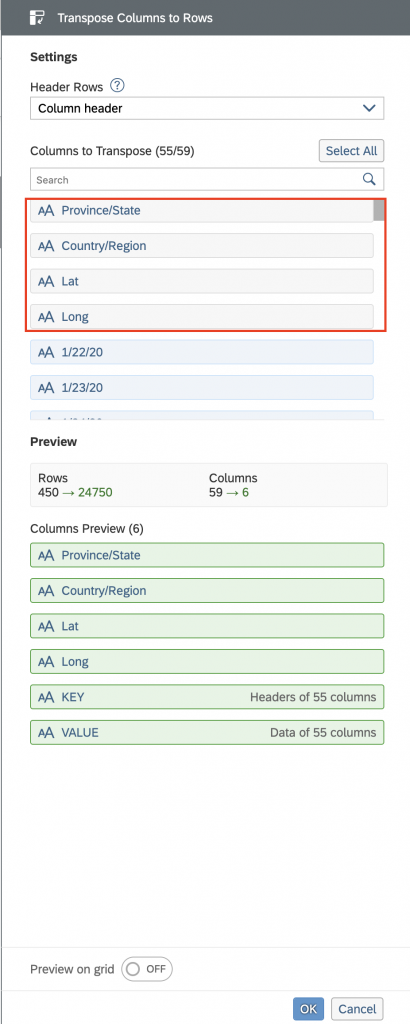
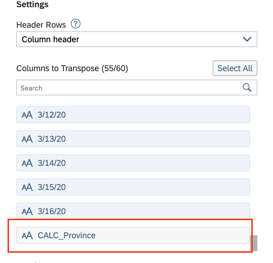
You can also activate “Preview” and inspect if the transpose works in expected way:
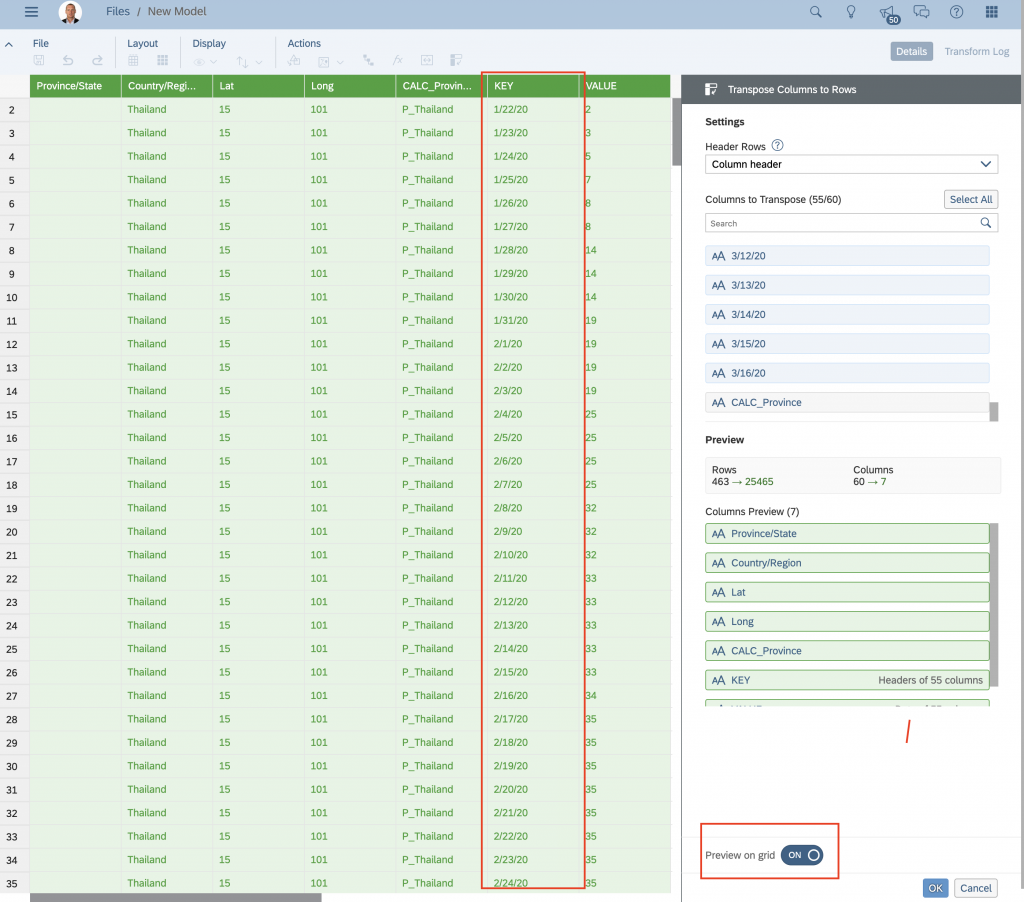
Press OK when you’re done and transformation will be done. We can also add more user friendly description for our Date dimension and make sure that system has recognised it as DATE dimension.
As you can see from the picture below, SAP Analytics Cloud has properly recognised dimension type as DATE, so we only need to add description to it. Double click on column name “Key” and rename it to “Date”:
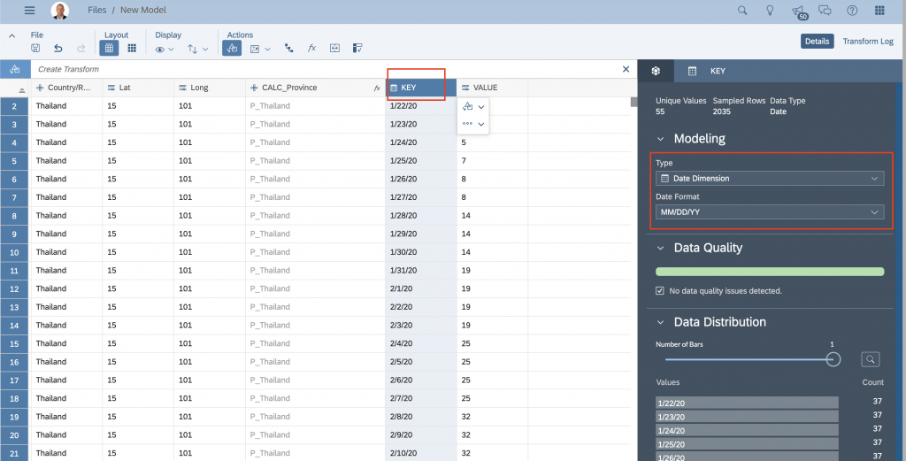
Result after renaming the “Key” column to “Date”:
AD3 – Preform GEO encoding by LAT/LONG: In this step we are going to add GEO encoding into the model. That way we’ll be able to visualise data on a map when building a story in SAP Analytics Cloud.
Select “GEO Enrich by Coordinates”:
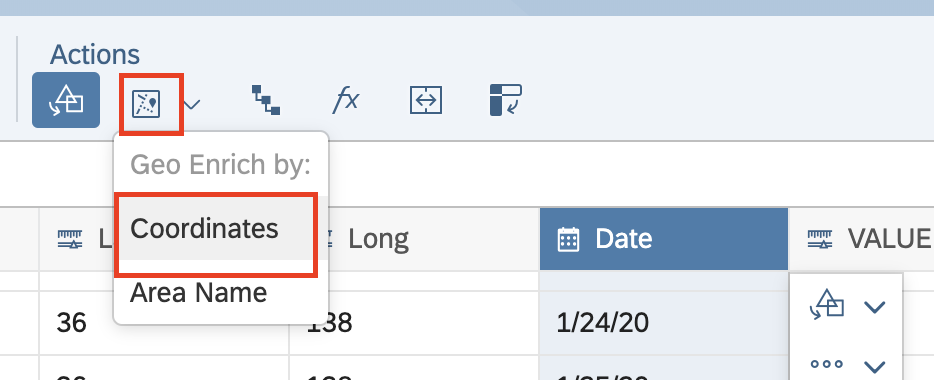
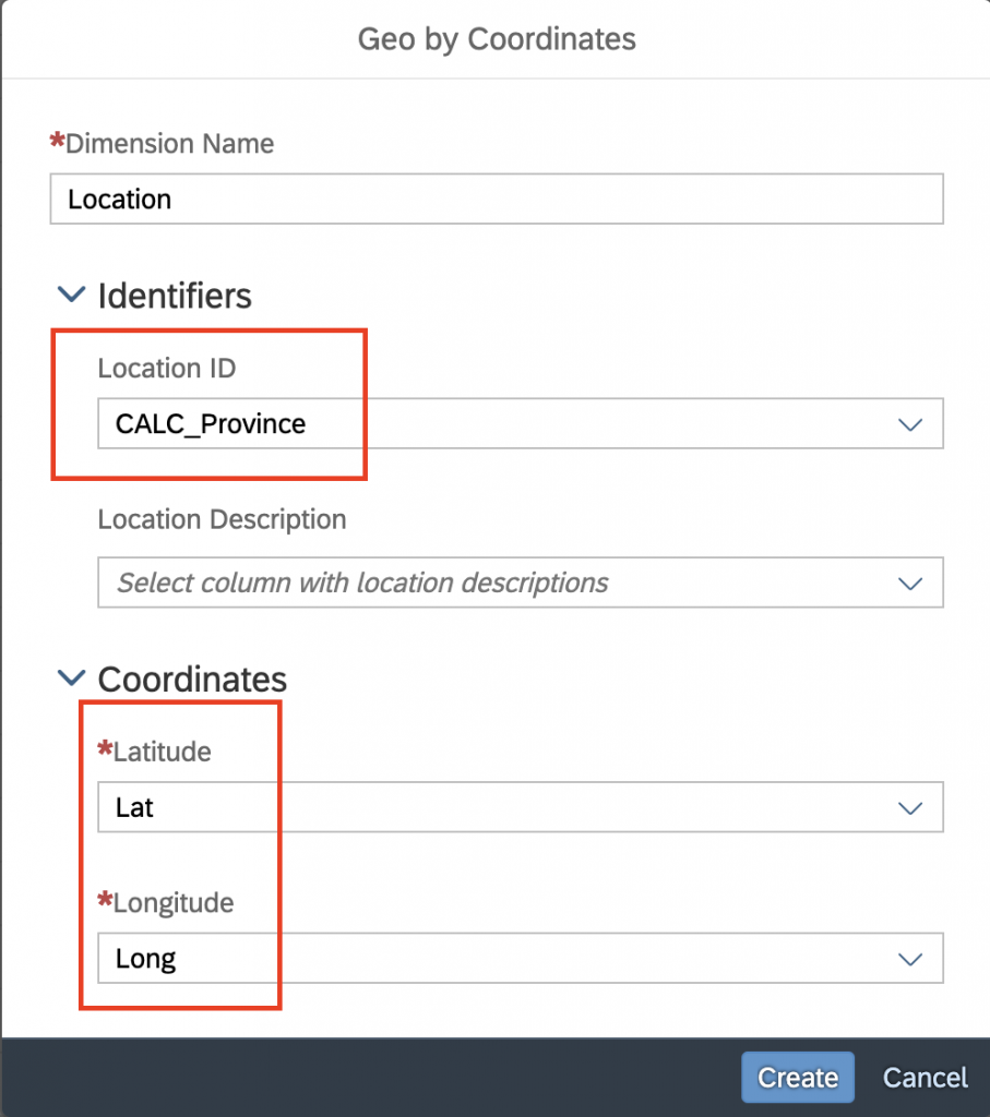
in the pop-up menu please select/define fields as shown and press “Create” when done:
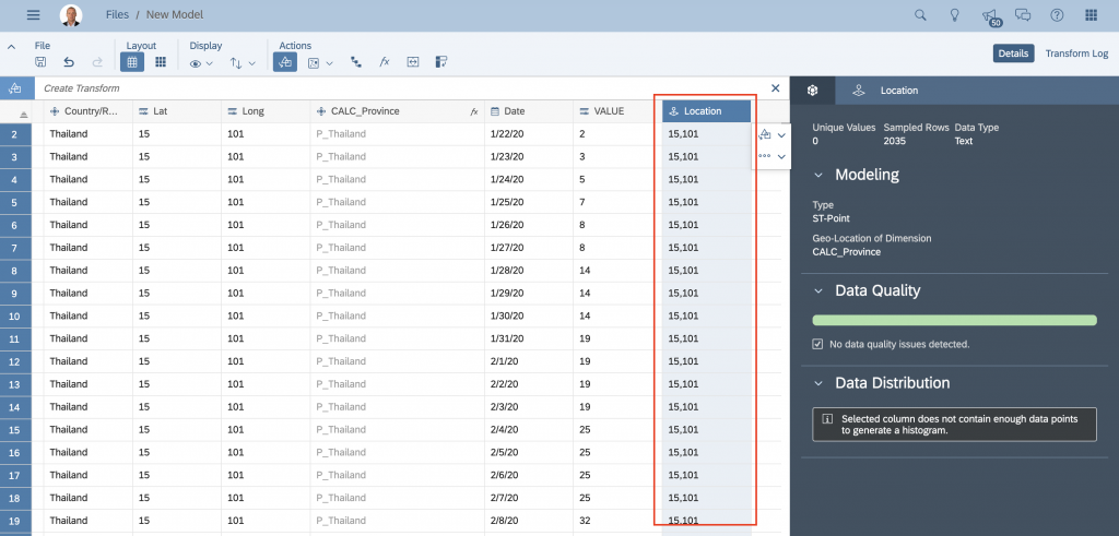
A new “GEO” column called “Location” has been created as shown below including the GEO encoding of all locations in the backend, which means we’ll be able to use this data on a GEO map.
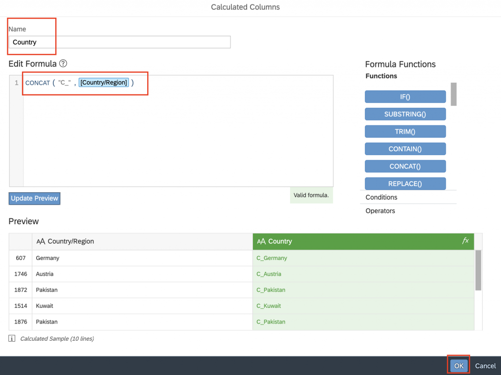
AD4: Create GEO hierarchy: If data allows (meaning this information is available), we can also create hierarchy within a certain dimension. SAP Analytics Cloud allows us to create PARENT-CHILD or LEVEL-BASED hierarchies. In our case I will create a PARENT-CHILD hierarchy with two columns “CALC_Province” and the copy of “Country/Region”. I will do this because in some use cases it might make sense to obtain a parent of hierarchy also as a separate dimension, that way we can use it as a stand alone dimension in charts/tables if needed.
Create a new calculated column as CONCAT between “C_” and “Country/Region” column and name it to “Country”:
In the next step I will define “Country” as parent of “CALC_Province” dimension:
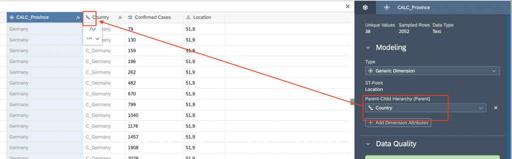
If everything was done properly, the icon on the left side of the “Country” has changed to a hierarchy icon.
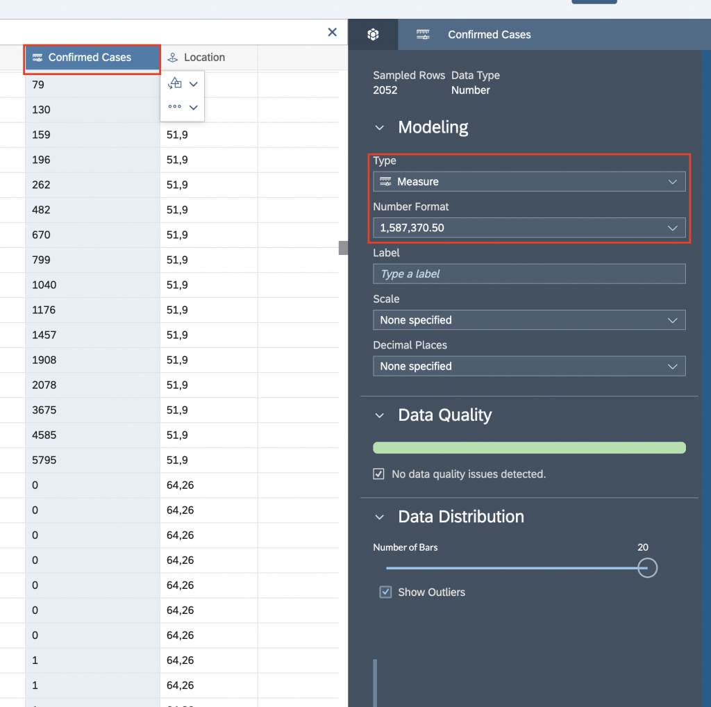
We will also rename the “VALUE” column to “Confirmed Cases” and check if SAP Analytics Cloud has defined a correct type to it. the column needs to be defined as measure:
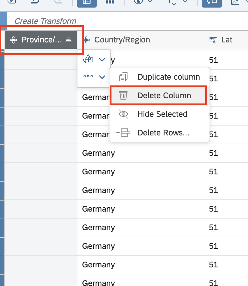
Furthermore you can also delete the original column “Province/State”, because we have created a calculated column “CALC_Province” that has a better quality of data in it.
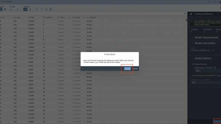
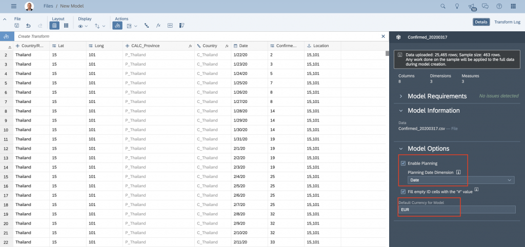
Before I create a model, I will also make sure that I create a planning model (no problem if you don’t have this option available, just ignore it. It means that your SAP Analytics Cloud environment does not come with planning license enabled. This is a separate purchase.). I will also define EUR as my currency. Note that for the time being we don’t have any measures that would carry currency information, but in case we would like to bring this into the model we can define it.
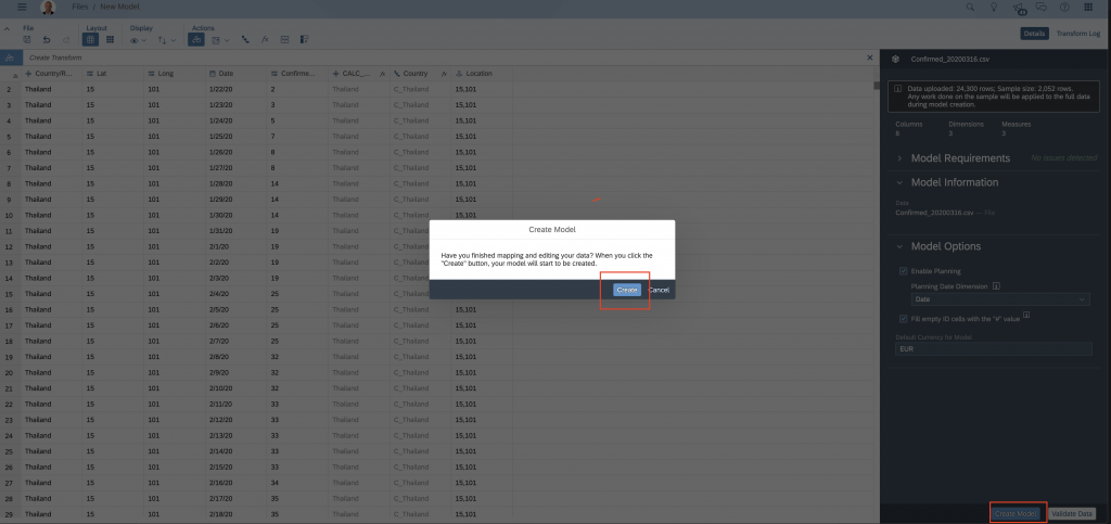
When finished, press “Create” and the model will be created:
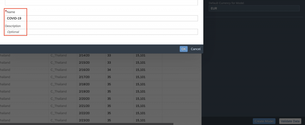
Save the model the desired loaction:
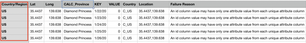
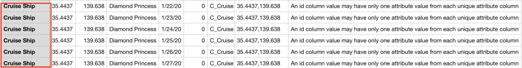
After you save the model, it is available for further inspection or you can just use it to visualise the data from it. As you can see, we have a message that 220 rows were rejected. We are going to deal with it later. But just a quick look into the REJECTED file gives us an understanding what is the reason for it.
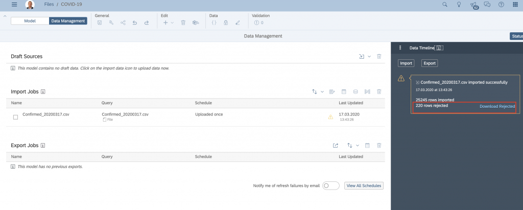
REJECTED file content:
Before I do any additional changes in the model I always like to explore the data from newly created model.
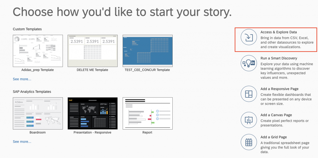
Create a new story and select option to explore the date. this will give us the possibility to select/filter the data in a simple way and SAP Analytics Cloud will provide chart suggestions:
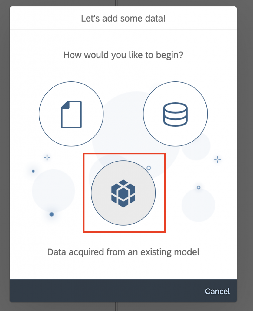
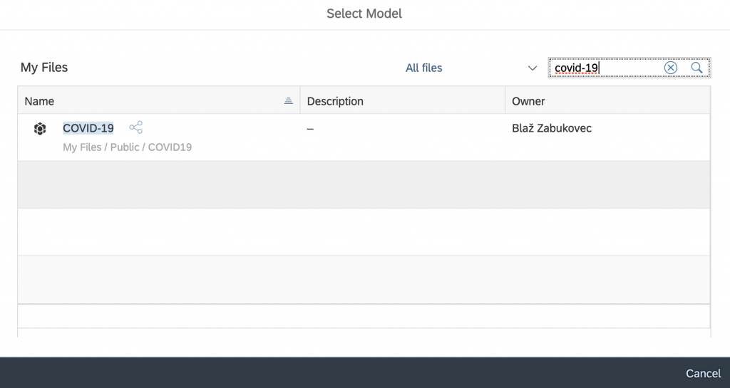
Select “Data acquired from an existing model” and then select the model that you’ve just created:
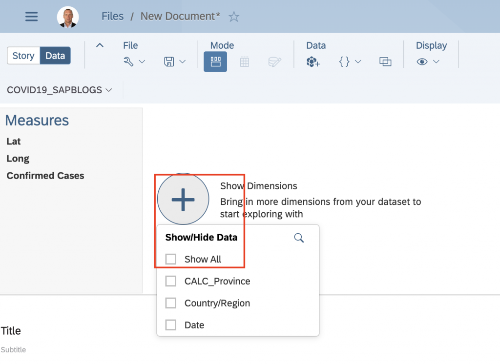
As you can see from screenshot below, we are now in explorer mode, where we can “search for the needle in the haystack” in a simple and easy way.
First we are going to add all available dimensions into our view.
In the next step we’ll select on the measure “Confirmed Cases” and also select Date dimension:
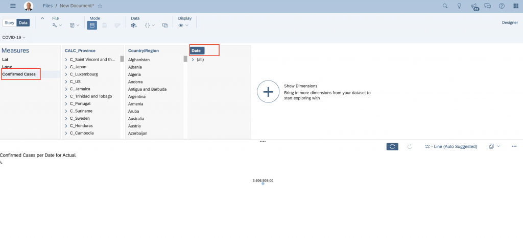
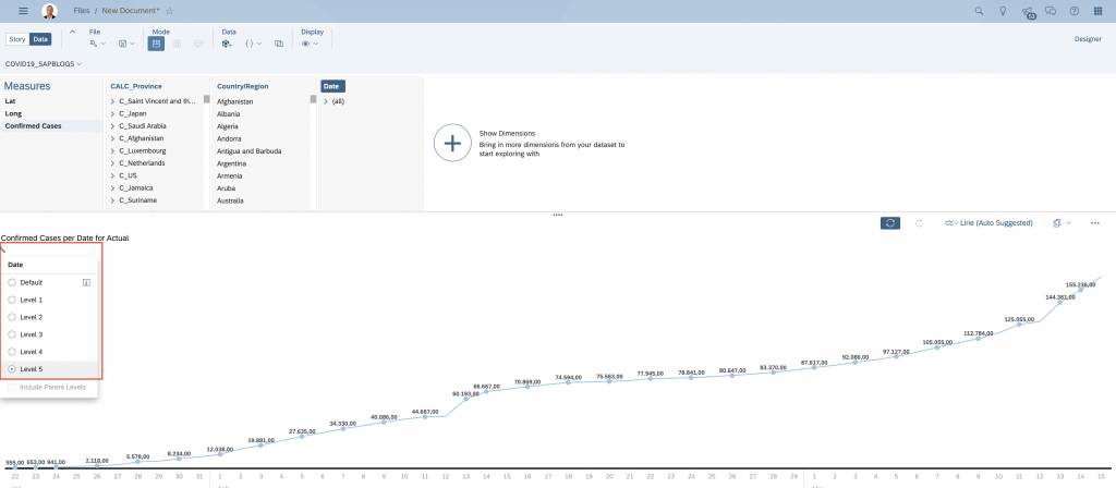
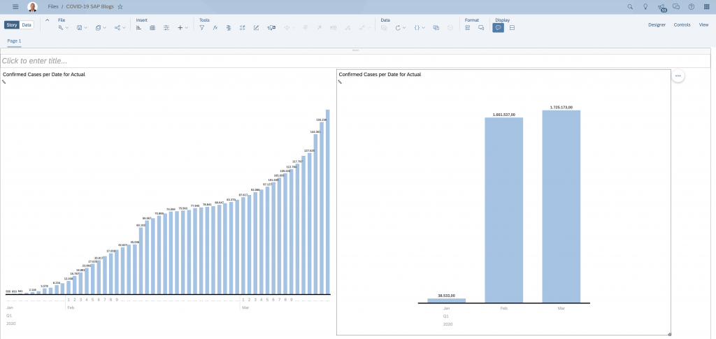
As you can see the value of “Confirmed Cases” is around 3,6 mio which is way above the official number that we have (please note this was done on 17.3.2020). If we drill down to the day level, we get more appropriate numbers. So obviously we need to make additional tweaks to the model so that aggregation would work correctly across the date dimension. Remember, number of COVID-19 cases in our data set is organised as balance so we need to define an EXCEPTION AGGREGATION in the model.
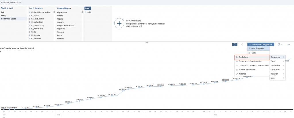
Just before we jump into the modeller let’s build a simple story that will contain our chart that we plan to use to verify if the tweaks done in the model were correct.
Change the chart type to Bar/Column:
and move the chart to “Page 1” of the Story:
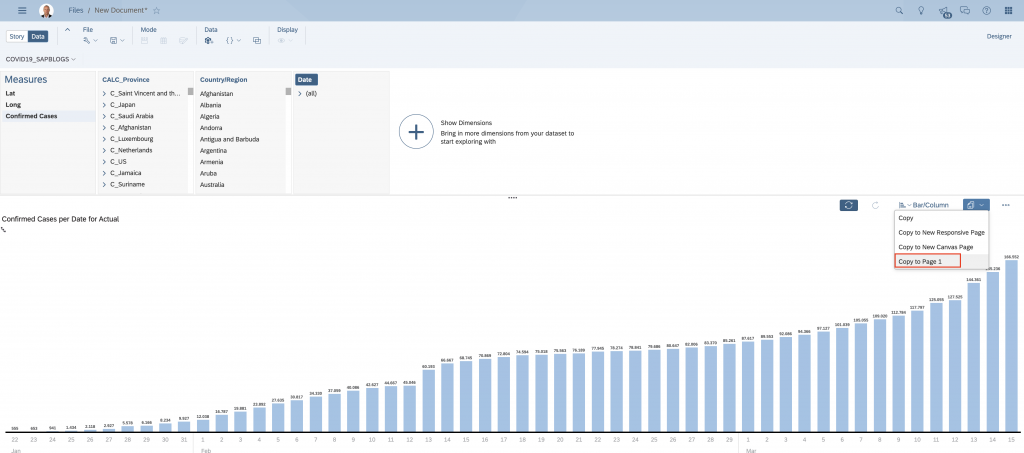
Resize the chart and use CTRL-C and CTRL-V to copy/paste the chart:
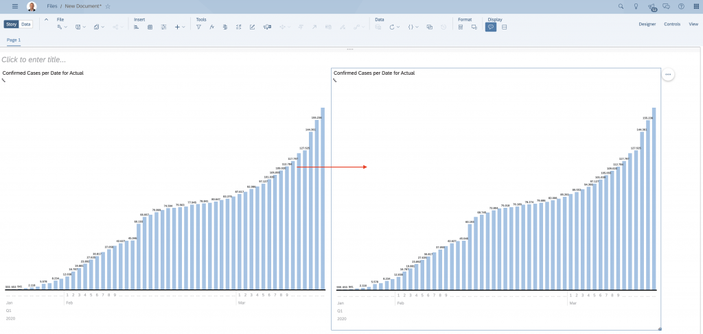
In the second chart drill-up to the level of month and save the Story.
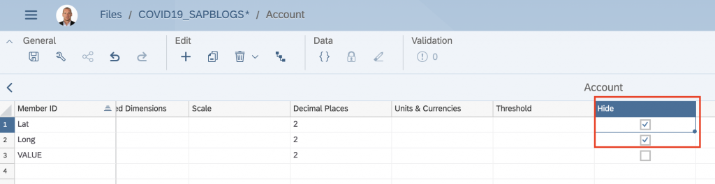
Let’s open again our model and adjust some settings. Go into the ACCOUNT dimension. Please note that ACCOUNT dimension contains all measures defined for model.
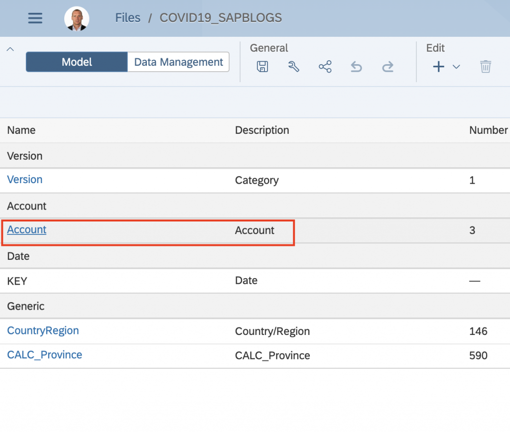
We will change the setting of exception aggregation for Confirmed Cases measure. The exception aggregation type will be defined as LAST and we’ll select Date dimension as the exception aggregation dimension.
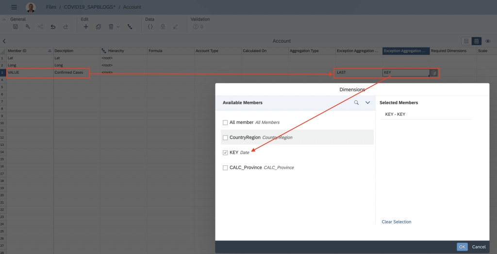
Please note this is a powerful capability that we can use to properly work with NON-ADDITIVE and SEMI-ADDITIVE measures. in our example “Confirmed Cases” is a SEMI-ADDITIVE measure which means it can be aggregated across all dimension and their hierarchy except the time dimension. Similar to this measure we also have many others like Inventory levels, Subscribers, Balance sheet items, etc.
I will also hide LAT and LONG measures since i don’t need them in my analysis.
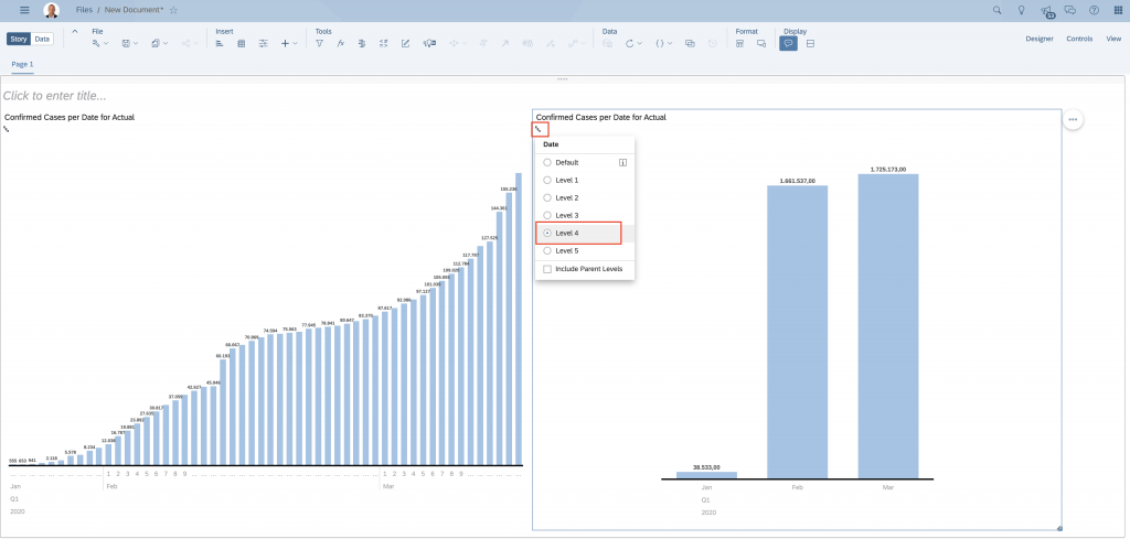
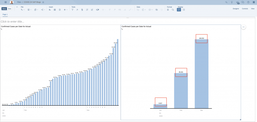
After we save the changes, we can observe the difference in BEFORE and AFTER chart:
BEFORE:
AFTER:
Stay tuned for Part 2 of the blog series where I will show how to bring other data (Deaths, Recovered) into the same model, deal with rejected rows and show how to build some analysis.


