Not sure how to visualize data in AppGyver? This is just the blog for you.
The goals of this blog are:
- To demonstrate that app creator who doesn’t have JavaScript experience can also easily use this chart component, even though it requires custom JavaScript codes.
- this blog can be referred as a documentation on how to use the Chart components in AppGyver. (I did not find official documentation in SAP or AppGyver webpage)
Data visualization component in SAP AppGyver
As of this moment that I’m writing this blog, “D3.js/Google chart” is the only component to display multiple forms of charts in SAP AppGyver.
AppGyver’s view components are usually easy to use and input properties are self-explanatory. However, input properties of “D3.js/Google chart” are not so straightforward and will probably leave you with questions marks. This is because the view component requires specific format of chart data and chart definition.
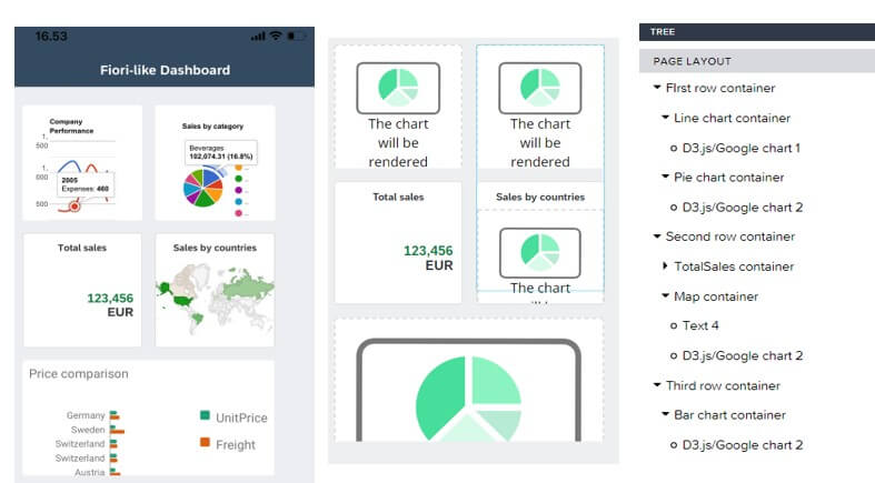
No need to worry though. Follow the steps below and try out different kind of charts available from Google chart. If you use this tutorial as a template, you’ll find it really NOT that complicated to use and soon you might be able to create a Fiori-like dashboard like this one
If you are interested in technicality of it, visit Google Chart and see the different kind of charts it supports, the data format and the parameters to modify the charts appearance.
Now without further ado, let’s dive into the hands-on exercise.
Bar chart
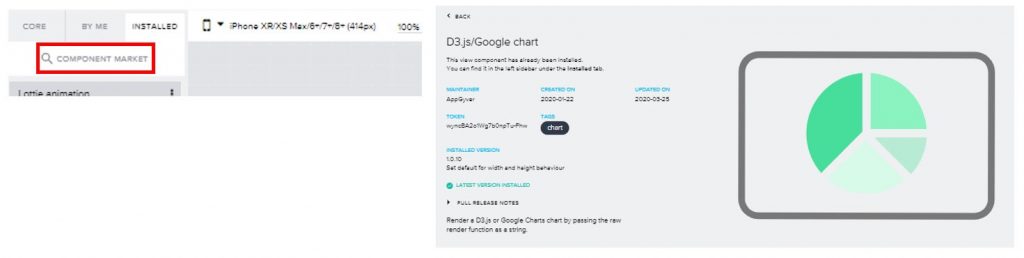
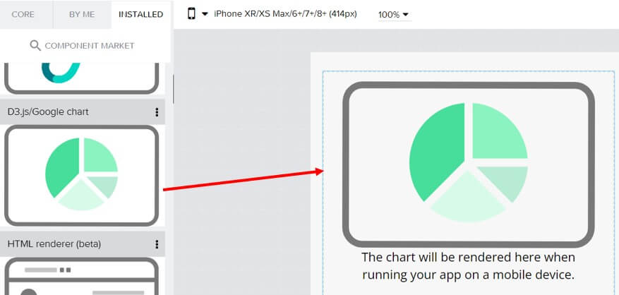
Step 1. Downloading component from market place
Go to the left side pane and select “Component Market”. Type “chart” and “”D3.js/Google chart“” should come up. Click install and the status of the component should change to “Latest version installed”. Go back to the canvas and now switch to Installed tab. Drag and drop the component into your canvas. Save.
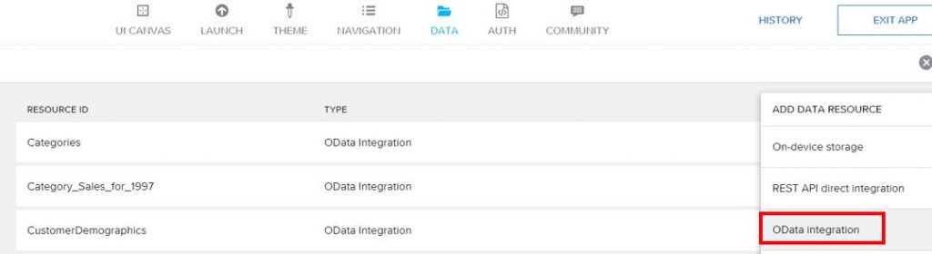
Step 2. Adding data source
In this tutorial, the world famous Northwind OData is used for its accessibility and simplicity. Go to DATA tab in the header, click Add Data Source and choose OData integration.
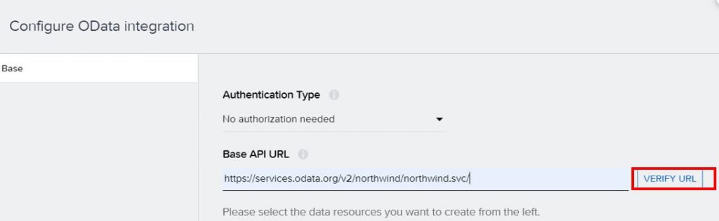
Enter “https://services.odata.org/v2/northwind/northwind.svc/” as the base URL. Very URL and all the data collection will be displayed on the left pane.
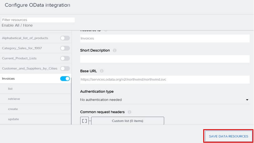
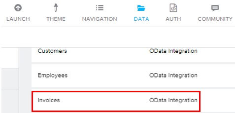
We will use Invoices for Bar chart. Save data resources.
Now the Invoice is listed as the data source. Click on the Invoice OData and choose list. Click on Run Test. If the status is OK and it returns with actual invoice data, the test is successful. CORS warning can be ignored as Northwind OData is not affected by it.

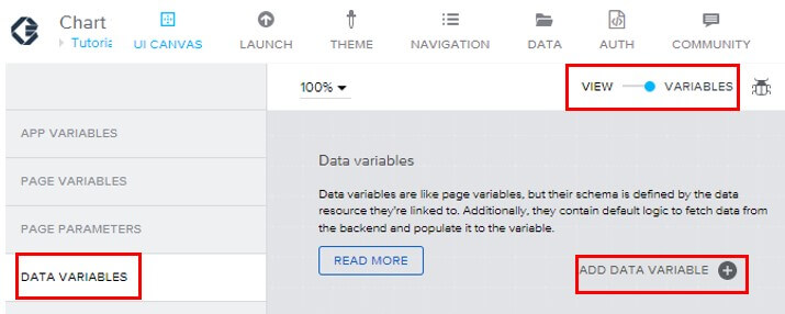
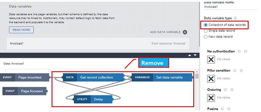
Next, go back to canvas and switch to variables. Choose Data variables and add “Invoices”. After adding it, it would look something like below. Remove the functions in the red circles for now. Save your progress.
Step 3. Adding variables and logic
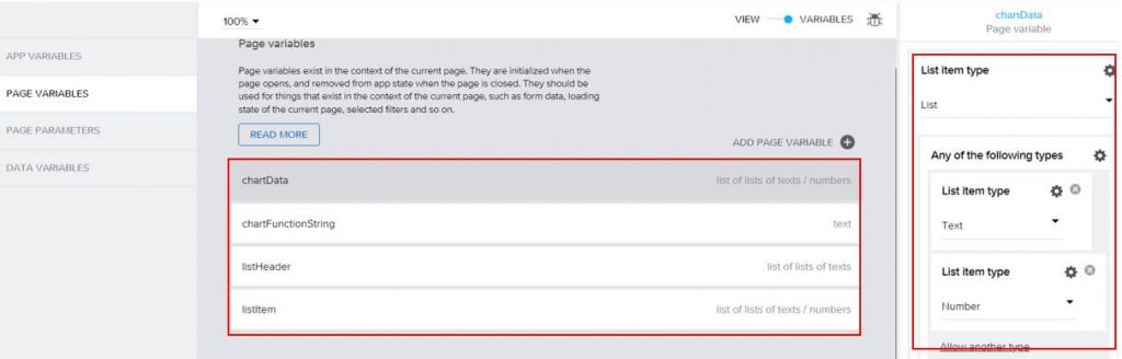
Select Page variable from left side pane and create 4 variables, “chartData”, “chartFunctionString”, “listHeader” and “listItem”. Make sure that chartData and listItem has type List of lists allowing text and number type. listHeader can only be list of lists text type because I don’t think header fields should contain any number fields.
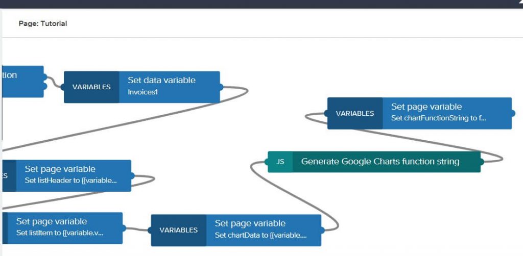
Switch back to View and open the bottom pane to add the function logic. Find “Get record collection” and “Set data variable” from left side pane and connect like so.
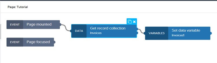
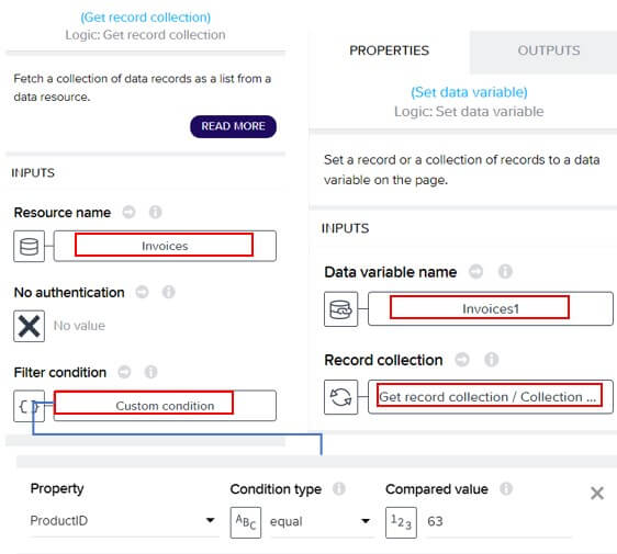
Set the properties of these functions. Invoices is set so that the data from invoices data Northwind OData(the one we tested in step 2) will be fetched. Set data variable will then set the fetched data into data variable that we defined. For the purpose of this tutorial, we will limit the data into a specific product(productID=62) to keep the data volume small. Save your progress.
Next, we will transform our fetched data set into List of lists format. Add three new “Set page variable” functions and connect them like so.
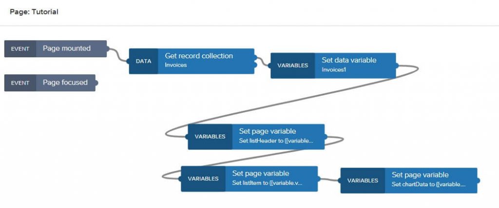
In the first Set page variable, set the header fields to listHeader.
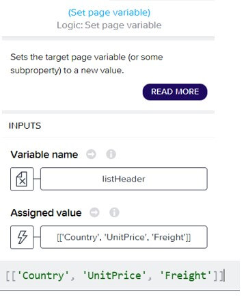
[['Country', 'UnitPrice', 'Freight']]
In the second Set page variable, set the invoice data to listItem. The formula is mapping the data from the data source Invoices into page variable listItem. This is necessary because Invoices is in the list of Object format and the AppGyver’s chart components only accepts list of list format(and that’s why we defined page variables with such data structure). To break down the formula, it’s getting all the data from fields “Country”, “UnitPrice” and “Freight” and pass them to listItem in list of lists structure. You can replace the fields name if you want to test with other fields.
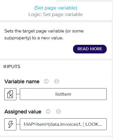

MAP<item>(data.Invoices1, [ LOOKUP(item, "Country"), NUMBER(LOOKUP(item, "UnitPrice")), NUMBER(LOOKUP(item, "Freight")) ] )
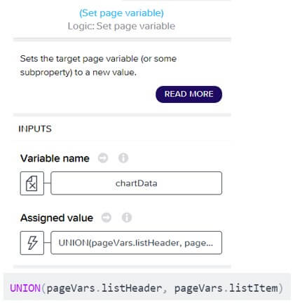
In the third Set page variable, we will combine the header data and item data into one list of lists variable, which is chartData. UNION is the formula function to do this job. Save your progress.
Step 4.Adding JavaScript code
Add JavaScript function from left pane and add Set page variable to follow. In the JavaScript function, paste the code below and make sure to add an output that’s in text type.
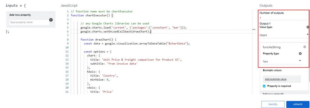
// function name must be chartExecutor
function chartExecutor() {
// any Google Charts libraries can be used
google.charts.load('current', {'packages':['corechart', 'bar']});
google.charts.setOnLoadCallback(drawChart);
function drawChart() {
const data = google.visualization.arrayToDataTable("$chartData");
const options = {
chart: {
title: 'Unit Price & Freight comparison for Product 63',
subtitle: 'from invoice data'
},
hAxis: {
title: 'Country',
minValue: 0,
},
vAxis: {
title: 'Price'
},
bars: 'horizontal',
height: 400,
colors: ['#1b9e77', '#d95f02']
};
// element ID must be chart_data_div
const chart = new google.charts.Bar(document.getElementById('chart_data_div'));
chart.draw(data, options);
}
}
// The chart component consumes the chart function as a string
const funcAsString = chartExecutor.toString();
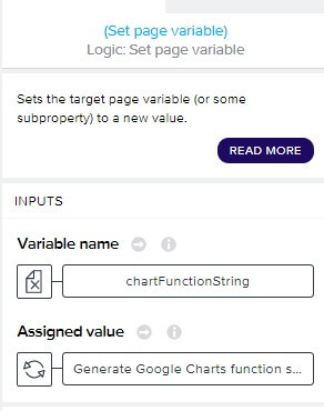
return { funcAsString }In the last Set page variable, set the output of JavaScript to “chartFunctionString”.
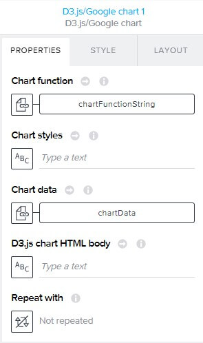
Finally, go back to the component view and set “chartData” and “chartFunctionString”.Save.
Good job! Preview your app on your mobile device and you will should get something like this. This will only work on the mobile devices.
Pie chart
In the same principle we can create other kind of charts. Let’s create a pie chart by following the steps of bar chart.
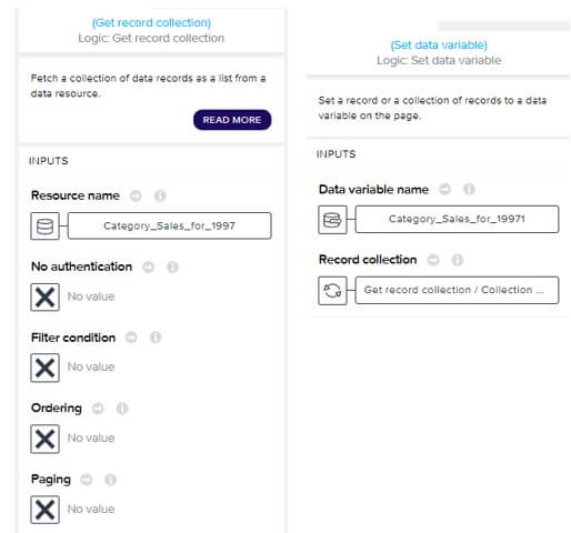
Step 1 is the same. On step 2, instead of using Invoices, let’s use dataset “Category_Sales_for_19971” from Northwind OData. Add the OData integration and data variable the same way. Next on step 3, creating 4 variables, “chartData”, “chartFunctionString”, “listHeader” and “listItem” is the same. Then add Get record collection and Set data variable. This time, use “Category_Sales_for_19971” instead of “Invoices”.
We will also change the data we are showing in the pie chart. change the header data to Category and Sales. Map these fields from data variable “Category_Sales_for_19971” to listHeader and listItem page variables.
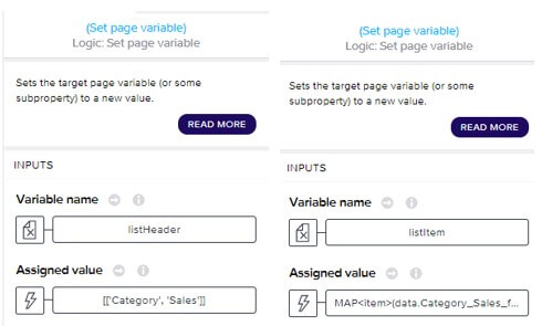
[['Category', 'Sales']]MAP<item>(data.Category_Sales_for_19971, [ LOOKUP(item, "CategoryName"), NUMBER(LOOKUP(item, "CategorySales")) ] )
Finally use UNION to combine these two variables into one list of lists variable “chartData”. This part is same as bar chart.
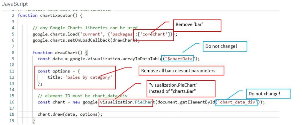
On step 4, we will add do changes to JavaScript.. Note all the changes in the red squares. Replace them with Pie chart to adapt to pie chart.
Another important thing is that never change the parameter “$chartData” and ‘chart_data_div’. AppGyver are rendering the charts behind the scenes using specifically these names. The chart will not show if these two parameters are in any other names.
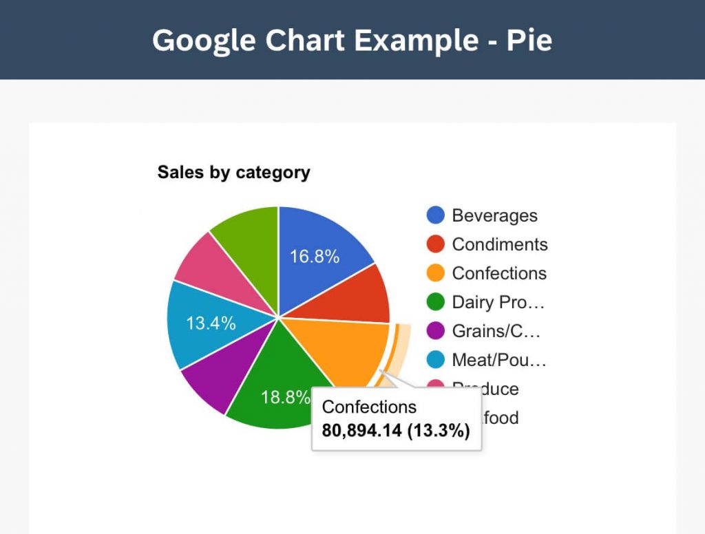
The rest of the steps are the same, Save your app and you’ll get something like this.
It’s all about adapting to Google Charts
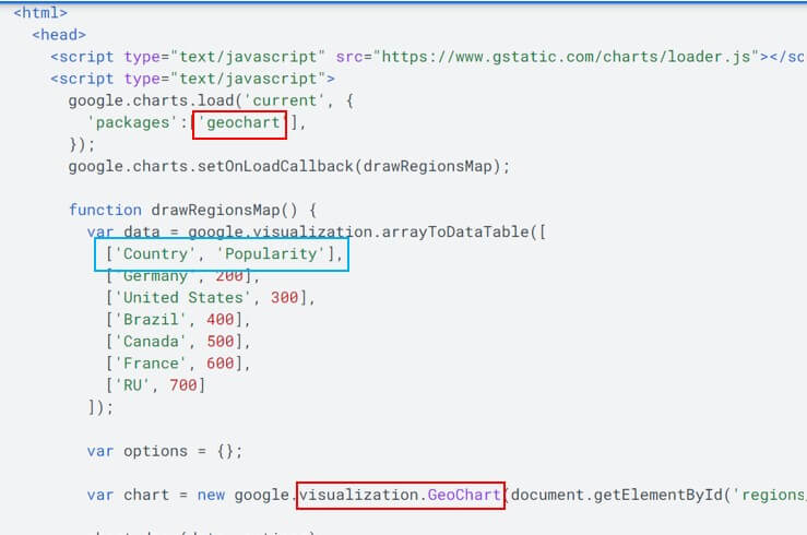
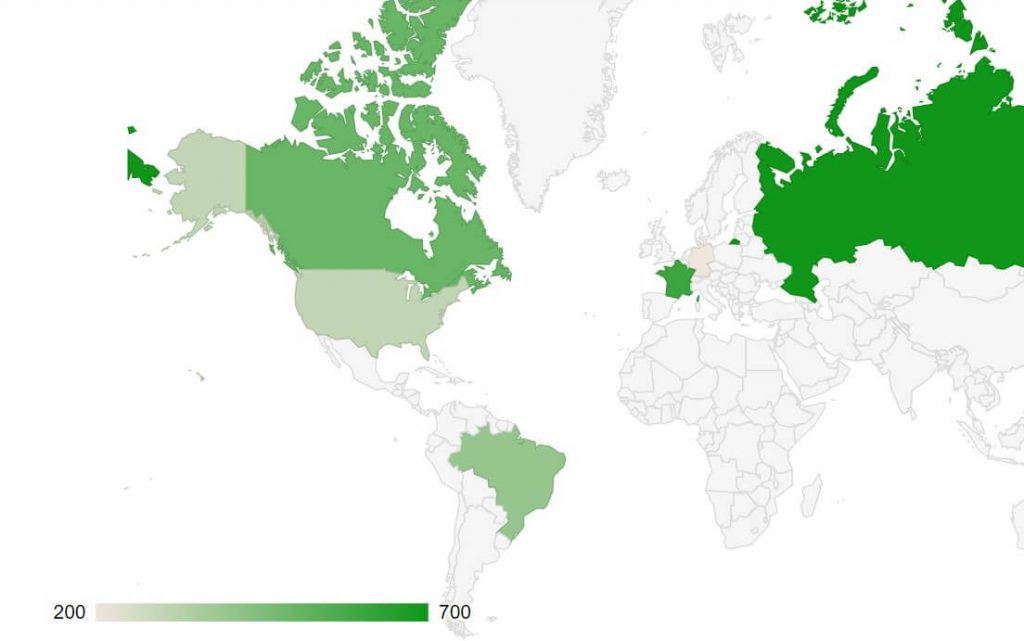
Lets take look at another chart from Google Chart. Geo chart requires JavaScript and it’s slightly different but it’s the same template. Just have to change the red squares below from the template in this blog. That’s all the change in the JavaScript code but note that Map requires its specific data structure(blue square), which is Country code and whatever numeric fields you want to show in the chart. The Google Chart example is hard coding the data that’s been fed. On the other hand, in our case in AppGyver, we have to modify the data set to listHeader and listItem because our dataset comes from OData with JSON format(and this format is interpreted as list of objects type in AppGyver).
Limitation
As of now, “D3.js/Google chart” only works on mobile devices. It will NOT render the charts on the web browser. In my opinion, this make the “D3.js/Google chart” much less attractive. Still it’s the only chart component and we should savor it.
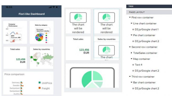
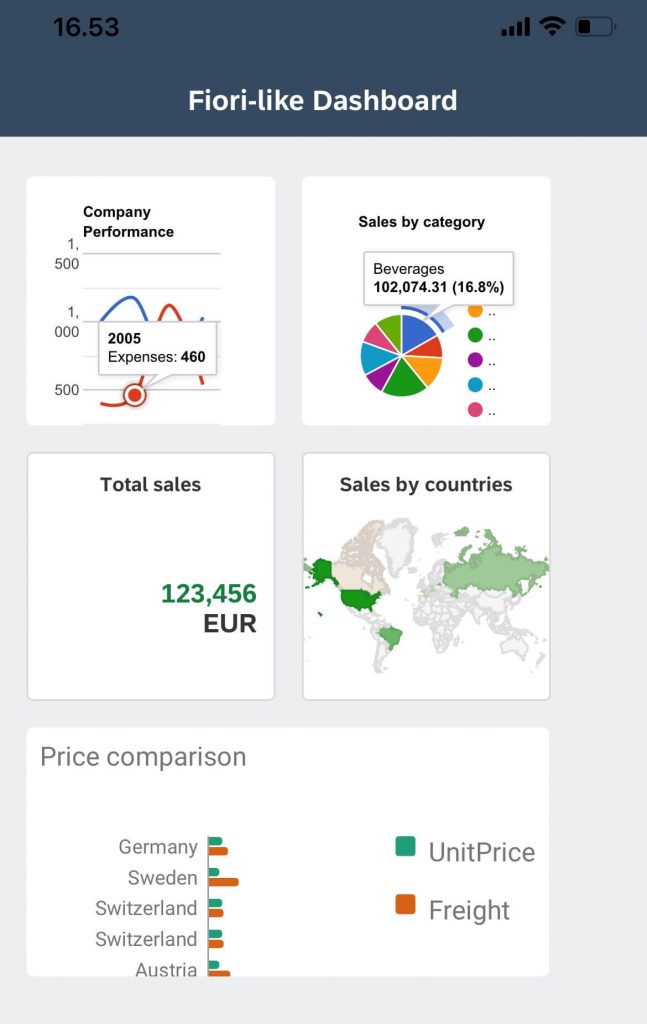
Fiori-like dashboard
If you followed and understood my blog so far, you should be able to create a Fiori-like dashboard. Here is how the page UI components are placed in my app. Note that Total sales number tile does not use chart component.
In addition, these settings are done but you can change it to fit your own flavor.
- Fiori Theme “Home” is used for the page layout
- Background color of the tiles uses Fiori Theme “Base”.
- Boarder of the tiles are set with “Large rounding”
- Width and Height of the tiles are 150x150px